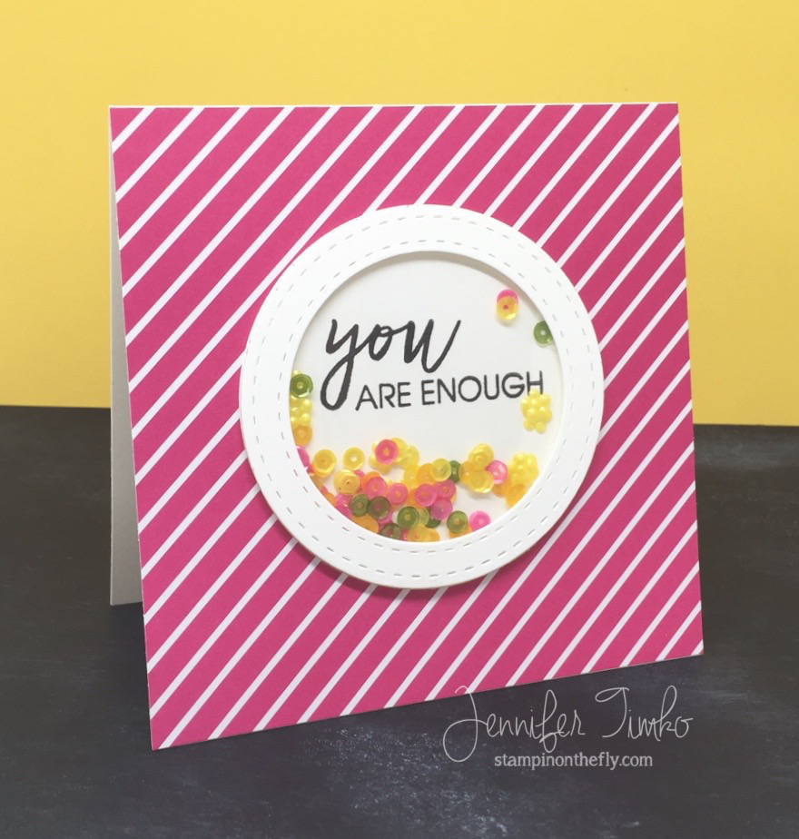
 I am so happy to share this card with you today for The Card Concept! First of all, I cannot even being to tell you how much I love this sentiment. I have been looking for the perfect place to use it and this card was definitely it! We all need to hear this message over and over (and over and over…..). There are so many people that will try to convince us that we need to change, that we need to do just one more thing, that there is something wrong with us somehow. Nope! Not true. None of that. While there is nothing wrong with working to be the best you, at the end of the day YOU ARE ENOUGH.
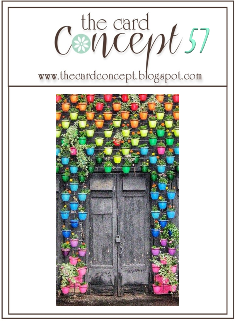
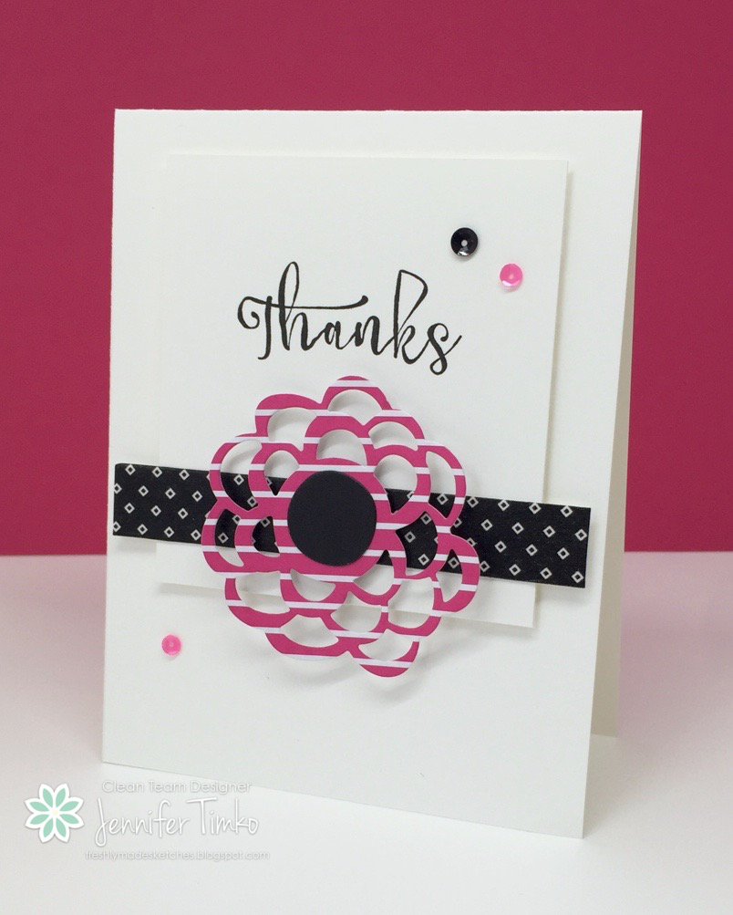
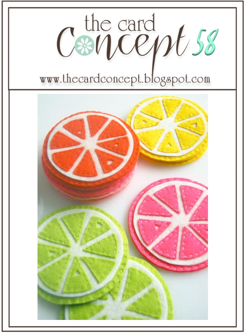
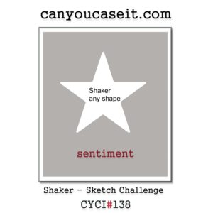
Ok….with all that out of the way, I’m going to admit out loud that this inspiration photo completely freaked me out. I first saw it and I had nothing, nada, zilch. I pondered how bad it would be to just call uncle and bail out this week, haha! No, I’m not kidding. So I walked away. For a week! And then it was time to face the challenge and woman up! So I looked at it a different way and saw fun colors and that stitching and I had my answer. Whew!!! I used this fun striped print from Pop of Pink and simply added a shaker with stitched circles. All I had to do was mix up two of my Pretty Pink Posh sequin mixes to get the colors from the inspiration. I took the Summer Mix and pulled out the teal and added some of the green from the Birthday Bling Mix. Perfect! And a Clean and Graphic card created with no wimping out! Sometimes challenges that give me the most trouble to start help me create some of my favorite cards. Totally true for today’s card. I am also submitting this for the Can You Case It challenge this week: Shaker Cards!
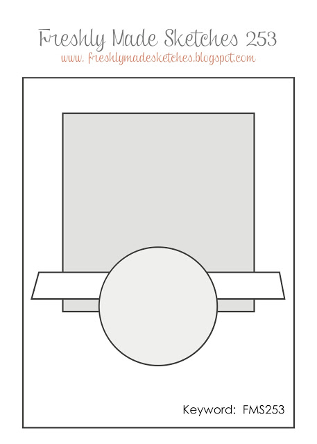
 I hope you will join right in with us on this one. Use any part of the inspiration photo and pick a style for creating….then off you go! Can’t wait to see you in the gallery. Now this is my second post of the day. You can see my Freshly Made Sketches post by just scrolling. Thanks for stopping in today. See you soon!
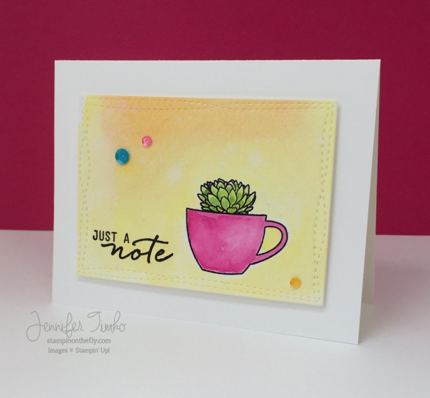
Supplies (affiliate links included):
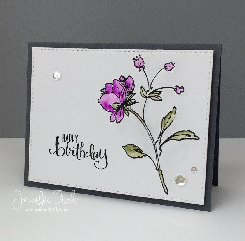
Stamps: Lovely (Essentials by Ellen – Ellen Hutson); Ink: Versafine; Paper: Thick Whisper White, Pop of Pink DSP; Accessories: Big Shot, Stitched Mat Circles (LID), Sequins by Pretty Pink Posh (Summer Mix, Birthday Bling Mix for Concord and 9th), Window Sheet, Foam Tape