Skip to content

CASE Me A Christmas Card – Surprise Edition

CASE Me A Christmas Card – Surprise Edition published on 1 Comment on CASE Me A Christmas Card – Surprise Edition

For those of you who know Michelle Lupton, you know that she is both super talented and one of the nicest people! Over the last years, she has done a series of CASE Me A Christmas Cards where she will CASE (Copy and Share Everything) one of her guests cards and vice versa. You take a non-holiday card and turn it into a holiday card using the inspiration of each other’s work. It is always such fun. This year, Michelle has had some things happen where she was just unable to commit to the project. Soooooo….a whole group of stampers committed to do it together in honor of her!!! This is primarily an Instagram event and all you have to do is go over to IG and search for the hashtag: #casemeachristmascard2023

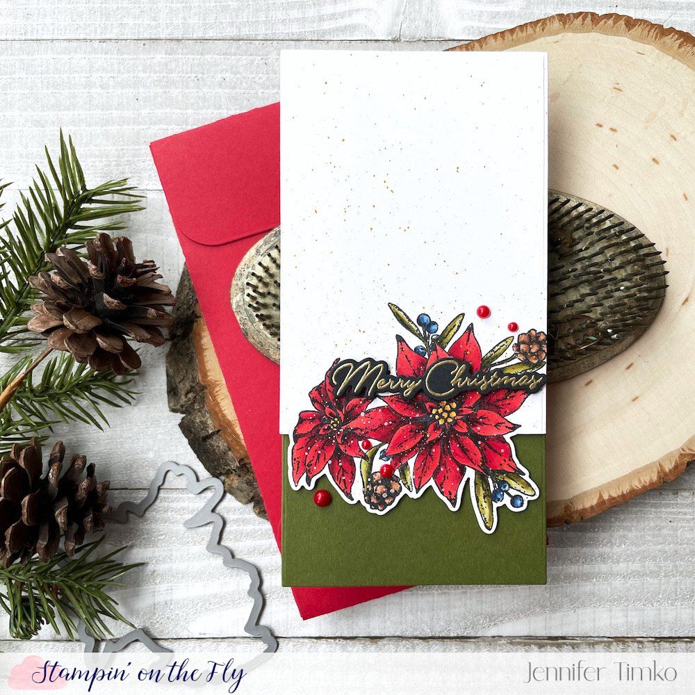
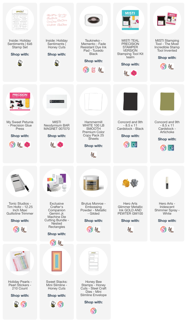
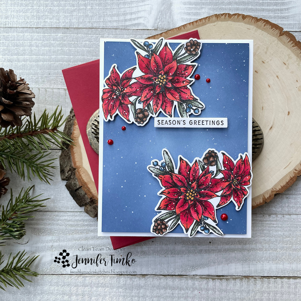
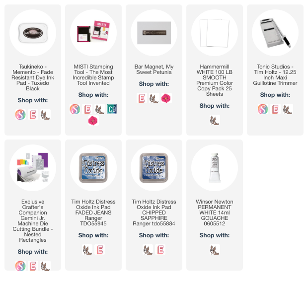
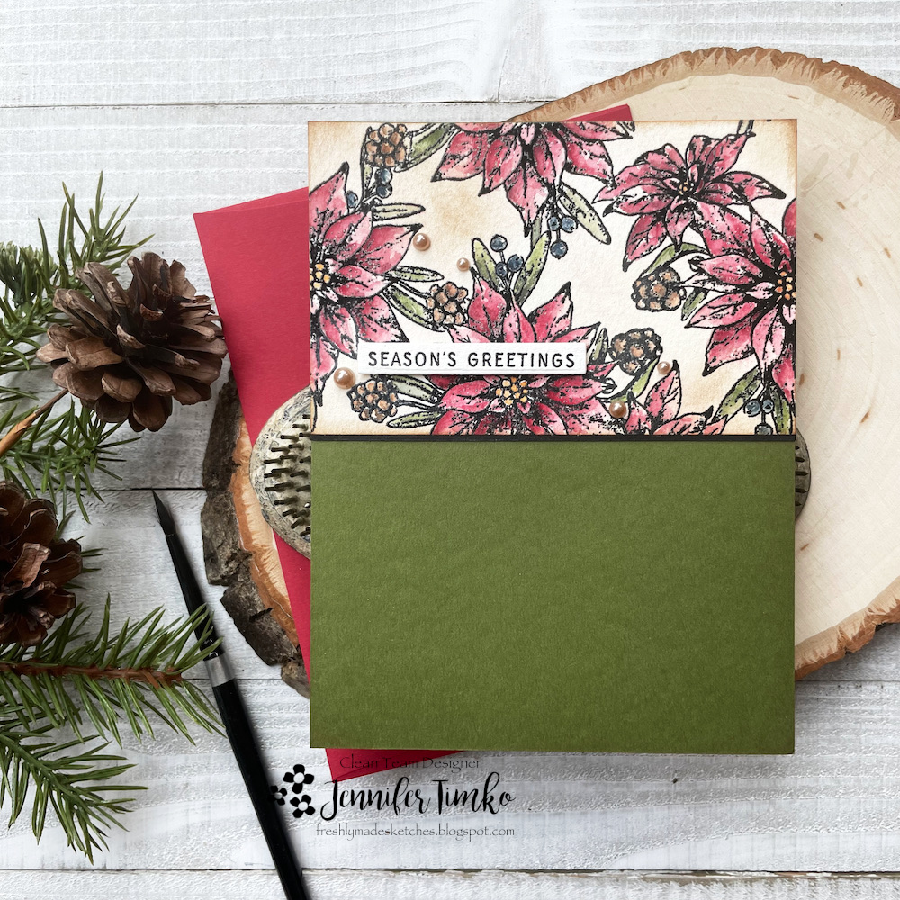
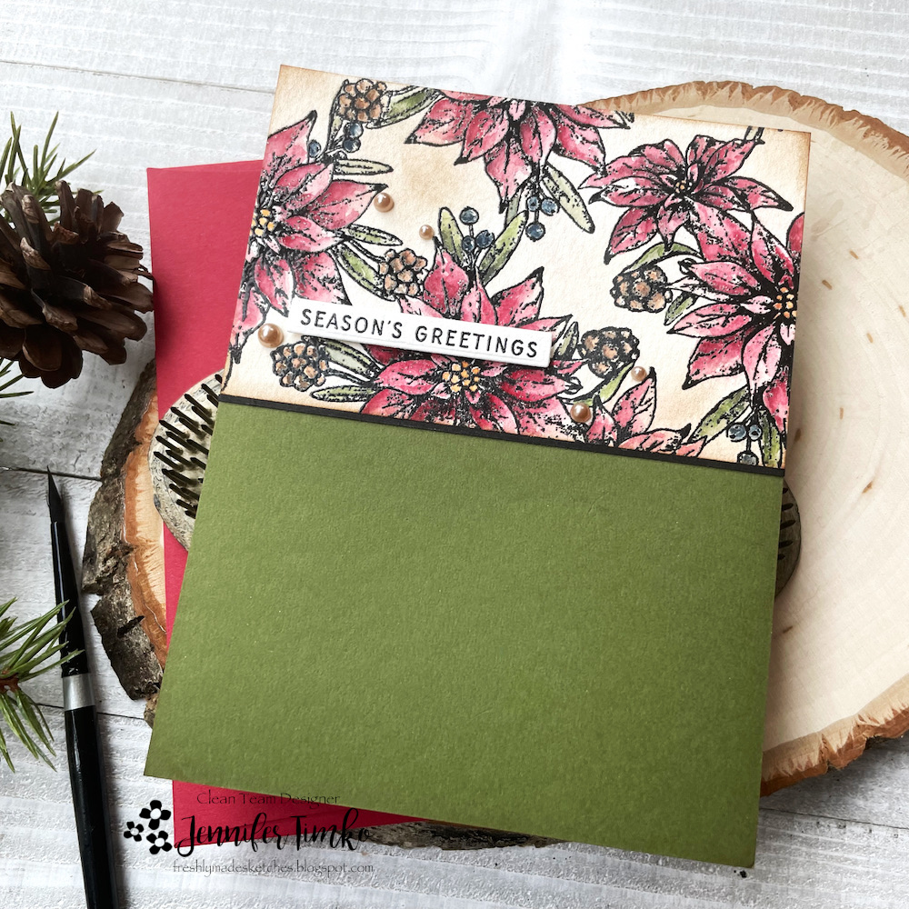
The hardest part of doing this for me is narrowing down the choice of what to CASE. I generally use the rule of three on a CASE where I change 3 things while keeping some of the main elements of the original. In this case, I chose a floral card with partial die cutting. Her original is posted below. I used the Joyful Poinsettia set from WPlus9 (I know you are super shocked) and found the die for the set worked perfectly in the partial die cutting. I used my Copic Markers to color the image with traditional colors.

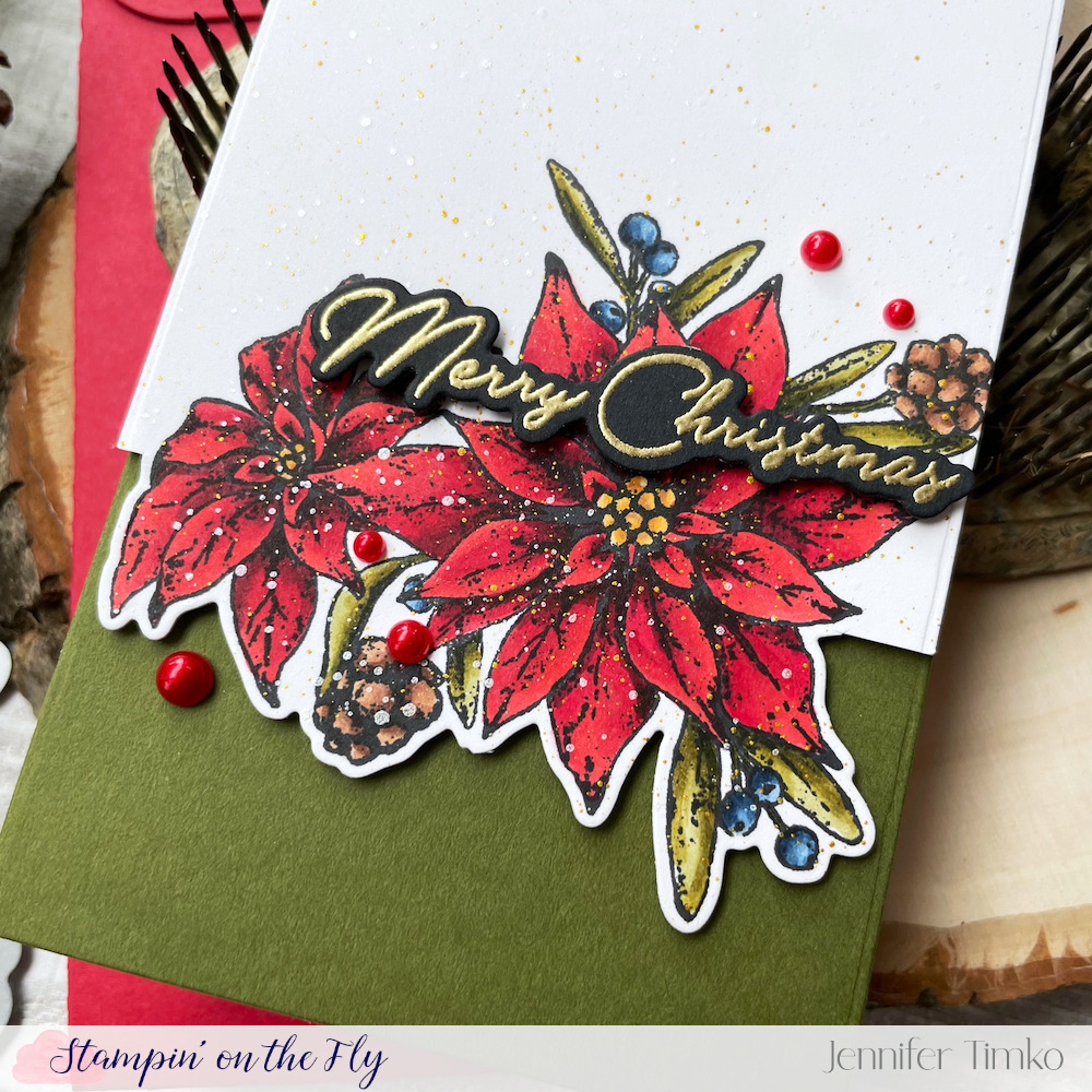
I chose Artichoke Card Stock from Concord and 9th as my base once I had finished my coloring. Then I created a mini slimline card using the Sweet Stacks: Mini Slimline Dies. I heat embossed my sentiment in Gilded Embossing Powder on Black Card Stock by Concord and 9th. Oh, and if you have ever had trouble with heat embossing on black (I did and thought it was my powders…and I tried a lot of powders), this card stock changed the game. It is smoother and somehow the heat embossing stays crisper. YAY! I added some splatters with Gold and Irisdescent White and then some red pearls.

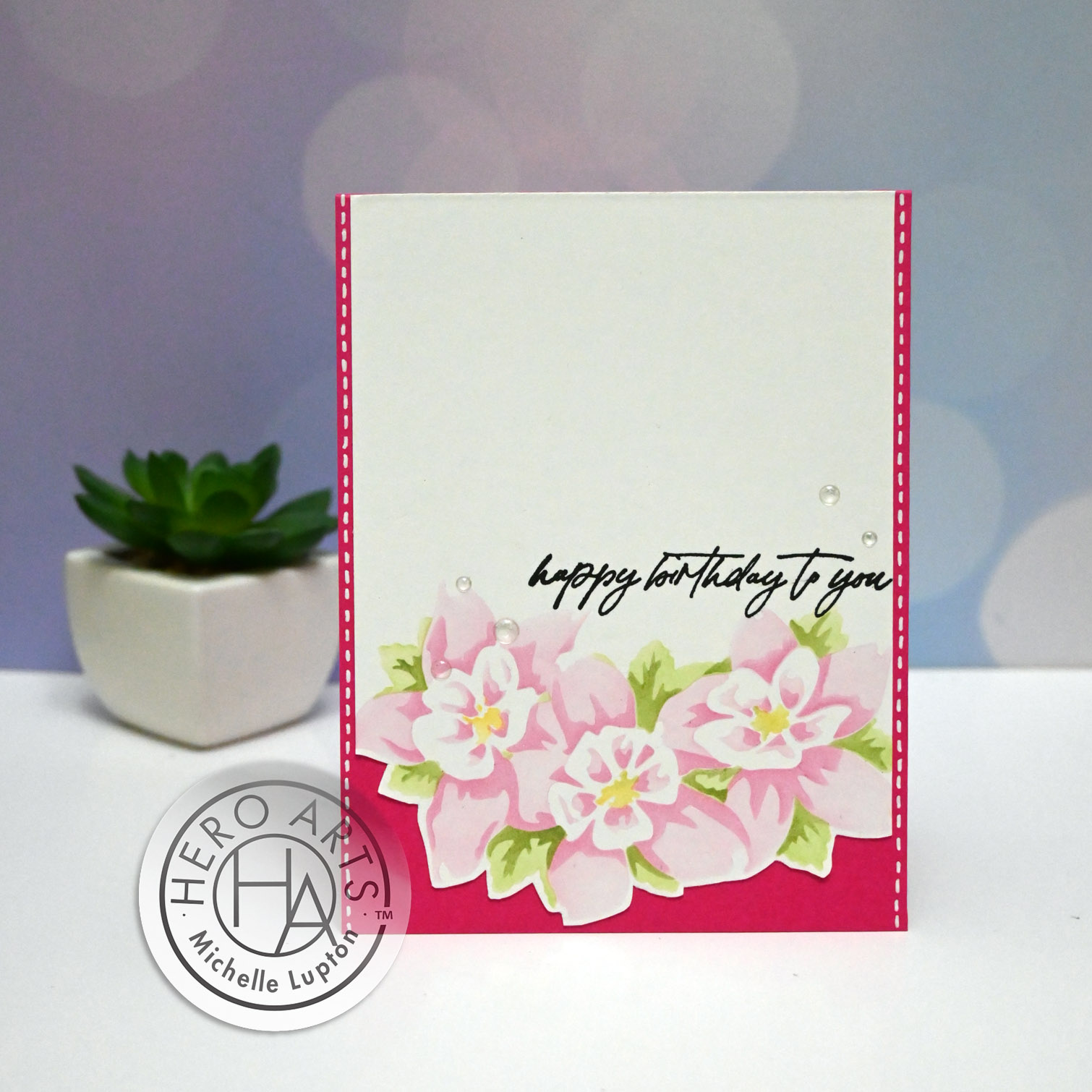
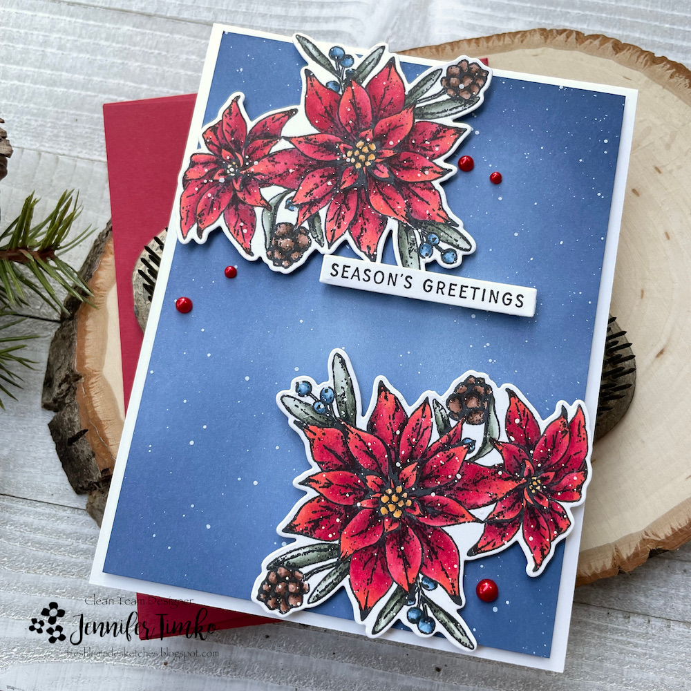
So here is Michelle’s gorgeous card. Things I kept: Partial Die Cut, Sentiment Placement, Florals and Gems. Things I changed: Slimline layout, Copic coloring, Raised sentiment, Image panel to edge.

I hope you like my version of her card. Please come over and celebrate with us all. Michelle is just beloved and I’m thrilled to be a part of this ode to her talent.

Freshly Made Sketches #598

Freshly Made Sketches #598 published on 7 Comments on Freshly Made Sketches #598

Hi everyone! Happy August to you! I am this week’s sketch designer at Freshly Made Sketches and I hope you will like this one. When I designed it, I had a floral in mind for the corner. I had this gorgeous poinsettia on my table from my last card so I opted to color the single image and go with Copics this time.

I stamped the image from Joyful Poinsettias twice and then colored. Dawn’s images have shading built into the design so I just followed her lead. I enjoyed spending a little time with my Copics! For the base I started with a light blue card stock and added Faded Jeans and Chipped Sapphire Distress Oxide Inks.

I decided to add some splatters with white gouache and some red pearls. The sentiment comes from the same set. I love all the options this set gives and I suspect you will see it in heavy rotation for this holiday season.

I hope you are having a wonderful start to your August. Thanks so much for stopping in today. I’ll see soon!

Freshly Made Sketches #596

Freshly Made Sketches #596 published on 5 Comments on Freshly Made Sketches #596

A cool new sketch idea at Freshly Made Sketches! Judy has us doing halfsies! Designs only on the top half of the card and the bottom is clean. I found it a bit of a challenge but happy with the final result.

Along with the new set from WPlus9 that I used last week, I ordered another set called Joyful Poinsettias. I like the background style design along with the single flower and sentiments in the set. Again with the watercoloring (because I know Dawn designs like a water colorist). I stamped the image in black then heat embossed with clear embossing powder. I colored the flowers and leaves and tried to keep to a more vintage palette. After it was dry, I added a little Vintage Photo Distress Ink with a light hand to “age” the white spaces.

I waited until I was done coloring to choose the base and I went with Artichoke by Concord and 9th. I stamped and embossed the sentiment, going with a small one to keep it on the top half of the card. Finally I added some champagne colored pearls as accents.

I hope you find a bit of inspiration in this card. I had lots of fun spending a little time on the watercoloring. Thanks so much for stopping in. See you soon!

Primary Sidebar