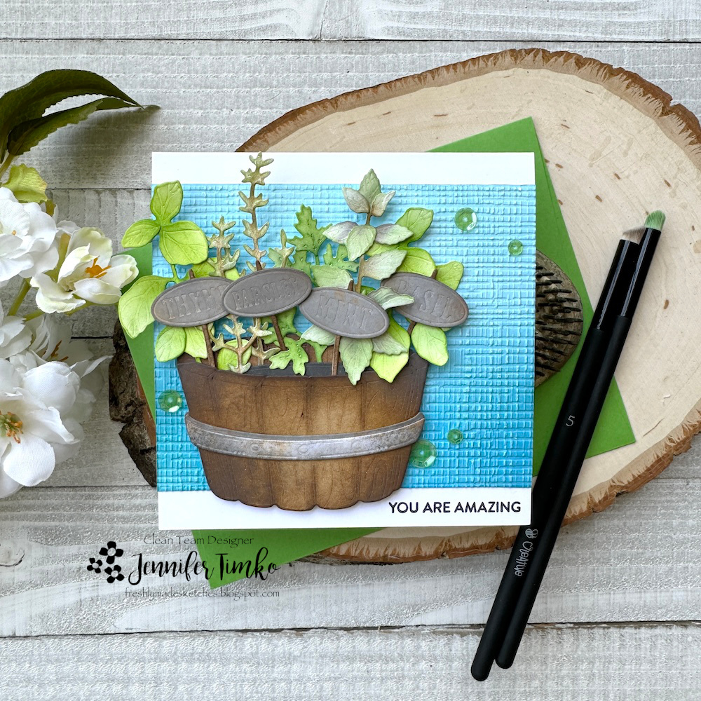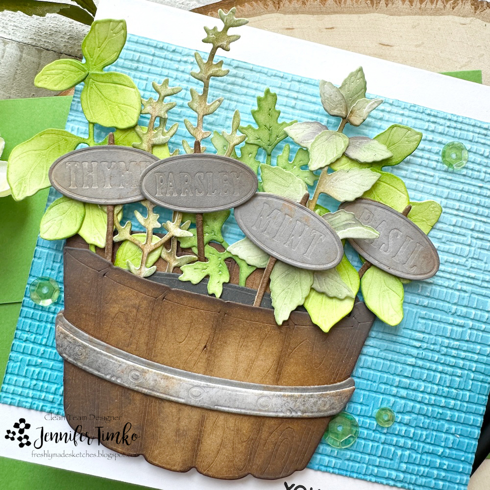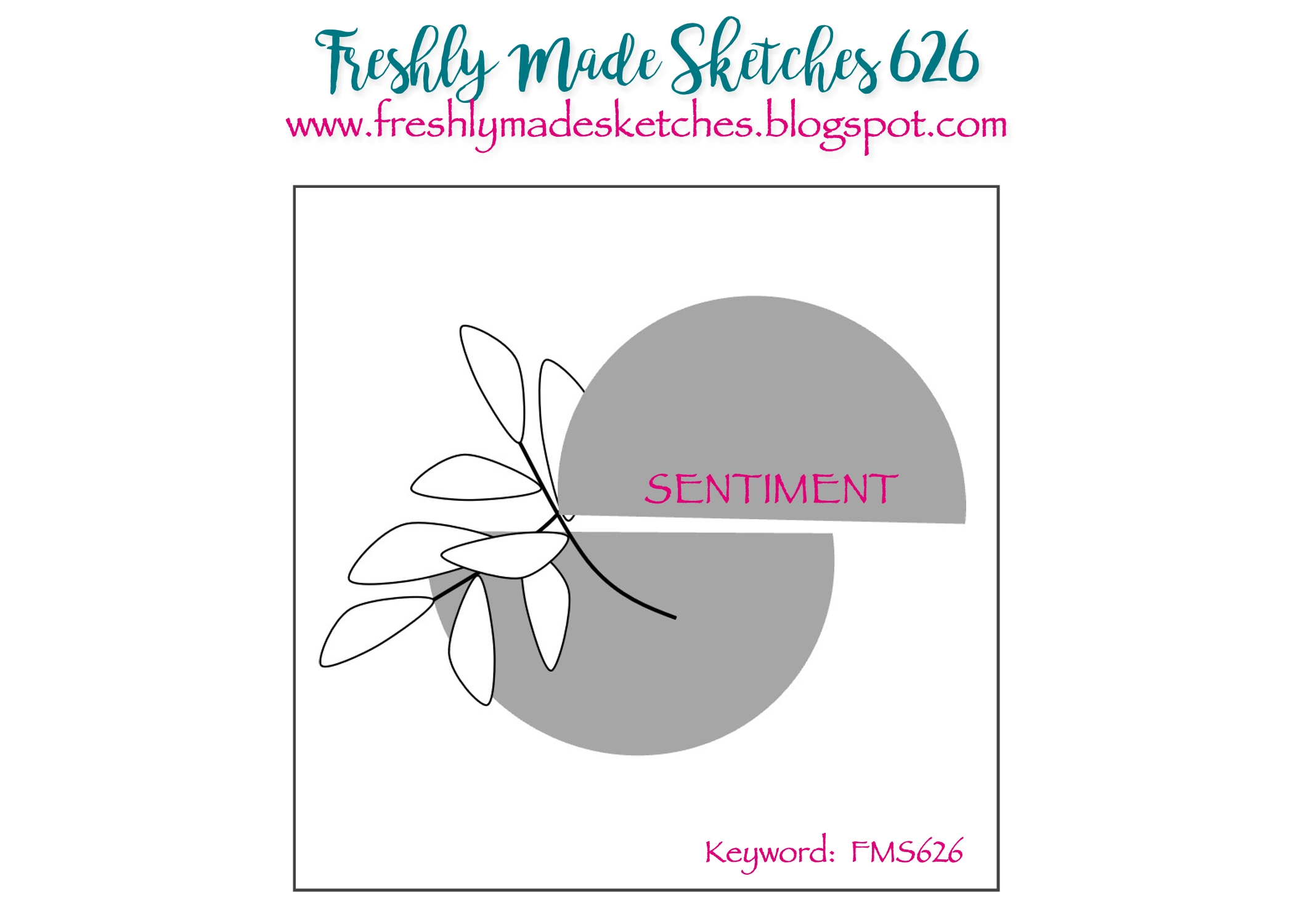
Hi everyone! I am the sketch designer over at Freshly Made Sketches and I hope you will enjoy the options on this one.

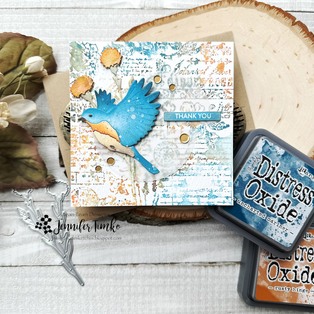
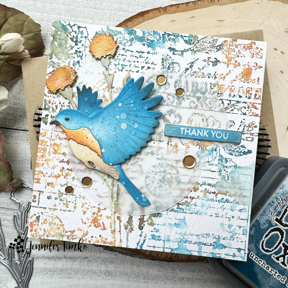
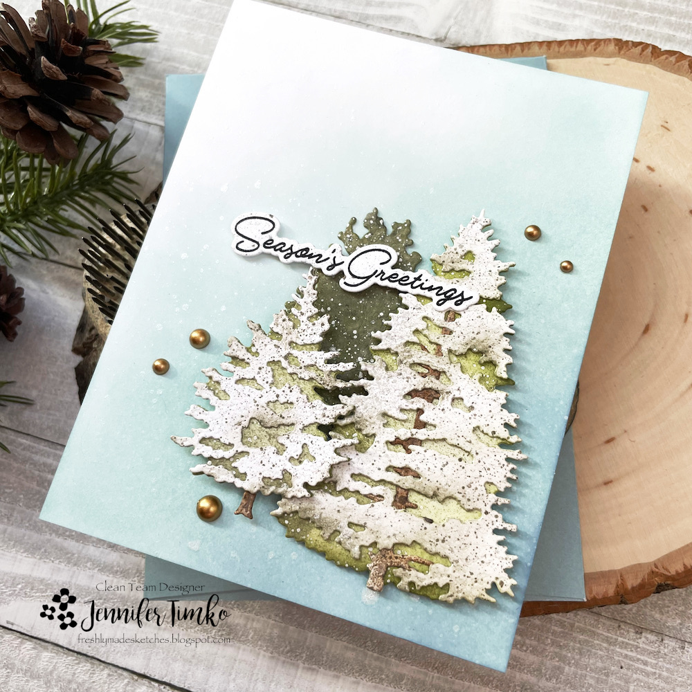
I’m still working on finding the right card for a friend to give his wife. After narrowing some things down and showing him some previous cards he narrowed it down to: hummingbird, vintage feel, touches of blue. I think maybe I’ve gotten closer to the mark. I did lots of ink smooshing, splattering and brushing it on. Almost all of it was Distress Oxide ink and all the paper was Distress Heavystock. I’m simply obsessed with the details on this hummingbird from Honey Bee Stamps. I just played with shading on greens and grays (Peeled Paint, Rustic Wilderness, Lost Shadow) plus a bit of Rusty Hinge and Candied Apple for his throat. I added Lost Shadow Distress Spray Stain for more splattering.

For the flower, I used Tattered Rose and Worn Lipstick plus a little bit of the Rusty Hinge left on the brush to pull in a little bit of orange. I used the Vintage Flora background stamp inked with a combination of Antique Linen and Rusty Hinge Oxide inks. I spritzed, stamped off and then applied the paper to the stamp to get a less detailed image. I then spritzed with Tumbled Glass Distress Spray and added more Tumbled Glass Oxide to the edges. The sentiment is from my go-to Mini Messages.

Thanks for dropping into today. Let me know if you think I hit the mark for my friend’s request. See you again soon!