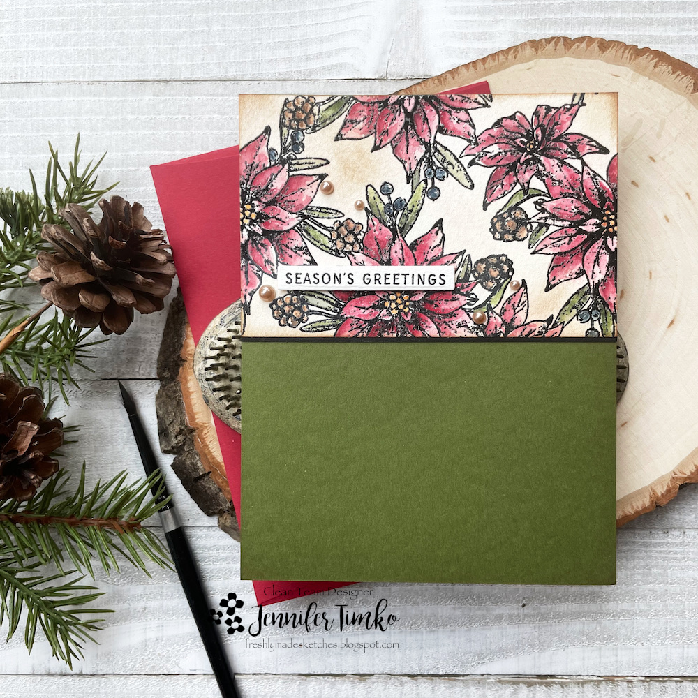
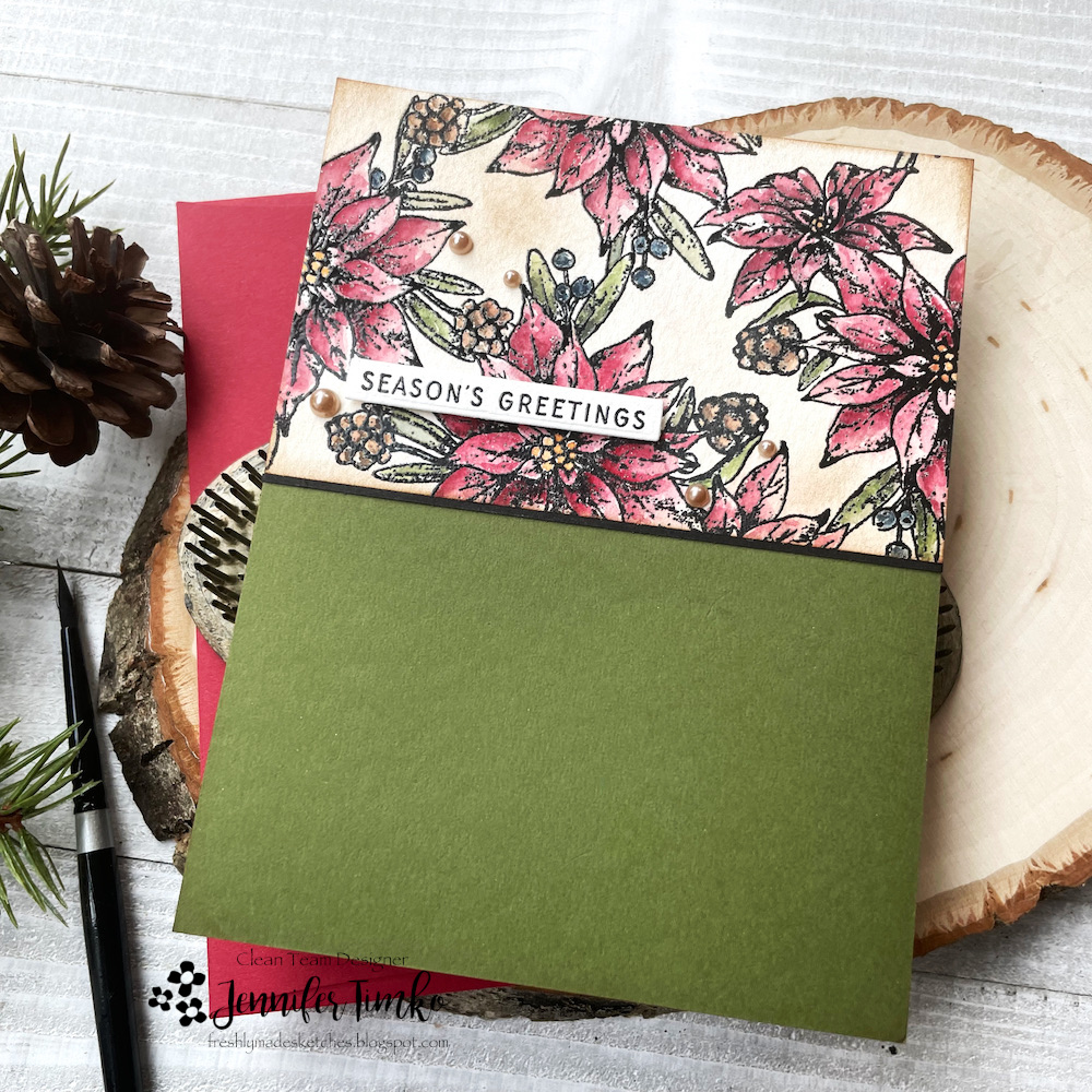
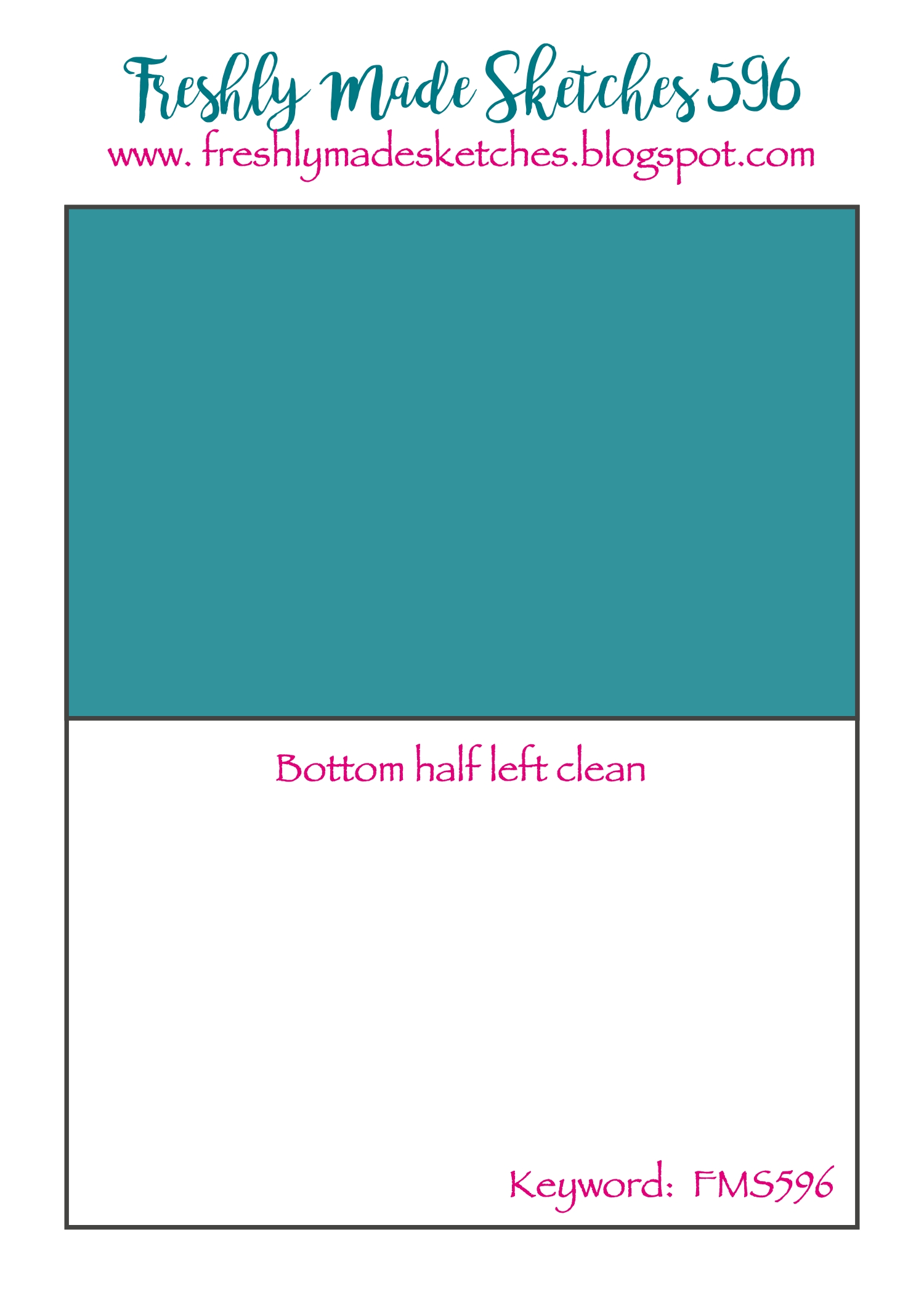
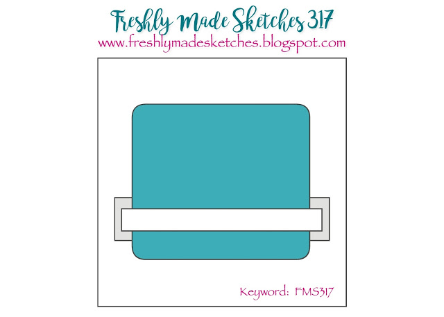
A cool new sketch idea at Freshly Made Sketches! Judy has us doing halfsies! Designs only on the top half of the card and the bottom is clean. I found it a bit of a challenge but happy with the final result.
Along with the new set from WPlus9 that I used last week, I ordered another set called Joyful Poinsettias. I like the background style design along with the single flower and sentiments in the set. Again with the watercoloring (because I know Dawn designs like a water colorist). I stamped the image in black then heat embossed with clear embossing powder. I colored the flowers and leaves and tried to keep to a more vintage palette. After it was dry, I added a little Vintage Photo Distress Ink with a light hand to “age” the white spaces.
I waited until I was done coloring to choose the base and I went with Artichoke by Concord and 9th. I stamped and embossed the sentiment, going with a small one to keep it on the top half of the card. Finally I added some champagne colored pearls as accents.
I hope you find a bit of inspiration in this card. I had lots of fun spending a little time on the watercoloring. Thanks so much for stopping in. See you soon!
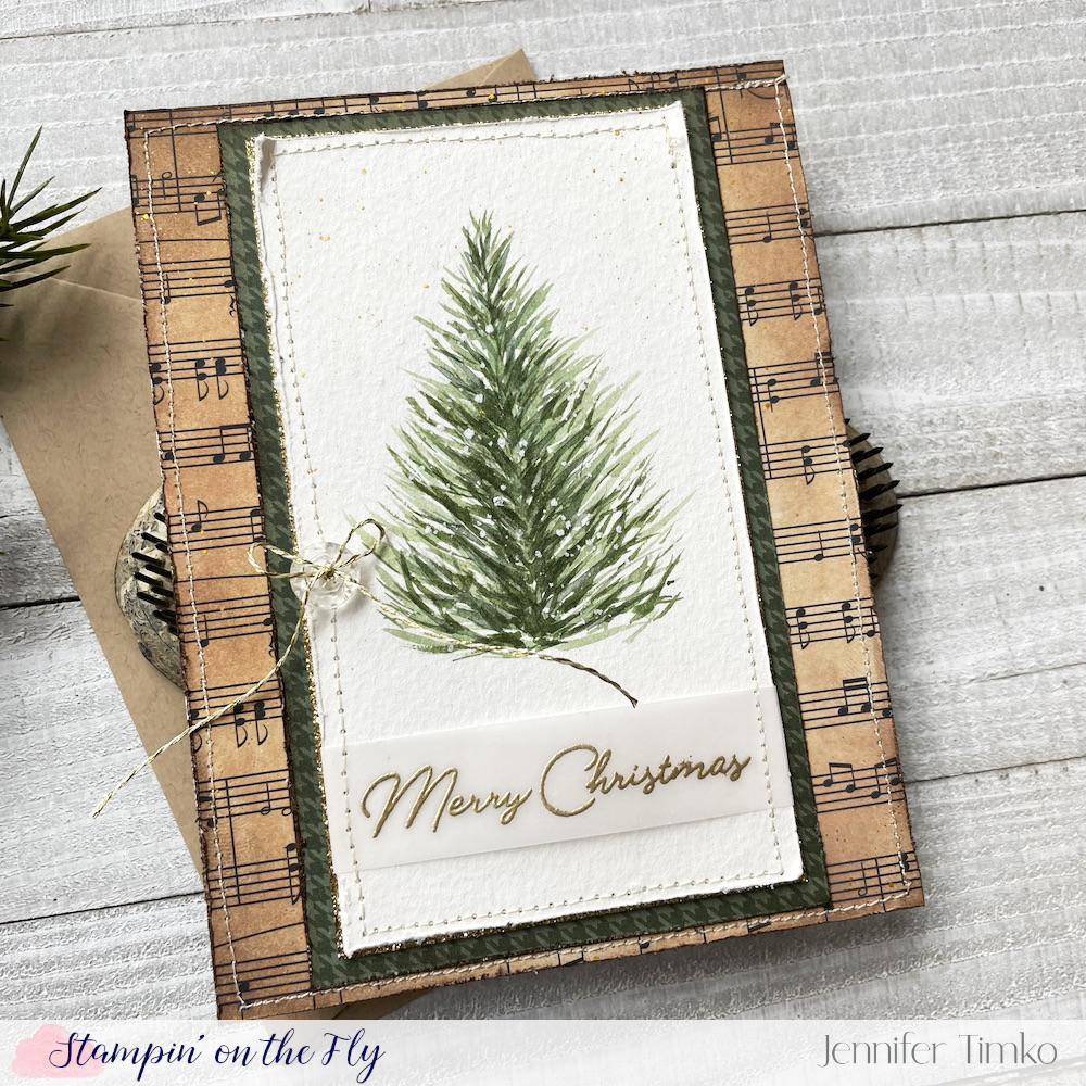
One more tree. Because the live from Dawn Woleslagle taught three styles and I had to try them all. You can find the links to her page on my post from last week. I hope you will bear with me because this has brought me so much joy in finding success in painting. I may even venture into some tags if I have any time to spend on them over the next couple of weeks.
I will say that I cannot pick a favorite tree to paint but I find this one and the first one I made a little more intuitive. Again, I left the tree simple (mostly for fear of messing it up by adding container) but I like the look. A bit more stitching since I feel it adds the right touch on this.
You can see in this closeup that I also added some white and gold splatters. For the background I chose an old, really old, music print from my stash. I inked it up with Distress Inks to give it a vintage look and added stitching to it too. I knew it needed a bit more shine so I started with the sentiment being gold embossed (and the gold splatters). But it still needed something else. It it hard to see in the photos, but right under the image layer is a layer of gold glitter paper. In person it really adds so much! A button and more gold twine to finish.
Again, thank you for those of you who have left kind words. Let’s face it, trying new things can be a bit intimidating and I’m glad you encourage me with your sweet comments. I’m actually out flying today and will likely be out in the system A LOT over the next couple of weeks. If you are flying for your traveling, please get to the airport early. I mean seriously early. I have already been seeing families completely devastated by the long security lines and the extra stress of risking their flights. Well, I’m off to get ready for another day. I’ll be back tomorrow with a new sketch from FMS (and something other than a tree). See you then!
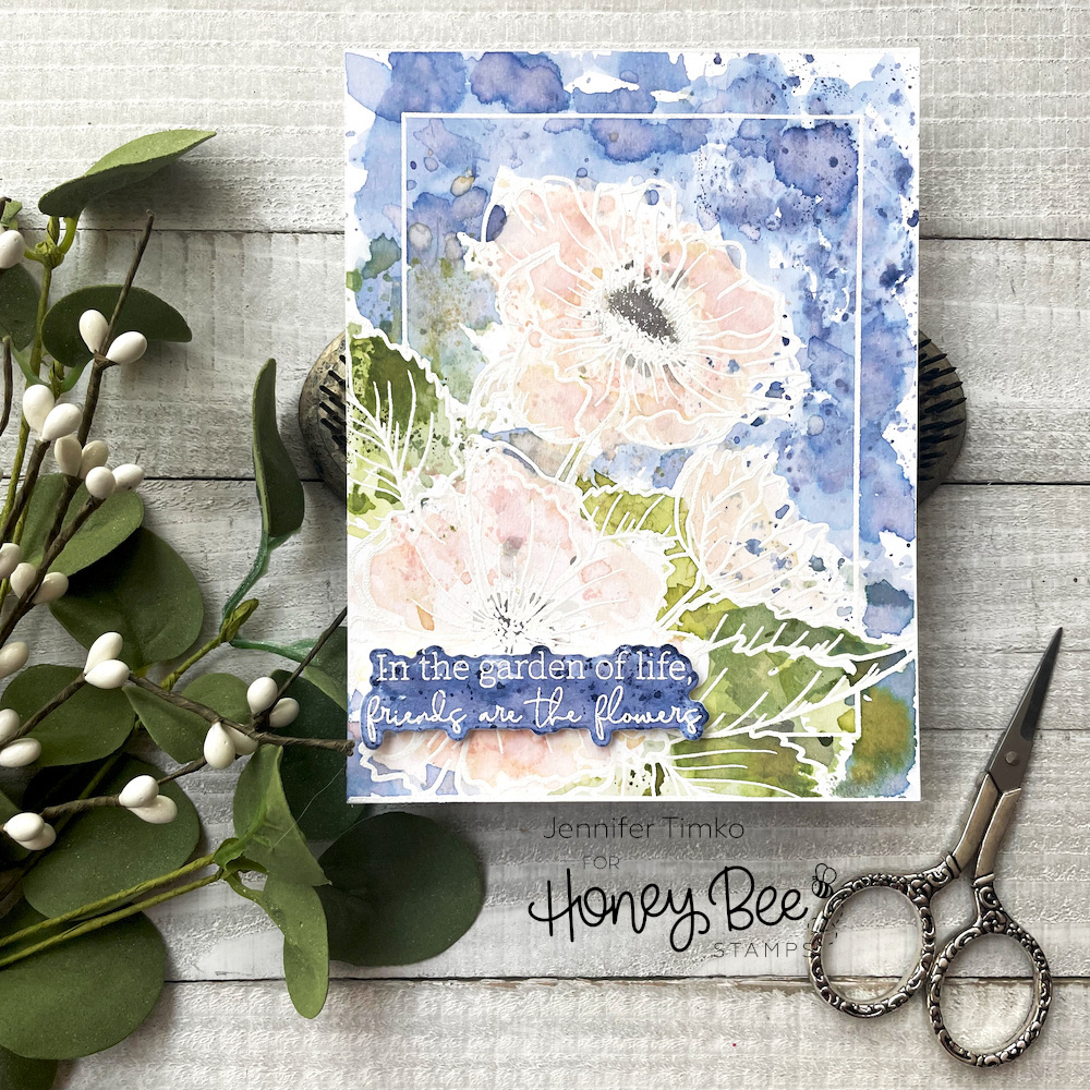
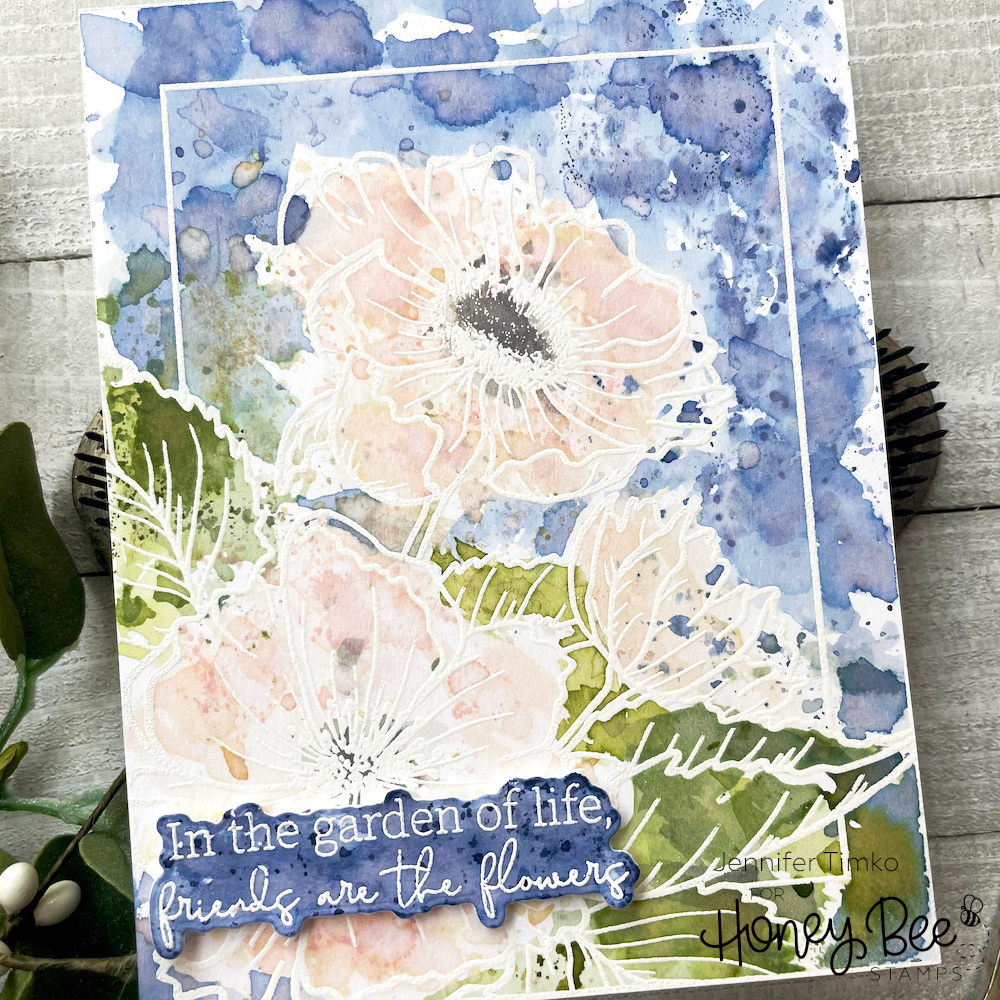
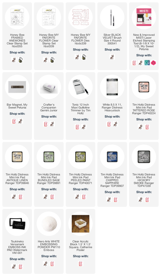
Sharing today for Honey Bee Stamps! I needed a day just to “play” in the stamp room and I thought I should pull out this new Framed: Anenomes stamp set. It is a gorgeous image and one that can be colored with so many mediums. I chose a very loose watercolor look with Distress Ink.
I stamped the image using Versamark Ink onto Tim Holtz Heavystock paper. It is made for distress ink techniques. For each color, I simply “smooshed” the ink from a mini pad onto a small clear block then added water with a paint brush. I took the block direct to paper to apply the color. Using a small block help you keep a little more control on where the color goes but still leaves it loose. If you need a bit more color in a specific place, you can add it with a paint brush. This is a layering process so leave time to allow drying to happen in between adding colors or additional ink.
Because I love the look of pale anemones, I made the leaves and the background bold and kept the flowers in muted tones of Tattered Rose and Antique Linen. For the sentiment, I stamped and heat embossed it onto more of the Heavystock paper. Then I colored it with the Chipped Sapphire in the same way as I did the flower except I made sure there was a bit more solid coverage as a base.
I hope you enjoy this card! Let me know if this makes sense or if you would rather see a video on how to create this look. Thanks so much for dropping in today!
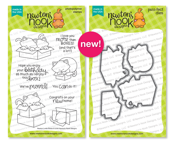
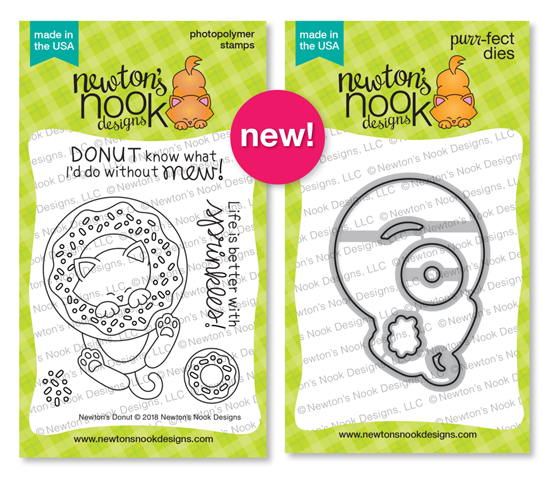
Welcome to the last day of the May Release from Newton’s Nook Designs. And for the last day we have not one but TWO adorable Newton sets for you. YAY!!! Yep, two of the greatest things in the world….boxes and donuts.
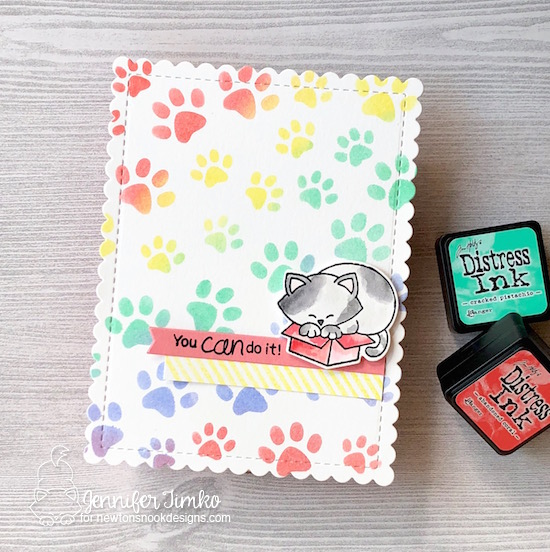
If you have ever known a cat, you already know all about the phrase “if it fits, it sits”. Well, the new Newton Loves Boxes is all about fitting and sitting!! It is hilarious. When Jennifer Jackson first showed the team the images, we all went just a little bit crazy! Pretty sure that will be the reaction from all of you today too. I created a background with the Pawprints Stencil and Distress Inks and then cut it out with the Frames and Flags Die. I colored up out furry friend and his box and then cut him out with the coordinating die set for the stamp. Don’t you think this sentiment is perfect for the image. Seriously, this cracks me up.
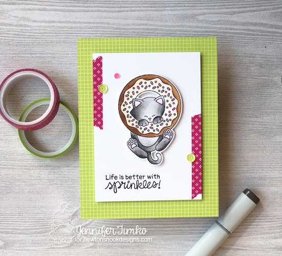
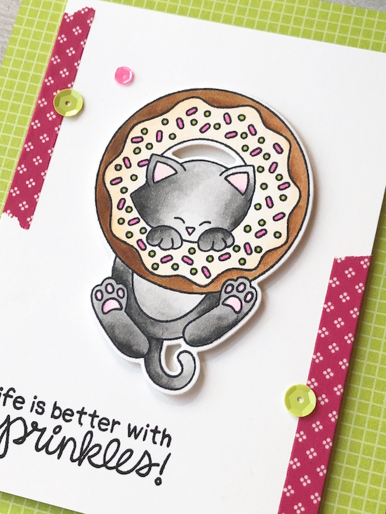
For my second card, I get to introduce Newton’s Donut. Well, I actually colored MY donut. That I want. Right now. But until I can figure out how to get it from him, it is Newtons’ donut. *smile* And because I am pretty sure sprinkles should always include pink and lime green, that is what I chose for the colors.
I made the donut into a chocolate version with vanilla frosting (a favorite of mine) and then tucked in this adorable kitty colored with gray. And there is something about the images with kitty “beans” (paw pads) that make me smile! I used a base of lime patterned paper and some great (retired) pink washi tape to pull the colors from the sprinkles and then added on some sequins in the same colors. On a technical note, I just have to tell you how well engineered this donut die is. Look at the placement of the cut-outs…really fantastic and easy to use! I love the time that is put into each of these sets. It always makes me so proud when I can support Newton’s Nook Designs and their hard work!
This daily double is a real win and I know you will all be as in love with the sets as I am. And now for a chance for free stamps!
Would you like to win the “Newtons Loves Boxes” or “Newton’s Donut” Stamp Set?
Each set will be given away to ONE lucky winner!
Here’s how to win:
Comment on the NND blog and Design Team blogs (see list below)! Thewinner will be chosen at random from the collective reveal posts. Make sure to check out each of their blogs and comment for your chance to win. You will not know which blog has been chosen so the more you comment on the better your chances are of winning! You have until Thursday, May 17th at 9pm CST to comment — winners will be announced on the blog post on Friday, May 18th.
Check out all the awesome Design Team Blogs below to enter:
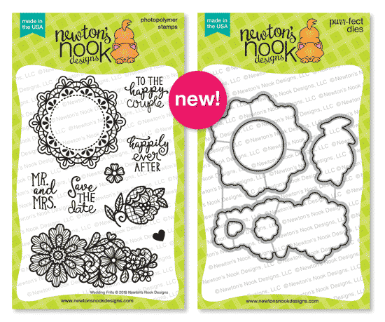
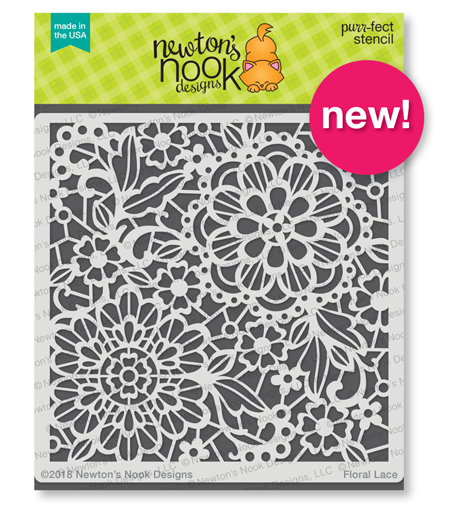
Welcome back for day 2 of the April Release from Newton’s Nook Designs. Today we have a wonderfully elegant set that is perfect for another fixture of spring…weddings. It is called Wedding Frills and it is gorgeous. As if that were not enough, we are showcasing a new stencil called Floral Lace as well.
When I saw these gorgeous images, I immediately wanted to make them look like lace on a wedding dress. Something about embossing white on kraft colored card stock does that! I cut the image layer with the Frames and Flags Dies and then stamped the big flower and sentiment with Versamark Ink (I did this in steps to avoid causing smudges with the Versamark). Using Wow! Bright White Embossing Powder, I heat embossed. Then I stamped a few of the little flowers and did the same. Using the coordinating Wedding Frills dies, I cut those out and popped them up. Finally I added some pearls to go with my wedding flowers. I love the elegant feel of this card!
For my second card I wanted something with a more spring-like feel. I cannot even tell you how awesome this stencil is to use! I taped it onto some Bristol Smooth card stock and then sponged on Distress Inks to highlight the flowers and leaves. I sponged a little bit more of the paper and then cut out my sentiment letters with the new Essential Alphabet Dies. I just used a bit of foam tape to pop them up and make them stand out more. Think of all the color combinations you can try! I can’t wait to make more of them.
I hope you enjoy these! What a day 2!! I know you have lots of hopping to do so off to visit the rest of the team for you. But first….a chance to win!!
Would you like to win the “Wedding Frills” Stamp Set?
Each set will be given away to ONE lucky winner!
Here’s how to win:
Comment on the NND blog and Design Team blogs (see list below)! Thewinner will be chosen at random from the collective reveal posts. Make sure to check out each of their blogs and comment for your chance to win. You will not know which blog has been chosen so the more you comment on the better your chances are of winning! You have until Thursday, April 19th at 9pm CST to comment — winners will be announced on the blog post on Friday, April 20th.
Check out all the awesome Design Team Blogs below to enter:
I’m busy, busy showing you projects this week and I have been waiting to show you this one. I made this while I was at Stamping Away and just love it!! It seems perfect that the wonderful Kim Singdahlsen is the sketch hostess this week at Freshly Made Sketches. I love what she creates with Taylored Expressions products so it seems fitting that I was able to use some of those for her sketch.
I started with the Mandala Cutting Plate and what a wow it is! I cut it out of some Bristol Smooth paper so that I could watercolor it. I smooshed some Distress Ink onto a clear block and added some water, then used that to color the mandala. I saved the large cut out section on the right side so that I could color it too. So bold and super simple to do! Another of the TE design team members, Jen Shults, brought this die (and many of its friends) to Stamping Away and she also brought a ton of TE stamps. I was like a kid in a candy store!! Took me a while but I finally narrowed down to the perfect sentiment from the Free Spirit stamp set. I cut out a banner with the Double Ended Flag Stacklet and then stamped on the sentiment using my Misti.
This may be my favorite card that I have made in a while and I was clearly inspired by all the rainbows and creativity while I was at the Whatever Craft House! I hope you enjoy this sketch as well…so many beautiful projects from our design team!! Thanks so much for stopping in. I’ll see you soon!
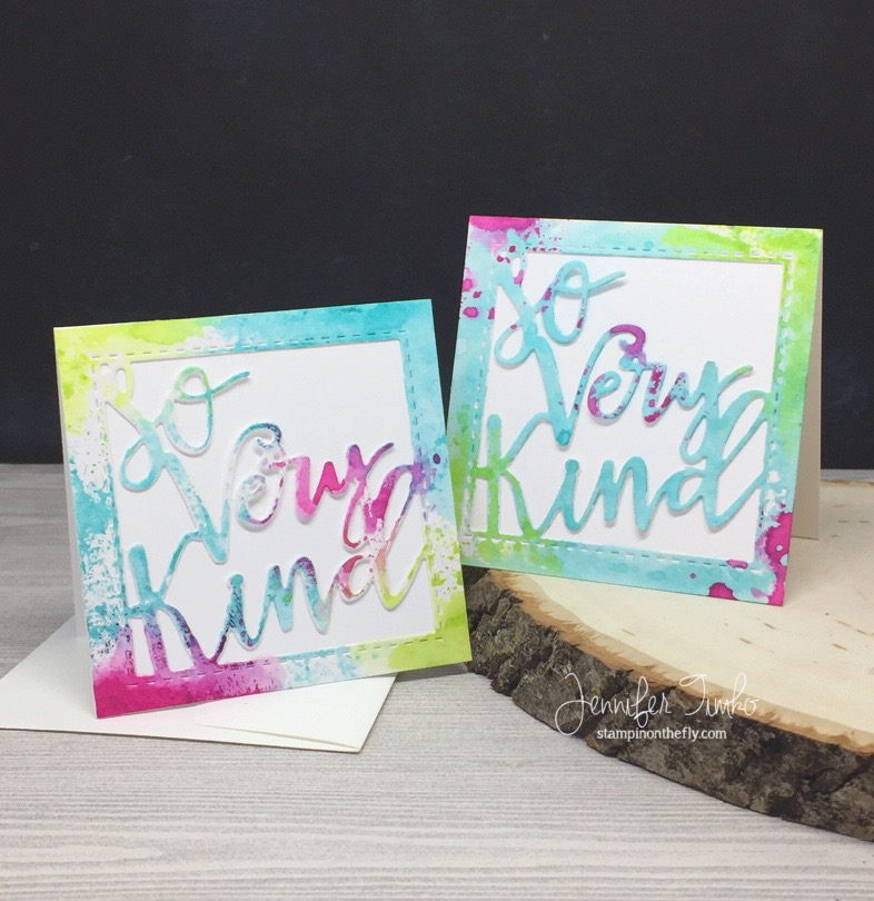
Dropping in today to show you some sweet little note cards that I made. Something about a little card that you can tuck into a package always makes me smile. And I don’t seem to make them enough. This little die with the sentiment comes from Lil’ Inker Designs and was among the sweet products I got at Stamping Away (I might as well warn you that I have many posts worth of enabling as I get to use these items). I made little 3″ x 3″ squares and then used the die to cut out the centers. Because I used Bristol Smooth paper, I was able to add these fun watercolor looks using Tim Holtz Distress Ink. I simply smooshed the ink onto a small acrylic block, spritzed with water and dabbed the color onto cut sentiments. So easy and yet so fun! Once dry, I attached them onto 3″ x 3″ cards and they are all ready to go. These already have homes that they are going to so I think I need to set about making more to have on hand.
Thanks so much to Lil’ Inker Designs for sponsoring Stamping Away. You are, indeed, so very kind!
Back tomorrow with a fun hop that you are going to LOVE! Until then, have a great day!
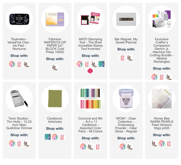
Supplies (affiliate links may be included):
Paper: Thick Whisper White (SU), Strathmore Bristol Smooth; Ink: Tim Holtz Distress Ink (Twisted Citron, Peacock Feathers, Picked Raspberry); Accessories: Big Shot, So Very Kind Greetings Die (Lil’ Inker Designs)
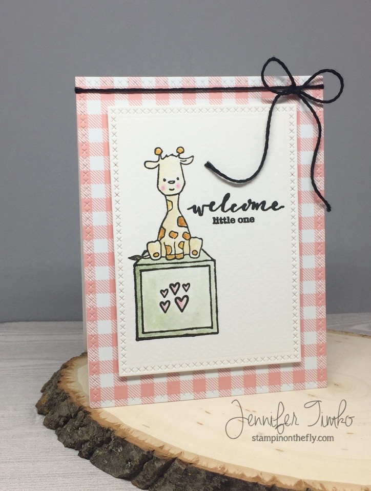
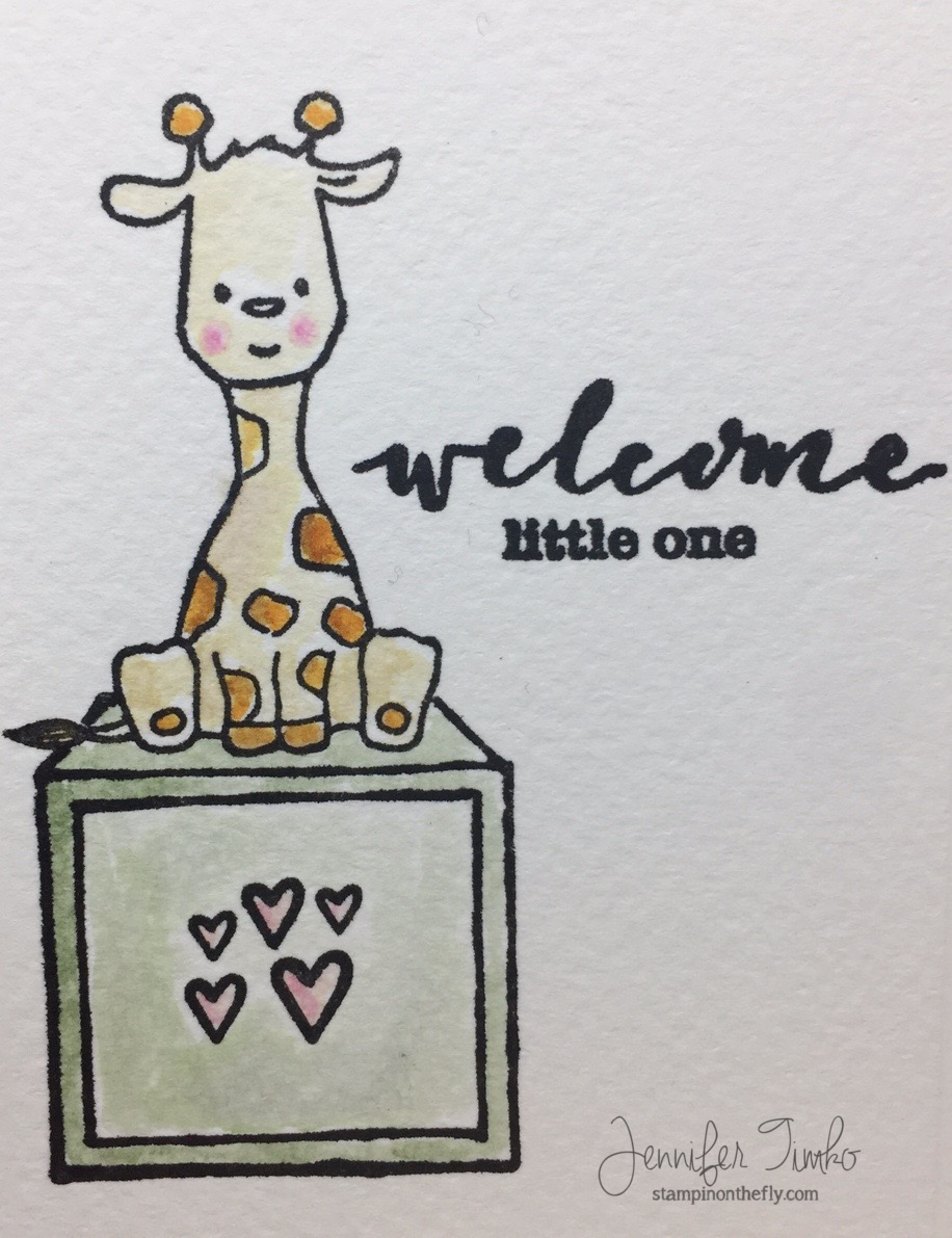
I think this little set is simply precious and I fell in love with the giraffe. With a baby them in mind, I chose soft Distress Ink Colors and colored this little fellow on Fabriano Watercolor paper. Just a little masking to allow him to sit on the block.
I masked the sentiment as well to mix the script with the print….love the flexibility to do that! Once everything was stamped and colored, I cut the image layer and the gingham paper using cross stitched dies. Finally a little black twine for an added detail.
I talked a bit about the Stamping Away retreat that I attended last week in my post from Wednesday and this is another of the sets so generously given to us by Shay of Winnie and Walter. She really is incredible!! And the Rerun has cards created by some of my retreat friends too so make sure to go see them all!
I’m also linking this with the Simon Wednesday Challenge where the theme is Girl Power and the focus is on Winnie and Walter stamps. Hope you enjoy my card and that you will be inspired to join in this month! Make sure to go check out the Winnie and Walter blog for all the details! Thanks so much for stopping in. See you soon!
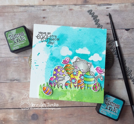
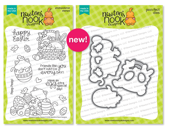
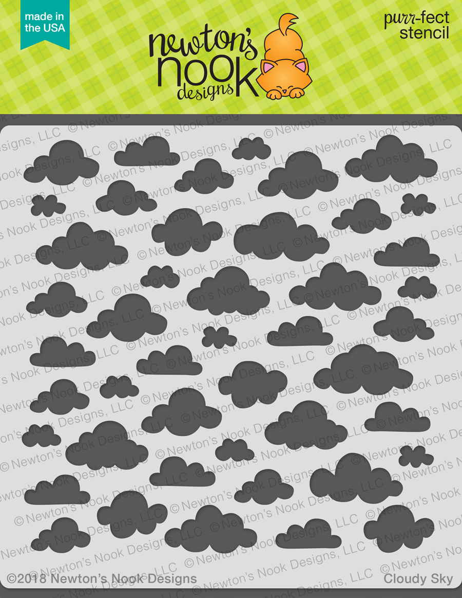
Welcome to day 1 of the February Release from Newton’s Nook Designs. This month’s reveals are going to wow you, as usual. Such variety and fun! Today we have an adorable set called Newton’s Easter Basket (with coordinating dies) along with a new stencil called Cloudy Sky.
I love that we get to start off with our favorite kitty this month! I chose the image with all the eggs but you are going to love the Newton “bunny” and Newton in the egg too. Such fun! I started by using the new Cloudy Sky stencil with Versamark ink and clear embossing powder. I just applied the ink straight from the pad. A little less precise but that was the look I was going for….just like real clouds! The embossed areas resist the watercoloring. I used Distress Ink in Peacock Feathers for the sky. I created the grass using Mowed Lawn and cut the edge with the Land Borders Dies. Then the real fun started! I stamped Newton, a few extra eggs and an extra bird. Using more Distress Inks I chose bright and happy colors and got to coloring. The coordinating dies make cutting out the elements easy. I added two extra eggs for dimension and the little bird seemed perfect on Newton’s tail. I pulled out my white gel pen to add a little more detail to finish.
Isn’t this a great day 1? Yep, I knew you would think so. Now on to everyone’s favorite part of release week. A chance to win!!
Would you like to win the “Newton’s Easter Basket” Stamp Set?
Each set will be given away to ONE lucky winner!
Here’s how to win:
Comment on the NND blog and Design Team blogs (see list below)! Thewinner will be chosen at random from the collective reveal posts. Make sure to check out each of their blogs and comment for your chance to win. You will not know which blog has been chosen so the more you comment on the better your chances are of winning! You have until Thursday, February 15th at 9pm CST to comment — winners will be announced on the blog post on Friday, February 16th.
Check out all the awesome Design Team Blogs below to enter:
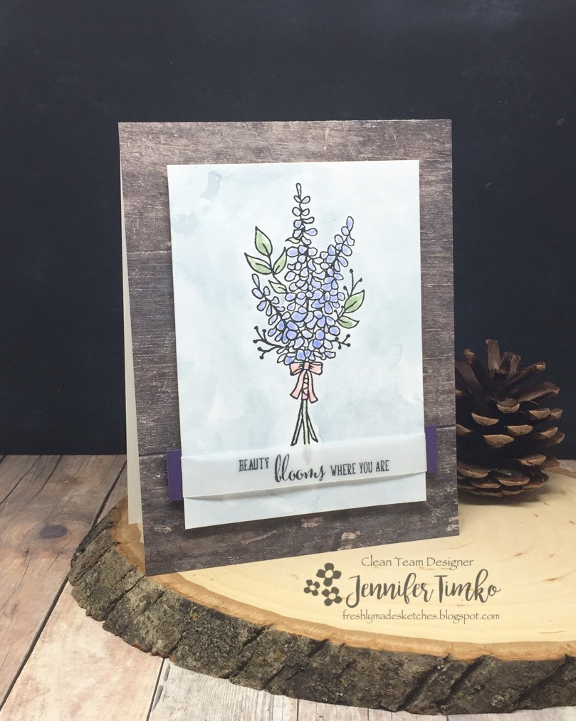
Yes, I finally did it. I took a break from making Christmas cards. Yes, I still have some to finish and all of them to address but I needed a brief reprieve. So I used this week’s Freshly Made Sketches sketch designed by the amazing Jen Mitchell to show off some new things.
Alright, alright, the sketch is actually a square. And I really love square cards! But I wanted to use this lavender image so badly and it just fit better on a rectangle. The flower is from the new Sale-a-bration set called Lots of Lavender and it will be available on January 3rd for free with a $50 US purchase. I actually heard it calling to me the second I saw it. I used some soft Tim Holtz Distress Inks on Bristol Smooth paper to color it and the background. Such a pretty one to work with and it hardly takes any time to color. I wanted to use this sentiment from the new Friendship’s Sweetest Thoughts Stamp Set (Occasions 2018, available on Jan 3rd too) but didn’t want to lose any of the image. Vellum to the rescue. I added a small piece of Elegant Eggplant behind the image panel to try to keep with the sketch. The whole panel is popped up on foam (I find this helps keep the panel smooth after watercoloring) and then put on a base from the Wood Textures DSP. These woodgrains are so pretty and can be used in so many ways.
I hope you like this pretty little look at spring! Now off I go, back to the Christmas card production line! Thanks so much for stopping in today. I’m back tomorrow with a fun card for Newton’s Nook. Until then, have a great day!
We use cookies on our website to give you the most relevant experience by remembering your preferences and repeat visits. By clicking “Accept”, you consent to the use of ALL the cookies.
This website uses cookies to improve your experience while you navigate through the website. Out of these, the cookies that are categorized as necessary are stored on your browser as they are essential for the working of basic functionalities of the website. We also use third-party cookies that help us analyze and understand how you use this website. These cookies will be stored in your browser only with your consent. You also have the option to opt-out of these cookies. But opting out of some of these cookies may affect your browsing experience.
Necessary cookies are absolutely essential for the website to function properly. This category only includes cookies that ensures basic functionalities and security features of the website. These cookies do not store any personal information.
Any cookies that may not be particularly necessary for the website to function and is used specifically to collect user personal data via analytics, ads, other embedded contents are termed as non-necessary cookies. It is mandatory to procure user consent prior to running these cookies on your website.


