Skip to content

Ghirardelli box

Ghirardelli box published on 4 Comments on Ghirardelli box

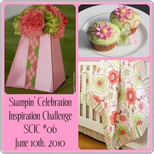
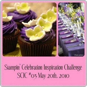
Happy Monday, everyone!  For those of you returning after the blog hop…welcome back!  I promised further details about the Ghirardelli candy box and here they are.  I realized that the black paper used in my original box was difficult to photograph so I made a different box for simplicity.  Since I was looking for lighter colors, it seemed like a great time to use the Stampin’ Celebration challenge for this week.  Just look at this beautiful picture:

It fits with my project perfectly!!  Now the original instructions for this box come from Splitcoaststampers and this tutorial.  I have altered some of the dimensions slightly and used my available tools instead.  You can click on any picture to see it larger.

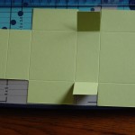
Start with a 4 1/4″ by 7 1/8″ piece of Certainly Celery paper.  Using my paper cutter, I scored 1″ away from both short sides.

Then I scored at 2″, 3″, 5″ and 6″, using my paper cutter again.

Now you have an end with a long rectangle and one with a short.  Use your paper cutter to remove the outer two sections on the short rectangle side.  The picture explains it better!

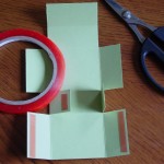
Cut the 1″ score lines and it will look like this:

Add Sticky Strip to the flaps as shown, attaching the little flaps first the then the rectangles so that the flaps folds towards the back.

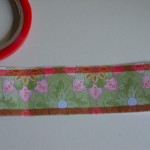
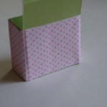
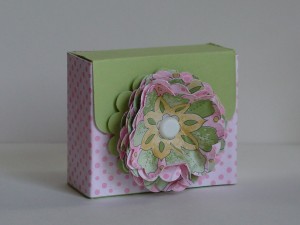
Once the box is together, I used the corner rounder punch on the flap.  Then use a 2″ by 7 1/2″ strip of DSP (I used Tea Party), attaching it around the box with Sticky Strip.

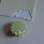
Where I used my Scallop Circle punch with the lady bug on my Blog Hop box, today I decided to use the puffy flower made with the Scallop Circle.  Corie over at Creations by Corie has a great tutorial on the flower.  I made sure that my bottom layer was not crumpled, however.  Using scraps from the Tea Party DSP, I made the flower and secured it together with a 5/16″ white Jumbo Brad.  Put dimensionals on the bottom of the Scallop Circle to attach it to the box (using those edge pieces is really useful here).

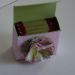
You can see that 4 pieces of the Ghirardelli chocolate fit in perfectly here.  Just tuck the little flaps on the packaging toward the back.

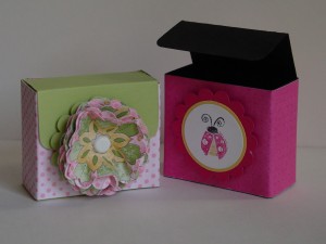
Here are the finished box and the two boxes together.

Thanks for dropping by!  Have fun with this little box…it is a cinch to put together!!

Jazzed up Flowers

Jazzed up Flowers published on No Comments on Jazzed up Flowers

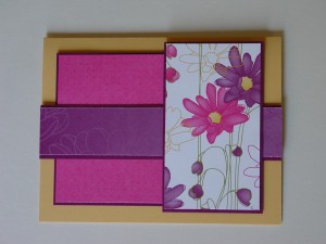
The challenge over at Stampin’ Royalty today is to “Jazz it up” and what a fun thing to do.  I knew I wanted to join in as soon as I saw the cool projects the Goddesses had made!  You start with a basic card or other project and then create a jazzed up version.  I didn’t have anything around that worked so I created a new basic card using the Splitcoast sketch challenge, SC283.  Here is my basic card:

I used the soon to be retiring DSP, Lovely Flowers (hostess) and cut out a flower panel and then used the other patterns to add to the layout.  I have really loved using this paper when I need a quick card that still has a wow factor!  At first I thought that I might even like the basic card better but then…

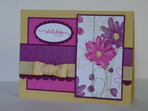
Well, I added some ribbon (SAB’09 Ret), cut out a flower and popped it up with a dimensional, and put on a sentiment (to match the scallop trim), and here is the jazzed up version:

Ok, I’m convinced…jazzing up was the right thing to do!  I just love this color combination and I am so happy that ALL of these colors will still be available as part of the Color Renovation.  While this DSP will be gone, I can tell you that I have seen a sneak peek of a DSP that has similar qualities.  The new catalog launch is just around the corner!!  Can’t wait!!

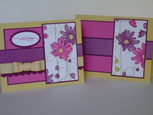
Thanks for stopping in!  Here is one more picture of the two cards together.  Have a great day!

Stamp:  Short & Sweet; Paper:  So Saffron, Rich Razzleberry, Lovely Flowers DSP; Ink:  Melon Mambo; Accessories:  Scallop Edge Punch, Scallop Oval Punch, Saffron Ribbon (Ret), Dimensionals

All products are Stampin’ Up!

Remembering…

Remembering… published on No Comments on Remembering…

As we approach this Memorial Day weekend, my title has two meanings.  First and most important, I want to thank those who serve and those who have served our country in the Armed Forces.  For the families who have made the ultimate sacrifice, there are no words of gratitude to express my family’s appreciation.  While I’m a big fan of cooking out and getting together with family (doing both this weekend), my heart is sad for those whose loved ones are deployed and whose parties will be missing that special somone this year.  My own husband is away this weekend but I am so lucky to have him home every couple of weeks or so.  I know that he is particularly happy to be able to bring needed supplies to the frontline troops who need them!!

My title, for the second part, is about saving special memories.  As we approach the end of Stampin’ Up’s celebration of National Scrapbooking Month, it seemed fitting to post a scrapbook page.  This one was created using My Digital Studio.  Talk to your demo about it because it is a super program with new “papers”, “stamps”, and “punches” becoming available all the time.  I have been working on a scrapbook project (traditional) and have been using some of the designer layouts from MDS as a springboard.  Such a time saver!! 

The layout today comes from Margaret Moody over at Pals Paper Arts, their challenge PPA44.  Go take a look at their wonderful projects using another super-usable sketch!  I also used the colors from Diva Coffee Break Designs, DCBD 178.  The patriotic colors matched my patriotic sentiment this morning!! 

The pictures were taken in the cargo compartment of a C-5 at last year’s Andrews AFB airshow.  Jacob just loves that big airplane!!

Thank you for stopping by.  Wishing you a safe and happy Memorial Day holiday!!

All products are Stampin’ Up!

Almost time to say goodbye…

Almost time to say goodbye… published on No Comments on Almost time to say goodbye…

to Almost Amethyst!  I must admit that I haven’t been a big user of this purple but the Tea Party DSP has given me a new appreciation for this shade.  Yesterday over at Stampin’ Celebration, they posted this fabulous inspiration:

Beautiful, isn’t it??!!  As previously stated, I don’t have a lot of purple but Tea Party seemed to fit the bill nicely with the Saffron and Celery that are also in the paper.  I saw the newest sketch from the OCC Sketch Blog, their OCCSC16.  Love this one!! 

The big flowers on the DSP and the sketch seemed to be made for each other.  I cut out a couple of the flowers and pulled out my lovely Celery satin ribbon.  The scallop border will be available again soon (I got it FREE during Sale-a-bration!!) and I really like the lacy look it gives.  Here is the end result:

If your computer is like mine, the Amethyst looks a bit blue but I promise it really is purple!!  Something about the afternoon lighting in my house, I guess.  All the work on this card was really done by the DSP.  I put a matching strip at the bottom of the inside and cut out another flower to put in there.  Thanks for taking a look today (and don’t forget to give these challenges a try!).  Have a great weekend!

Stamp:  Short & Sweet; Paper:  Tea Party DSP, So Saffron, Certainly Celery; Ink:  Almost Amethyst; Accessories:  Celery Satin Ribbon, Scallop Border Punch, Dimensionals

All products are Stampin’ Up!

Masculine Sage?

Masculine Sage? published on 7 Comments on Masculine Sage?

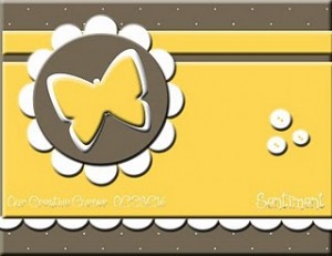
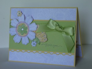
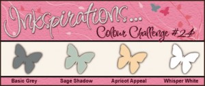
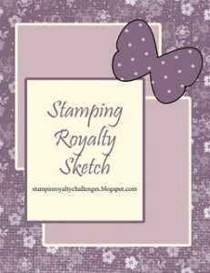
I tried to combine a few challenges today and the first was from Our Creative Corner.  The challenge was to make a masculine birthday card.  I also used the latest sketch challenge from Stampin’ Royalty, their challenge #20.  Finally, I used the colors from Makeesha over at Inkspirations.  Take a look at the colors and the sketch!

The colors pretty much “required” me to use the Nouveau Chic DSP.  Now that Sage is retiring, I am using up my stock. 

Without further discussion, here is my card (yes, the image panel does look crooked…I fixed it but didn’t have time to take a new picture):

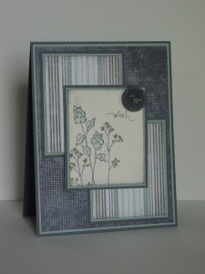
I started with Oh, So Lovely (Ret) and tried to make it more masculine.  The paper certainly did the job but I’m not so sure the image is “manly”.  Oh well, challenges are jumping off points and I gave it the college try!  I have really enjoyed this DSP…just think, when I first ordered it I thought it would be “out of the box” for me!  I continue to find that the DSP’s from Stampin’ Up always exceed any expectation that I have!!  I did a little sponging  but otherwise the card is pretty straightforward.  I don’t have a particular need for this card but it is always so nice to have some in the “stash” ready to go!  Thanks for stopping by.  Have a great day!

Stamps:  Oh, So Lovely (ret), Short & Sweet; Paper:  Nouveau Chic DSP, Sage Shadow, Basic Gray, Very Vanilla; Ink:  Sage Shadow, Basic Gray, Apricot Appeal, Going Gray; Accessories:  Gray Corduroy button, thread (dyed Sage with the Marker), Blender Pen, Sponges

All products are Stampin’ Up!

A new challenge and an old favorite

A new challenge and an old favorite published on No Comments on A new challenge and an old favorite

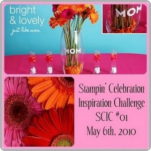
I was looking for inspiration for a thank you card today and I found it…times two!!  First of all, I found a brand spankin’ new challenge from Stampin’ Celebration!  You’ll recognize some of the names and faces, and you’ll be inspired by the fun colors.  Just look at this picture:

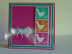
Conveniently enough, there is a compatible challenge over at Pals Paper Arts (PPA41).  For some reason I can’t link the picture so go take a look!  I used the colors from Stampin’ Celebration and the cool birds from the Pals to get my card moving along.  After I decided on the birds from Of the Earth, I played around with variations of using those squares.  As I started putting the card together, I realized that I had settled on a version of the Pals sketch from a few weeks ago (PPA38).  Well, a good sketch is one you can come back to over and over!!  I used the Melon Mambo DSP from the level 3 hostess set Lovely Flowers.  Can I tell you how happy I am that Melon Mambo is staying on as a new core color??!!  I’m not much of a pink girl but this pink really works for me! 

I’m using this as a thank you card for a friend.  I hope she like the happy colors, too!  Thanks for stopping by and I hope to see you again soon!

Stamp:  Of the Earth (hostess); Paper:  Lovely Flowers DSP (hostess), Taken with Teal, Melon Mambo, Whisper White; Ink:  Melon Mambo, Taken with Teal, Pumkin Pie; Accessories:  White Organza ribbon, Playground buttons, thread

All products are Stampin’ Up!

Ribbon of Hope in Pink and Cocoa

Ribbon of Hope in Pink and Cocoa published on No Comments on Ribbon of Hope in Pink and Cocoa

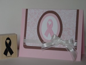
My card for today has a more CAS (Clean and Simple) look than some I have done lately.  A wonderful woman who works at my older son’s school is putting together a “Pink Ribbon” donation basket to auction off later this year.  Knowing how time can get away from me, I figured I better get to work on some cards for her basket.  When I purchased this Ribbon of Hope stamp, I knew it would be something I would want to have on hand.  This is my first card with it.  I must confess that this isn’t my favorite card but I think that is because a card for such a great cause should be amazing.  When I saw the Our Creative Corner Sketch for this week, it seemed like the perfect way to focus on the ribbon stamp.  I pulled out some retired Pink Pirouette DSP and paired it with Close to Cocoa.  Out came the Big Shot and popped out some ovals, tied on the beautiful Organza ribbon and here it is:

OCCSC12 - Pink Ribbon Donation 1


Hopefully I’ll be back to posting a bit more often.  Thanks for stopping by today.  Let me know what you think!

Vogue, in a Cameo performance

Vogue, in a Cameo performance published on 12 Comments on Vogue, in a Cameo performance

The wonderful team at Diva Coffee Break Designs chose me as their Featured Artist for this challenge.  Thank you so much for the complement!! 

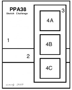
Happy weekend, everyone!  I hope you are enjoying spring as much as I am.  My boys are playing soccer and today is going to be a perfect day to be a soccer mom.  Before I’m off to the excitement, I wanted to post this card I made yesterday.  Margaret Moody over at Pals Paper Arts has come up with yet another fantastic layout. 

PPA38

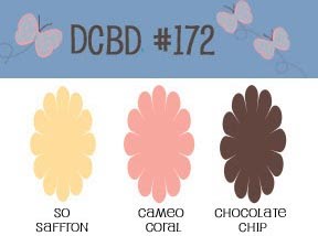
I knew this would be the perfect place to pull out my new Presto Patterns DSP and give you a sneak peek.  This paper is white with embossed patterns.  You get to customize it for whatever colors you want!!  How much do you love that??!!  The team over at Diva Coffee Break Designs came up with a beautiful color challenge this week and I wanted to give it a try.

DCBD172


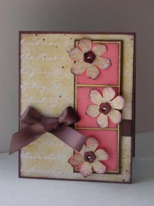
Cameo Coral is one of the retiring colors in this year’s Color Renovation so I’m working on using up my extra paper.  I started with a base of the Presto Pattern DSP and sponged it with So Saffron.  I then sponged the edges in Chocolate Chip and, as a final touch, sprayed on a bit of the Log Cabin Smooch Spritz (also new to the Summer Mini).  I thought that Rock-n-Roll would be the perfect technique to use on the Vintage Vogue flowers.  First I inked up the flower in So Saffron, then I did a “heavy” roll in the Cameo Coral and finally a “light” roll in the Chocolate Chip.  I stamped all three flowers and Spritzed them, too.  I cut them out and stitched on the buttons from Button Latte.  After a bit more sponging on the flowers and the Cameo Coral squares, I put on the Chocolate Satin Ribbon.  These colors are really pretty together and I love the effect of the Spritz. 

PPA38, DCBD172 - Presto Vogue


I can’t wait to hear what you think about the new products!  Hope you have a great weekend!

Stamp:  Vintage Vogue (Occasions Mini); Paper:  Presto Patterns DSP, Chocolate Chip, So Saffron, Cameo Coral; Ink:  So Saffron, Cameo Coral, Chocolate Chip; Accessories:  Button Latte, Log Cabin Smooch Spritz, Chocolate Satin Ribbon, Sponges, Thread, Dimensional

All products are Stampin’ Up!

Elements with a Smooch

Elements with a Smooch published on No Comments on Elements with a Smooch

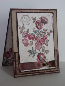
Have you ever had a card that was almost right?  I mean, you like it but it just needs a little something.  Well, that is how I felt about my last post.  I really like the card but it was just missing that special something.  I am teaching a Watercolor 101 class this week and really wanted to use this preview of the new set Elements of Style as an example.  So, back to the drawing (or coloring) board I went.  I reworked the colors and used Kraft (soon to become Crumb Cake) and Chocolate Chip.  Really, who doesn’t like cake with chocolate chips, after all??!!  I brightened up the colors a little bit to match the richer feel of the Chocolate Chip.  As a final touch, after distressing and sponging the edges, I used my new Smooch Spritz that will be available in the new Summer Mini.  This one is Log Cabin and has a bronze look to it.  I thought the satin ribbon with the linen thread finished this card off right.  It is, of course, another take on the Our Creative Corner Sketch 10, except this time I stayed with the sketch orientation.

Watercolor 101 - Elements and Smooch


Thanks for dropping by to see the new version!  You comments are always appreciated. 

Stamp:  Elements of Style (Summer Mini); Paper:  Kraft, Chocolate Chip, Watercolor; Ink:  StazOn, Pretty in Pink, Rose Red, Not Quite Navy, Sahara Sand, Chocolate Chip; Accessories:  Log Cabin Smooch Spritz, Chocolate Satin Ribbon, Linen Thread, Sponges, Dimensionals, Blender Pen

The return of River Rock

The return of River Rock published on No Comments on The return of River Rock

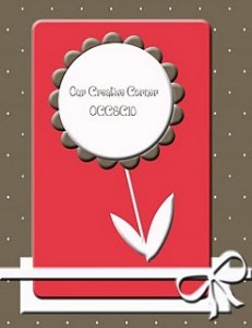
Well, if you haven’t heard by now, let me be the one to share the great news!!  Stampin’ Up is having a Color Revolution and there is quite a shake-up going on.  Some of my favorite old In Colors are returning, namely RIVER ROCK!!!  Sorry to yell, but I am really, really, really happy about that!  I have resisted using River Rock with my Soft Suede (even though they are amazing together) because I had to hoard my River Rock.  Well, no more!  I can use it with reckless abandon knowing I can get more.  Yea!  I just received my pre-order for the upcoming Summer Mini (be on the lookout, it starts on May 1st).  The first set that simply had to be ordered was Elements of Style.  I love it!!  There were a couple of challenges that I wanted to try today and the first is the Pals Paper Arts challenge 37, Flowers.  Well, Elements of Style is all about flowers so that was easy enough!  Now to the layout.  I headed on over to the Our Creative Corner Sketch blog for their OCCSC10.

OCCSC10 - Designed by Jennifer Meyer


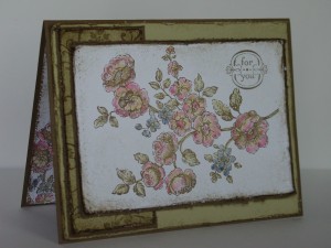
This seemed to have plenty of room for the big flower stamp!  I (sadly) don’t have any River Rock ribbon left, so I just did a little piercing in place of the ribbon.  I stamped the image with Soft Suede ink on Whisper White and colored in the flowers (using a blender pen) with So Saffron, Pretty in Pink, Rose Red, Night of Navy, and River Rock.  These are all part of the core colors that are remaining.  I distressed the paper and sponged with Soft Suede.  The small rectangle was created with the swirl and sponging with Soft Suede.  I popped the image panel up on dimensionals then created a matching inside.  I did find that flipping the layout worked better for me (it didn’t start that way though!).

OCCSC10, PPA37 - Elemental River Rock


I hope you like this as much as I do.  Thanks for stopping by!

Stamp:  Elements of Style (Summer Mini); Paper:  Soft Suede, River Rock, Whisper White; Ink:  Pretty in Pink, So Saffron, Rose Red, Night of Navy, River Rock, Soft Suede; Accessories:  Piercing tool, Mat Pack, Dimensionals

All products are Stampin’ Up!

Primary Sidebar