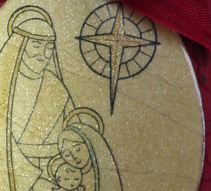
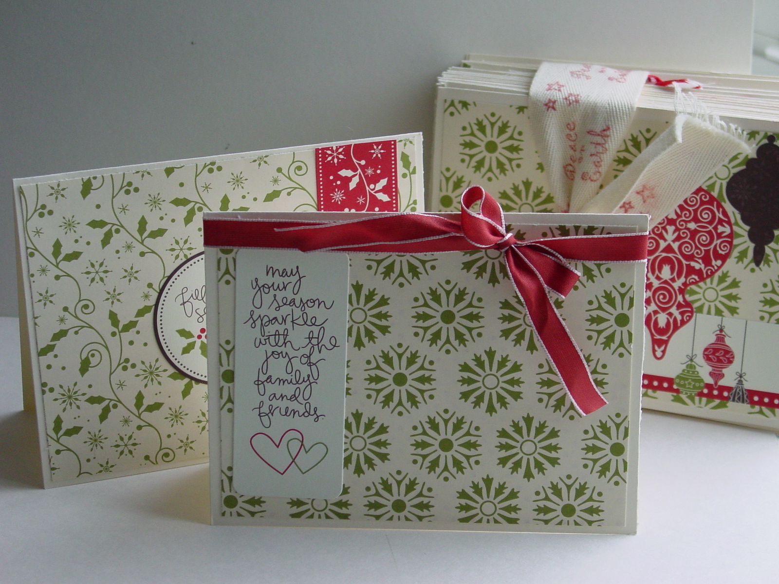
I haven’t been posting this week because I have been working on some projects for a Blog Hop coming up this weekend. I am participating in the Stampin’ Addicts Hop this weekend featuring products from Stampin’ Up’s new Holiday Mini. My set is Rejoicing in Christmas and I have had so much fun it. Here is a sneak peek:
Lots of sparkle, yes indeed!! Make sure you drop back by this weekend.
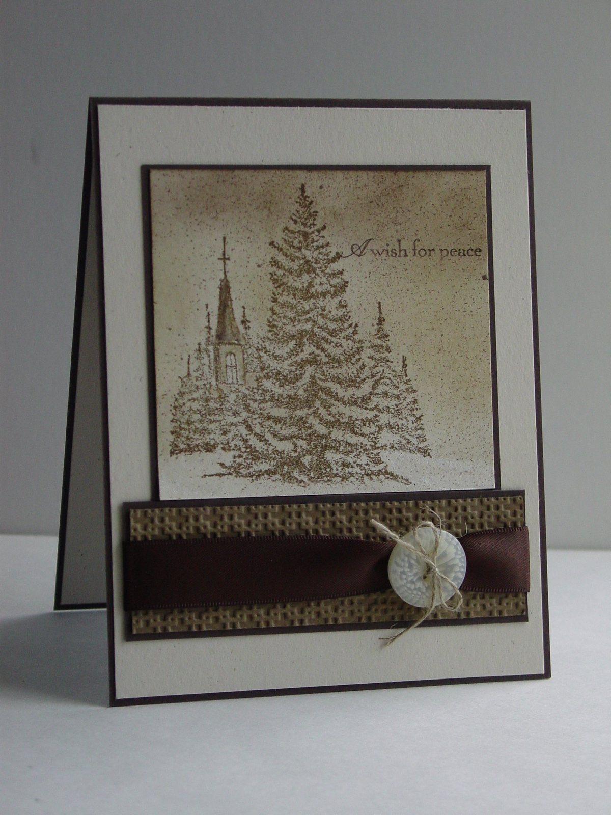
Now for today’s post I have made another Christmas card using a beautiful set called A Wish for Peace. I used the Sketch Challenge 295 from Splitcoaststampers and the Stampin’ Royalty challenge #34, Monochromatic Neutrals. I chose brown as my neutral (big surprise) and started with Naturals Ivory paper. I stamped the church image and then sponged on Sahara Sand, Soft Suede and Early Espresso ink for the sky. Hard to see in the picture but I used Champagne Mist Shimmer Paint for the church and Frost White Shimmer Paint for the ground. Finally, I used some Smooch Spritz on the whole image. Pulled out the Square Lattice embossing folder (well, that would assume that it had been put away, but you understand), tied on the button with Linen Thread and attached the Espresso Satin Ribbon. Here is the final result:
This card is going right into the stash for my Operation Write Home Challenge. It came together quickly so I’ll probably make a few more just like it!
That’s it for today. Make sure to stop back by on Friday (or during the weekend!). Have a great Wednesday!
Stamp: A Wish For Peace; Paper: Naturals Ivory, Soft Suede, Early Espresso; Ink: Soft Suede, Early Espresso, Sahara Sand; Accessories: Big Shot, Square Lattice Impressions Folder, Shimmer Paints, Smooch Spritz, Espresso Satin Ribbon, Linen Thread, Neutrals Designer Buttons
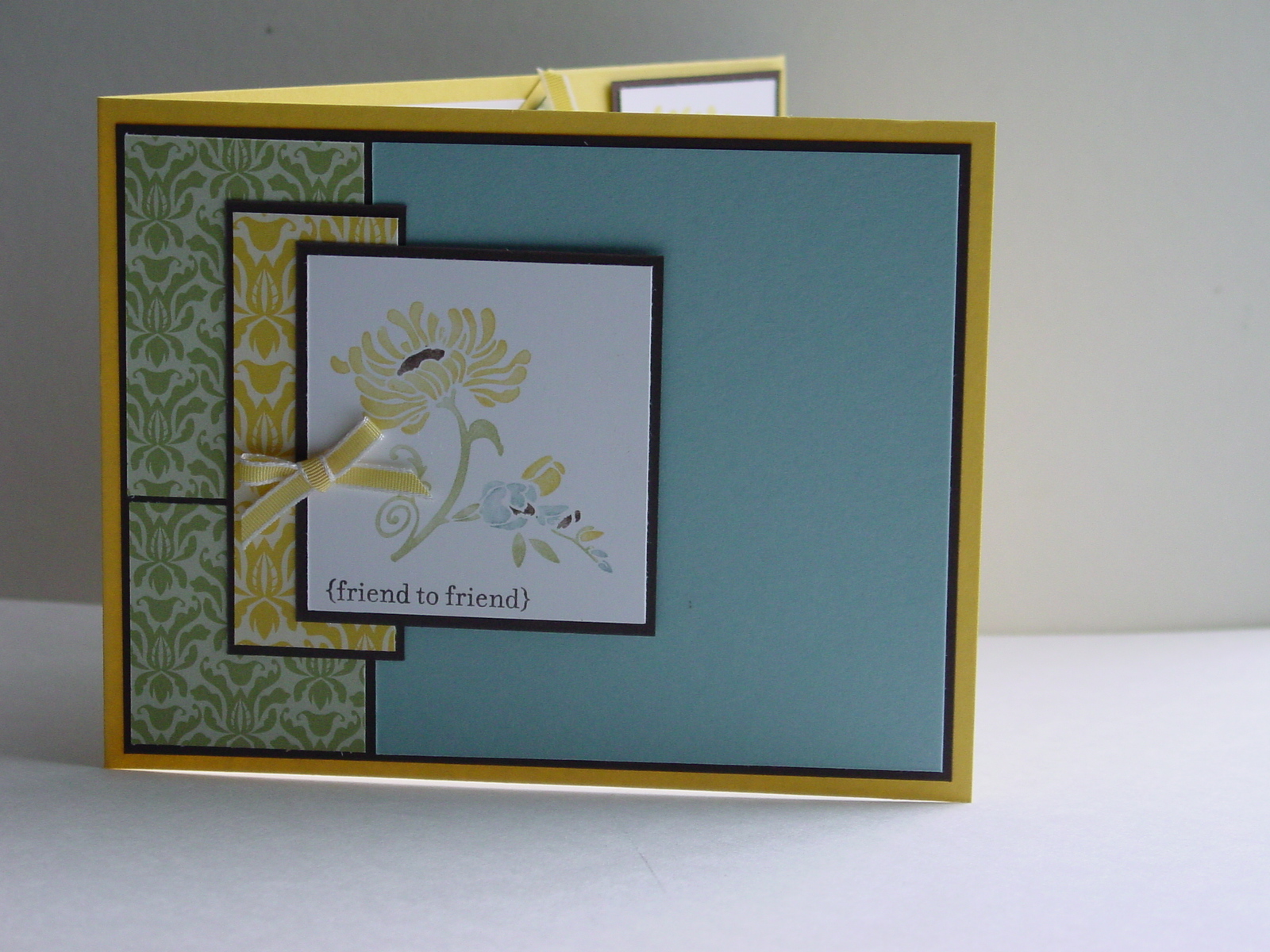
The wonderful team over at Pals Paper Arts have redesigned their website and it looks fantastic. Their challenge this week is “Day into Evening”. First you make a basic card and then you dress it up. Fun! My idea for the dress up was to add a little something to the card…a corner bookmark. For the basic card, I found a cool layout over at Unscripted Sketches (their sketch #67). I missed the deadline but I thought this was worth trying. I pulled out my Friends Never Fade set again and the coordinating Greehouse Gala DSP. Here is the result:
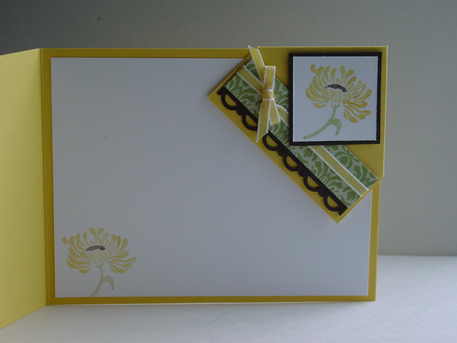
The card itself is pretty basic and would be lovely to send all by itself. But to “dress it up” a bit, I created a surprise when you open it. I found a tutorial over at Splitcoaststampers a while ago for these corner bookmarks and knew that I wanted to try them for my club. I found that the 4″x4″ bookmark they show was a bit too big, so I modified it to 3″ square. After playing with the decoration of the bookmark, my square turned into a 3″x2 5/8″ rectangle. The Espresso piece is 2 7/8″ long which allowed for the perfect scallop with my Scallop Trim Border Punch and the Espresso square (diamond) is 1 1/2″ square. I secured everything on the bookmark with Sticky Strip to make really sure that it stays together. Here is the dressed up inside of the card:
I used this wonderful 1/8″ Taffeta again and it is just the right size for a little addition like this. I’m not sure who will get this card yet but it is nice to have a card with a little present, all in one! In keeping with my Operation Write Home Challenge, I made a second card for my ever growing box of cards to send to our heroes overseas. Thanks for stopping in today. Hope you have a great weekend!
Stamps: Friends Never Fade, Teeny Tiny Wishes; Paper: Daffodil Delight, Baja Breeze, Early Espresso, Greenhouse Gala DSP, Whisper White; Ink: Daffodil Delight, Baja Breeze, Pear Pizzazz, Early Espresso; Accessories: Scallop Trim Border Punch, 1/8″ Daffodil Taffeta, Sticky Strip, Mini Glue Dots, Dimensionals
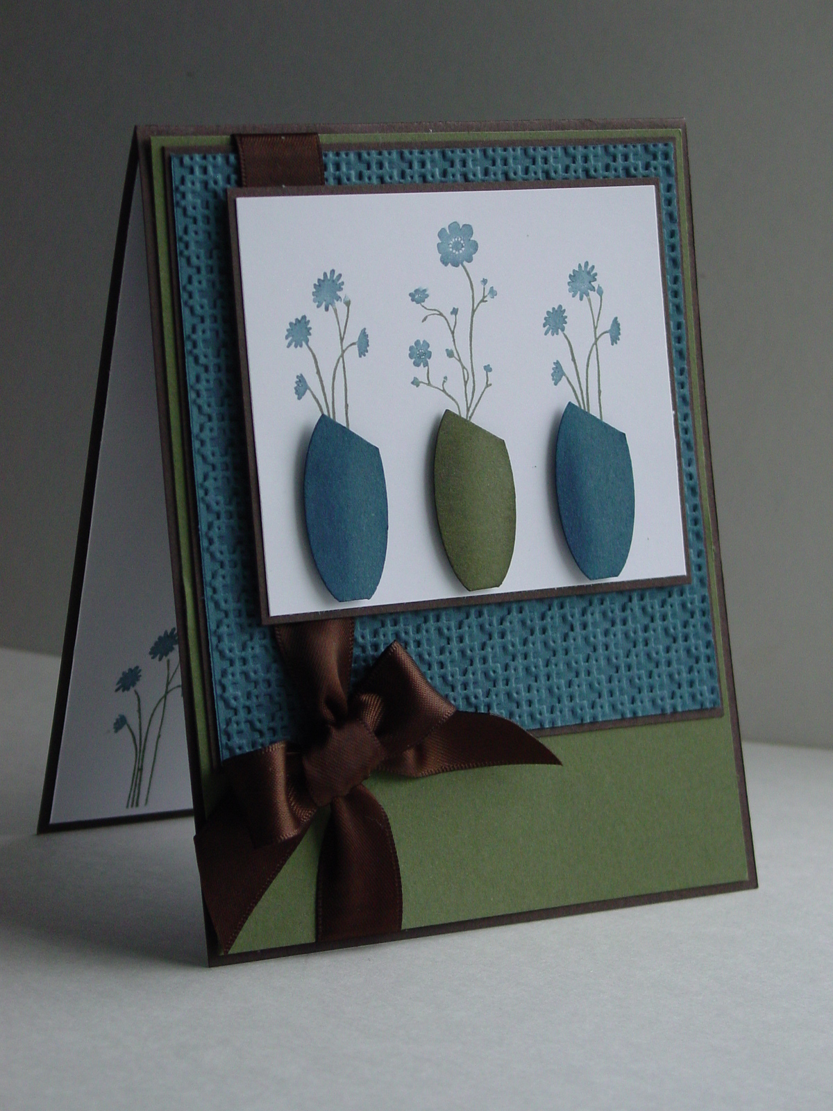
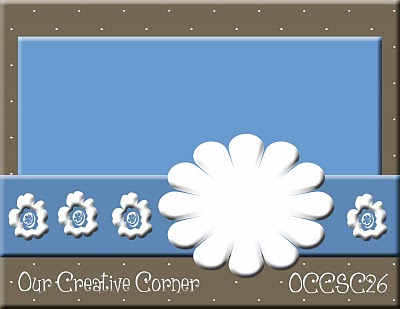
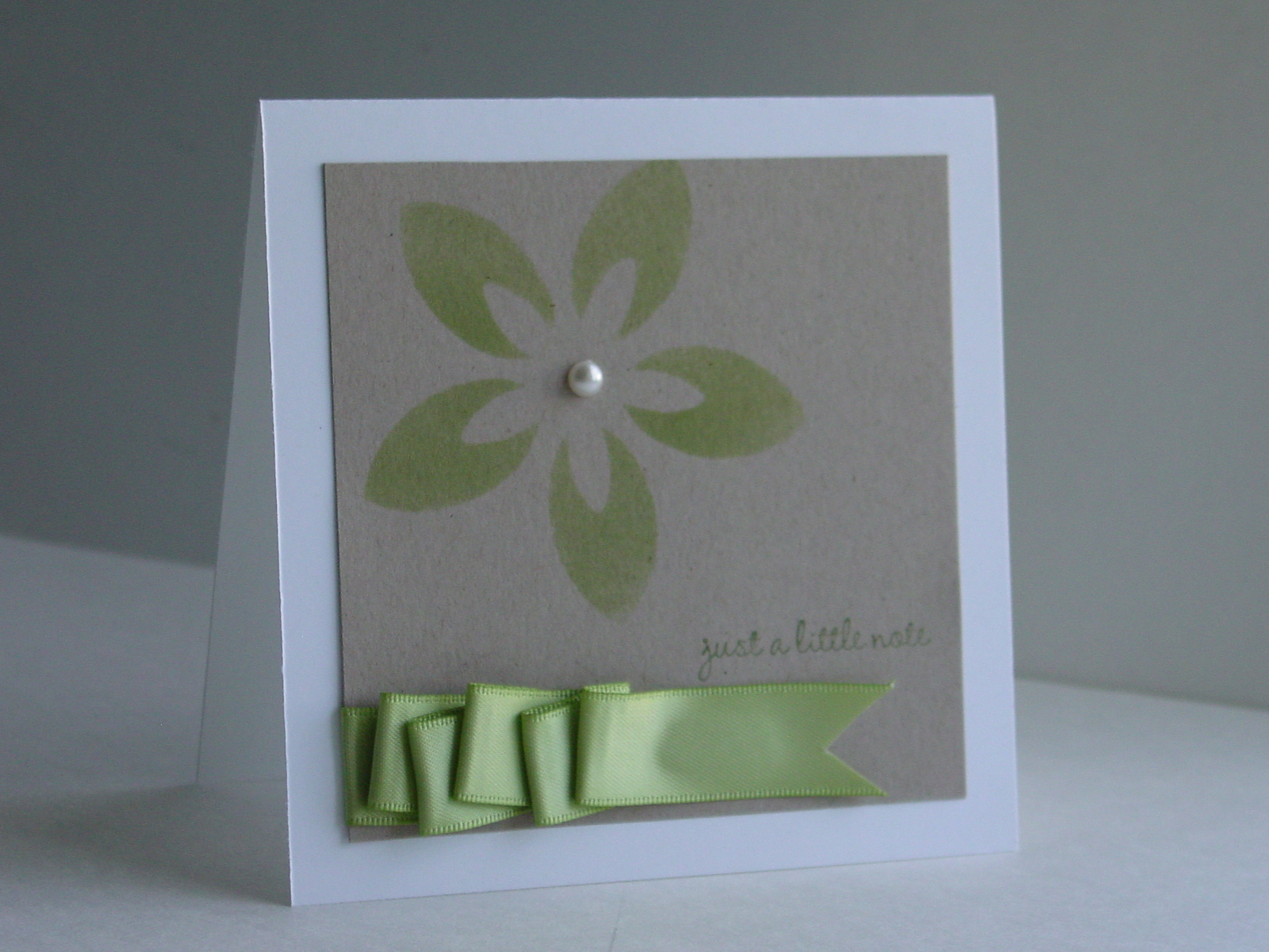
This week I am meeting with my clubs for the first time this year and what better way to celebrate than use a new hostess set??!! I love the new Silhouette Sentiments and have wanted to try punch vases for a while. Michelle Zindorf is an extremely talented Stampin’ Up demonstrator who kindly shares many tutorials. I used her Punched Vases Tutorial as inspiration for my vases. I also loved the OCC Sketch 28 and used that layout. I am so happy with the result!
As you can see, I used the sponging technique to give a shadow to the vases and then popped them up on dimensionals. My Square Lattice Embossing Folder came out again…told you that you would see it alot! The best part is that this is pretty easy to make and yet the details make it special.
Now, I had an extra surpise today. One of my new club members, Nancy, brought me a lovely bundle of cards for my Operation Write Home challenge. Just take a look at these!
How can I thank her enough for all these lovely cards?! Aren’t they pretty? She has certainly put me well on my way towards filling up a box for the OWH project.
Thanks for stopping by today. Hope you have a great rest of your week!
Stamp: Silhouette Sentiments (hostess level 1); Paper: Always Artichoke, Not Quite Navy, Early Espresso, Whisper White; Ink: Always Artichoke, Not Quite Navy; Accessories: Small Oval Punch, Sponges, Espresso Satin Ribbon, Dimensionals
Oh, my little friend Dasher is back!!! He went into a rest period after his big trip with Santa last year but it was time to pull him out again. I seriously LOVE this reindeer!! Now, rest assured, he is not back in this August heat without a really good reason…actually two reasons. First, I have issued a Christmas card challenge to my steady group of stampers. No excuses, no procrastinating, now is the time to start with the Christmas cards. I asked them to figure out how many people they estimate to be on their nice list (you know, deserving of your finest card making nice). Take that number and divide it by four, then make that many cards a month between now and November. No muss, no fuss, and your cards are done before the true holiday panic sets in.
As of today I am putting out another challenge, or at least drive, request. In one month, we will celebrate Patriot Day (Sep. 11th). As a United Airlines pilot and a former Air Force pilot, I find this day particularly sad. I would like, instead, to make it a day of thanks for those serving in our Armed Forces. If you are not familiar with Operation Write Home, click on over there right now and then come back for my challenge.
I am looking to join in with them to celebrate their Birthday Bash. I’m asking my stampers to donate as many cards as possible to the cause (some Christmas and some all occasion) and I will end my month with an Open House on Sep. 10th. If you live in Northern VA and would like to donate cards, please let me know and I will get you the specifics. Operation Write Home does have some pretty specific rules about glitter (NONE) for the safety of our troops, so please nothing sparkly that can rub off in any way.
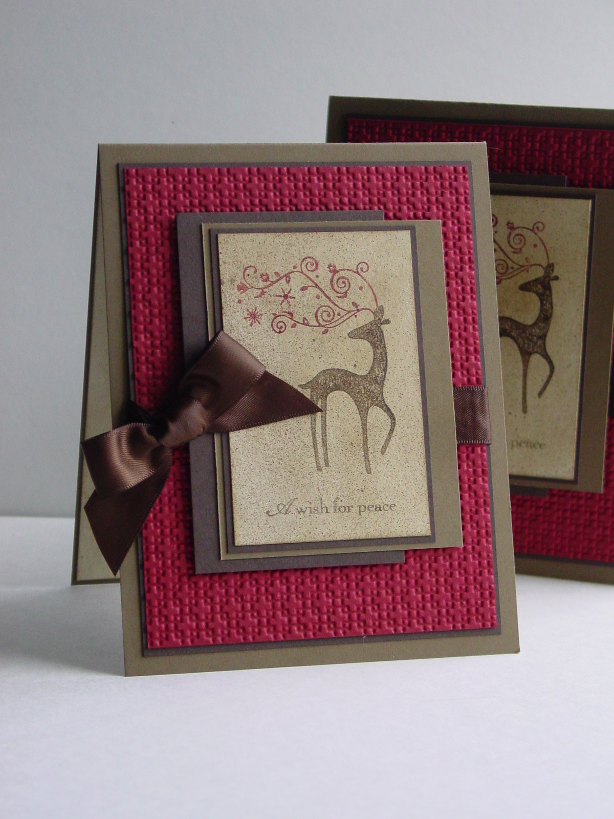
Ok, so now that I have TWO card challenges in place, I needed to get going! I found the sketch over at Splitcoast today (SC293) really helpful to get me moving. Additionally, I wanted to add some embossing for the Our Creative Corner challenge – It’s Embossable. Naturally I pulled out my new Square Lattice embossing folder…yea! As I stated above, there is no glitter allowed on the OWH cards but a little shimmer is always a good thing. I started with a Naturals Ivory panel, sponged it with Soft Suede and then applied Champagne Shimmer Paint with a sponge dauber. A little mist of Smooch Spritz and I was ready to stamp on Dasher (p. 20 IBC) and the words from A Wish for Peace (p.38 IBC). I inked up “A wish for peace” because it seems particularly appropriate for my OWH kick-off. The Cherry Cobbler embossed panel really added the dimension I wanted for this and the Early Espresso satin ribbon finished off the card. I just wish you could see the shimmer on little Dasher!
Now, you will notice that there are two cards. Part of my OWH request was that every time a card gets stamped, just make two. Yep, design once, stamp twice!! Easy! Yes, I know where is he??!!!! Wait no more…
You can click on the photo to see it bigger if you’d like. Now aren’t you glad to see this fellow again?? Both of these are going into my OWH stack and I will take a picture on Sep. 11th with the final result.
I hope that this motivates you to donate some cards too. There are shipping details and lots of card ideas at the OWH site. Thanks for dropping in today. Happy stamping!!
Stamps: A Wish for Peace, Dasher; Paper: Cherry Cobbler, Soft Suede, Early Espresso, Naturals Ivory; Ink: Cherry Cobbler, Soft Suede, Early Espresso; Accessories: Champagne Shimmer Paint, Big Shot, Square Lattice embossing folder, Espresso Satin Ribbon, Dimensionals
Thanks to the team over at Pals Paper Arts for making my card an Artist Pick this week! I am so thrilled!
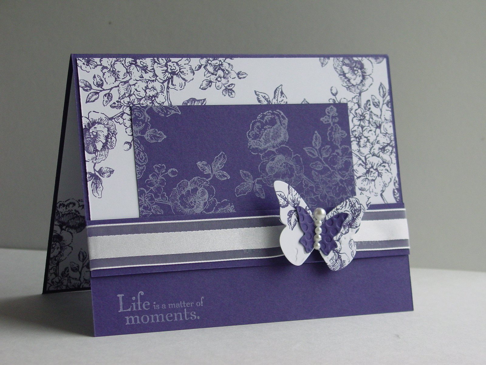
I have to admit that the mojo went missing this morning. Maybe it has to do with the fact that my kids were running around and asking all kinds of questions but, hey…that’s what they are supposed to do, right? I tried watercoloring my Elements of Style, embossing the watercolored images, re-watercoloring, sponging…you get the picture. Suffice it to say, there was no image worth saving. That is when I simplified. If watercoloring wasn’t going to work today, it was time to skip it! The big flower stem in the set looks like toile to me and then it hit me. Pals Paper Arts has a monochromatic challenge and the color is PURPLE. Ummm, ok. Well, I have to admit that purple is not a go to color for me. The toile idea and the purple did seem to work though. With all my reservations about purple, the new Concord Crush really is an appealing color. It is so rich and almost dark enough to have a neutrals feel. The OCC Sketch Blog has a great new layout this morning, too:
After the first failures, I was ready to try it again! As soon as I stamped that flower in the Concord Crush, I knew this was going to work! I stamped it on the Concord paper with Craft White and then popped out some butterflies with my Beautiful Wings embosslit. Seems my Big Shot has been getting more of a workout lately!
With the elegance of the toile look, I added some White Organza ribbon. Finally, I wanted to dress up the butterfly so I got the new Basic Pearl Jewels out. These little things are so very cool! Pull them off, stick them on, instant elegance!! Here is the final result:
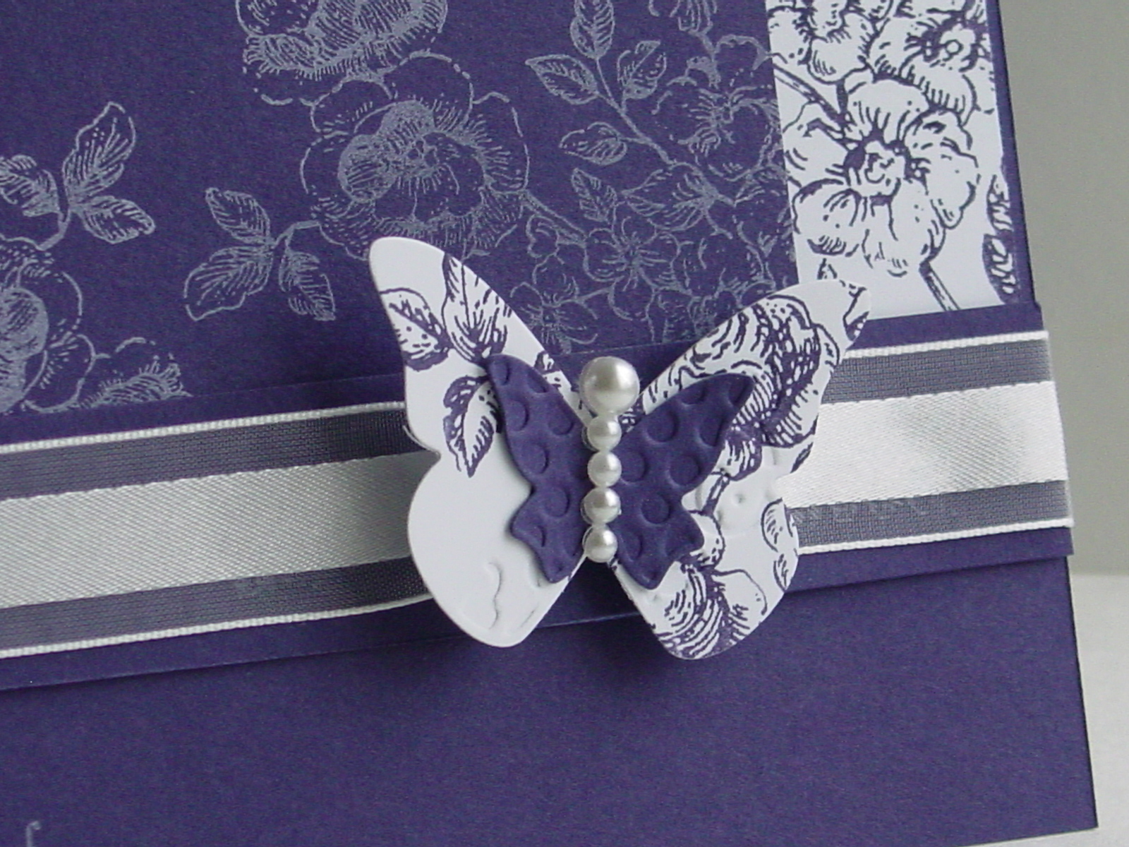
And here is a close-up of the butterfly:
Details on the butterfly: I attached the Concord little butterfly to the toile big one with a little Dotto along the midde. I cinched the ribbon with some thread and then tied the butterfly onto the ribbon. My original intention was to leave thread antennae so I had a knot at the top of the butterfly. Once I started putting on the pearls, I realized that the thread wasn’t right and trimmed it down. I simply attached the big pearl to the knot…makes it look like I planned it but lucky is better than good sometimes!
The best part about this card is that I have a dear friend who loves purple and has a “significant” birthday coming up. Shhh, don’t tell her that this is her card!! Thanks so much for stopping in today!
Stamp: Elements of Style; Paper: Concord Crush, Whisper White; Ink: Concord Crush, White Craft; Accessories: Big Shot, Beautiful Wings Embosslit, White Organza Ribbon, Basic Pearl Jewels
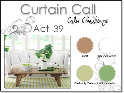
Stenciling is showing up everywhere and Stampin’ Up has started making some of the most beautiful products for this technique. Sadly, my first order in the new catalog was all about new colors and new stamps (don’t worry, though, I’m certain this will be remedied in future orders!). The challenge over at Stampin’ Royalty (SR#28) takes advantage of this trend and asks for projects using stencils. I sacrificed one of my Fresh Cut Notes (p. 171) so that I could play along. The best part is that I can continue to use this one note over and over for many projects so it was a worthy sacrifice! I saw the CAS76 layout challenge over at Splitcoast and knew this was the way to go. By definition, stenciling gives the feel of layers without actually having to have them and I wanted to keep the laying to a minimum. Stacey’s Curtain Call Act 39 used the most lovely combination this week…take a look:
This card came together pretty quickly. I sponged over the flower with Certainly Celery ink onto the Crumb Cake (Kraft) paper. The center was a bit too bare so I popped on one of my new Basic Pearl Jewels. You can expect to be seeing ALOT of these on my card, by the way! I added the sentiment with Wild Wasabi ink and was left with the ribbon to do. I saw this cool tutorial from Makeesha on how to scrunch the ribbon using Sticky Strip. Well, it works great and adds so much texture! Here is the final result:
I must say that I wasn’t totally thrilled with the final result at first (although I love each element), but it is growing on me. Definitely more Clean and Simple than I have been doing lately. Let me know what you think. It is a bit out of my box but that is what challenges are so good at doing for us stampers! Hope you have a great day…thanks for stopping in!
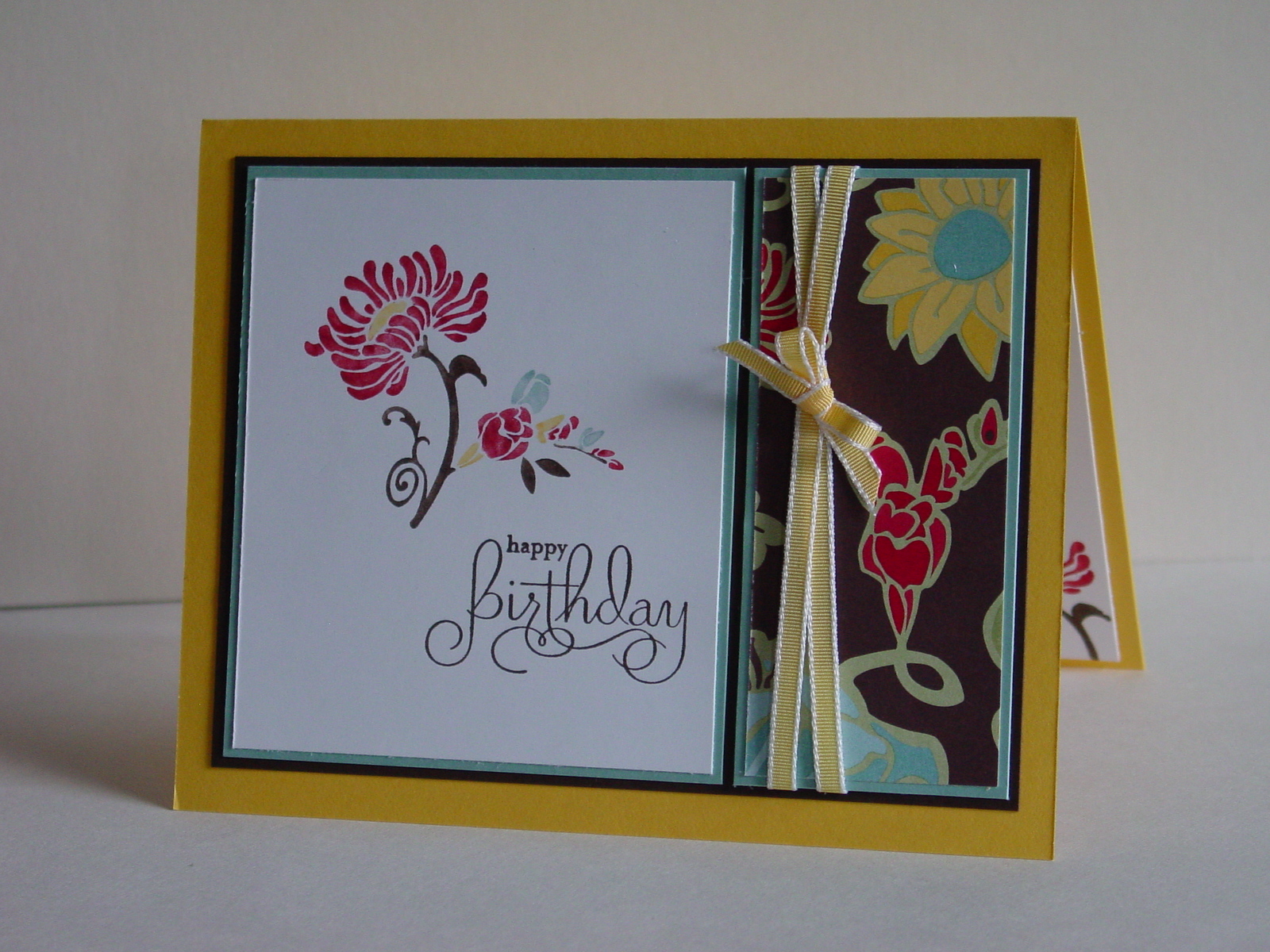
My fabulous upline, Brandi, has a birthday coming up! Yea! Of course I needed to make a card using my latest products. I really wanted to make another card using Friends Never Fade and Greenhouse Gala DSP, but this time using a darker color palette. I found this great layout over at the OCC Sketch Blog:
I knew it was just right! For the small rectangle, I used a piece of the DSP that has Chocolate Chip as the main color. I wanted the darker piece so that I could use my cool new 1/8″ Daffodil Delight Taffeta Ribbon. It is really fun ribbon! I have to say that I have been leaning towards wider and wider ribbon the longer I have stamped so this was kind of a gamble (or so I thought) to buy. No fear, it is awesome to work with and, frankly, works in places that wide ribbon won’t. I colored directly on the flower stamp with Daffodil Delight, Baja Breeze, Real Red and Early Espresso markers. The words are from the Well Scripted set (ret). Here is the result:
The little bow was inspired by Kerin Sylvester‘s card for this week’s Stampin’ 411 sketch challenge. I used Early Espresso paper for the layering and it really goes beautifully with this DSP! I find it funny how the addition of some new colors can change how I feel about the existing ones. Real Red has generally not been my “go-to” red but somehow it feels updated when added to the Daffodil, Baja Breeze and Espresso.
Brandi, I hope you have a wonderful birthday! Thanks so much for being my upline and inspiring me to become a Stampin’ Up demonstrator!!
Stamps: Friends Never Fade, Well Scripted; Paper: Greenhouse Gala DSP, Daffodil Delight, Baja Breeze, Early Espresso; Ink: Real Red, Daffodil Delight, Baja Breeze, Early Espresso; Accessories: 1/8″ Daffodil Taffeta Ribbon
As I posted my baby cards last weekend, I told you that I had been working on a big (for me) project. Well, the secret is out and I can share now. A dear friend of mine is pregnant with twins and I was part of a group that made her matching scrapbooks. Her twins are actually one boy and one girl so the scrapbook use the same layouts (bacically) but with different papers. You may or may not know that I am not much of a scrapbooker. I have used My Digital Studio with some wonderful success but have never made entire traditional scrapbooks. Together with two of my friends, Christine and Simone, we committed to making these books. Let’s face it, the mom of twins isn’t going to have time to scrapbook for a while!!
We started by getting two of the adorable Olive Polka Dot 6″x6″ albums from the Summer Mini. Then, we chose the Petal Party and Happy B-day Simply Scrappin’ Kits as the base for each. It is amazing how stampers with totally different styles can create a unified project just by using the same papers!! The best part is that we had lots of paper and self-adhesives left over so that the mom can add finishing touches once the pictures are in.
To add to the fun, there is a challenge over at Stampin’ Royalty this week that is about “Seeing Doubles” – SR#26. It seemed like the perfect time to post some of these great pages.
To start, I have the two cover pages (created by me):
I really don’t have room for all the pages but I am going to show you a couple of my favorites! Take a look at the fabulous artwork on the “first tooth” pages created by Simone (on the left, each pairing). Her dear husband drew it for her…wonderful!
And the following pages were created by Christine as “Grandparent” pages:
We tried to leave lots of room for journaling and embellishment after the pictures are put in. We were so thrilled with the final result and, more importantly, the mom-to-be seemed to love it! So glad you stopped by and I hope to see you again soon!
It is official…I have survived the first week of summer break and I’m still able to be awake after the kids go to bed. We have had a lot going on and I have been sadly lacking in my posts. I’m definitely having to adjust to the new schedule!! That said, I have been busily creating but I can’t post it quite yet. I can tell you that I was working with some friends on a special gift for a special someone who is having a baby shower this weekend. I don’t want to spoil any surprises so I will say no more!
Because I was doing the “other” project, I just got around to cards yesterday. Now, this shower is for twins…how fun is that??!! Well, maybe not for Mommy late in the pregnancy but fun for the rest of us!! I did, however, come to the rapid conclusion that most baby stamps use the words “one”, “baby” and other singleton things like that. Not only that, I have virtually no baby stamps (a situation that will be fixed soon after July 1st!). I went to one of my Stampin’ friends and raided her stamp stash. Once home, Margaret Moody and the Pals Paper Arts team saved me once again. They have a sketch challenge this week (PPA48), thank heavens!! As usual, I can’t seem to load their sketch so you’ll have to drop on by and see it for yourself (and give it a try)!! Now that I have my new catalog, I have doubled my efforts to use up old papers. Because the twins are a boy and a girl, this left me room to use pink and blue (I know, pretty traditional but it works). I saw the onesie in A Little Love and knew what I wanted to do! The idea is in no way original but I have never used it and I’m so happy with this card!
I used retired DSP (Bella Birds) with the Bordering Blue and So Saffron strips. The onesies were paper pieced to add a little interest after I colored them with Pink Pirouette – my brand new marker – and Bordering Blue (popped up on Dimensionals). I used the “Welcome” part of “Welcome Baby” from the Short & Sweet set. Finally, I dyed some thread with my Chocolate Chip marker for the clothesline. I must say that this card makes me smile!!
I needed another card for the same shower and turned to the So Many Scallops set (ret, SAB). I love the little baby set in it other than it says “Sweet One”. I used my Pretty in Pink and Bordering Blue markers to fill in everything but the words on the stamp and stamped it first. I cleaned the stamp thoroughly and then inked up the “Sweet” word only. Using my handy-dandy Stamp-a-ma-jig, I put the word right where it belongs. I must say, I’m feeling pretty clever about these modifications (and very sympathetic to parents/friends of multiples when it comes to stamping)! I used last week’s Stamping 411 sketch, SSC156. Take a look at Lee Conrey’s card here and you’ll see my ribbon inspiration for this sketch.
The DSP on this one is from the Sweet Pea paper pack (ret). I used the beautiful White Organdy ribbon and cinched the bow together with a 5/16″ White Jumbo Brad.
Well, these are the cards and I can’t wait to share some of the gift pictures with you! Thanks for stopping in. I hope you have a great weekend!
Card 1:
Stamps: A Little Love (ret), Short & Sweet; Paper: Bella Birds DSP (ret), Chocolate Chip, Pink Pirouette, Whisper White; Ink: Pink Pirouette, Bordering Blue, Chocolate Chip; Accessories: Stamp-a-ma-jig, Dimensionals, thread
Card 2:
Stamp: So Many Scallops (ret); Paper: Bordering Blue, Whisper White, Sweet Pea DSP (ret); Ink: Pretty in Pink, Bordering Blue; Accessories: Stamp-a-ma-jig, White Organdy ribbon, Jumbo brad, Dimensionals
One of my dear sons had a birthday a couple of weeks ago and I am woefully late in getting the thank you cards done for him. I turned to the Trendy Trees set because those trees are just perfect for a boy card!! I am still trying my best to use up my retiring colors and DSP’s so I wanted to use the Sweet Pea DSP (Occasions Mini). I found a great sketch over at the TechnoStamper Monday Lunchtime Sketch Challenge. Take a look at this one…love it!
I change it into a square to better fit the thank you card plan (less space to fill on the inside). I was also thrilled to see that the challenge over at Stampin’ Royalty this week is “Masculine Themed” cards. I felt like Taken with Teal (retiring) really has a boy look to it…hopefully that is masculine enough! The Sahara Sand cloud paper is part of the Sweet Pea DSP Pack. I simply used the part of the paper that didn’t include the birds. The Chocolate Chip poly-twill ribbon (ret) finishd the job. I am really trying to use up my Chocolate Chip ribbon and, trust me, that is a lot of ribbon!!! How else can I justify buying some of the lovely new ribbons from the upcoming catalog??!! Here is my card (and its friends).
I just cut out some Sahara Sand squares for the inside that my son will write on. I really like how the clouds add interest to the card without taking away from that cute tree!
Thanks for taking a look. Hope your day is fantastic!
Stamp: Trendy Trees; Paper: Taken with Teal, Chocolate Chip, Sweet Pea DSP, Whisper White; Ink: Taken with Teal, Chocolate Chip; Accessories: Chocolate Poly-Twill ribbon, Stamp-a-ma-jig
All products are Stampin’ Up!
Primary Sidebar
We use cookies on our website to give you the most relevant experience by remembering your preferences and repeat visits. By clicking “Accept”, you consent to the use of ALL the cookies.
This website uses cookies to improve your experience while you navigate through the website. Out of these, the cookies that are categorized as necessary are stored on your browser as they are essential for the working of basic functionalities of the website. We also use third-party cookies that help us analyze and understand how you use this website. These cookies will be stored in your browser only with your consent. You also have the option to opt-out of these cookies. But opting out of some of these cookies may affect your browsing experience.
Necessary cookies are absolutely essential for the website to function properly. This category only includes cookies that ensures basic functionalities and security features of the website. These cookies do not store any personal information.
Any cookies that may not be particularly necessary for the website to function and is used specifically to collect user personal data via analytics, ads, other embedded contents are termed as non-necessary cookies. It is mandatory to procure user consent prior to running these cookies on your website.