Skip to content

Moving Forward

Moving Forward published on 15 Comments on Moving Forward

*My thanks to the PPA design team for choosing this as a Pals Paper Artist Pick!*

I debated many names for this post but it seems that the name of the Ronald McDonald House Charities stamp says it all!  For so many, the battle with a child’s health issue is all about looking to the future — future research, future good health, future dreams!  Ronald McDonald House Charities supports the families so that they can support the sick/hospitalized child.  I am incredibly proud to be part of a company that supports this amazing charity.  Stampin’ Up gives proceeds from a designated stamp every year and has so far donated over $1 million.  During Convention this year, Stampin’ Up gave every demonstrator there a free copy of this stamp.  I knew then and there that I wanted to do something amazing to pay this gift forward…but what??!!

I have been following the progress of a local Warrenton girl, Sydney Davies, who is strong and amazing.  Her big brother Tyler was an assistant coach for my oldest son’s soccer team this year and I became familiar with this remarkable family.  Sydney was diagnosed just over one year ago with Acute Myeloid Leukemia (AML) and has been in the hospital almost every day since.  She is working very hard to be strong enough for a bone marrow transplant.  Her family recently went up to the Minnesota Children’s Hospital in hopes that she would get her transplant.  Sadly, it was not to be and she needs a higher white blood cell count for this to be possible.  So she has come home to Virginia.  I read in her latest Caring Bridge update that the doctors feel she is doing well enough to spend some time with family and friends, leaving the safety of the hospital.  In her mother’s words, they are taking “baby steps” and moving over to a Ronald McDonald House in Fairfax.  Sydney is in need of a miracle and for now RMHC is helping her and her family to continue to fight for that miracle.

I knew immediately what I wanted to do.  So I am running a “stamp drive”!!  I want to sell as many Moving Forward stamp sets as possible so that the profits go to this amazing charity.  Please let me be clear.  I am NOT looking to profit on this.  In order for that to happen I will donate any and all commissions from the sales of this stamp to Sydney’s Children’s Cancer Research Fund.  Additionally, if the orders made directly through me add up to a workshop ($150) then I will randomly select one of those who ordered as the hostess.  You can order this stamp via my DBWS (click on the Shop Online airplane on the sidebar) or through me directly.  I prefer the second method so that I can give someone a great hostess benefit but I will celebrate the sale either way.  You can comment on this post, leaving your e-mail, and I will get back to you or you can email me directly at jentimko@gmail.com.  I’d like to run this stamp drive for one week so please contact me or order as soon as possible (but no later than August 1st).  If you don’t feel the need for this set and still want to help, I would love it if you donated directly to Sydney’s fund at the link above!!

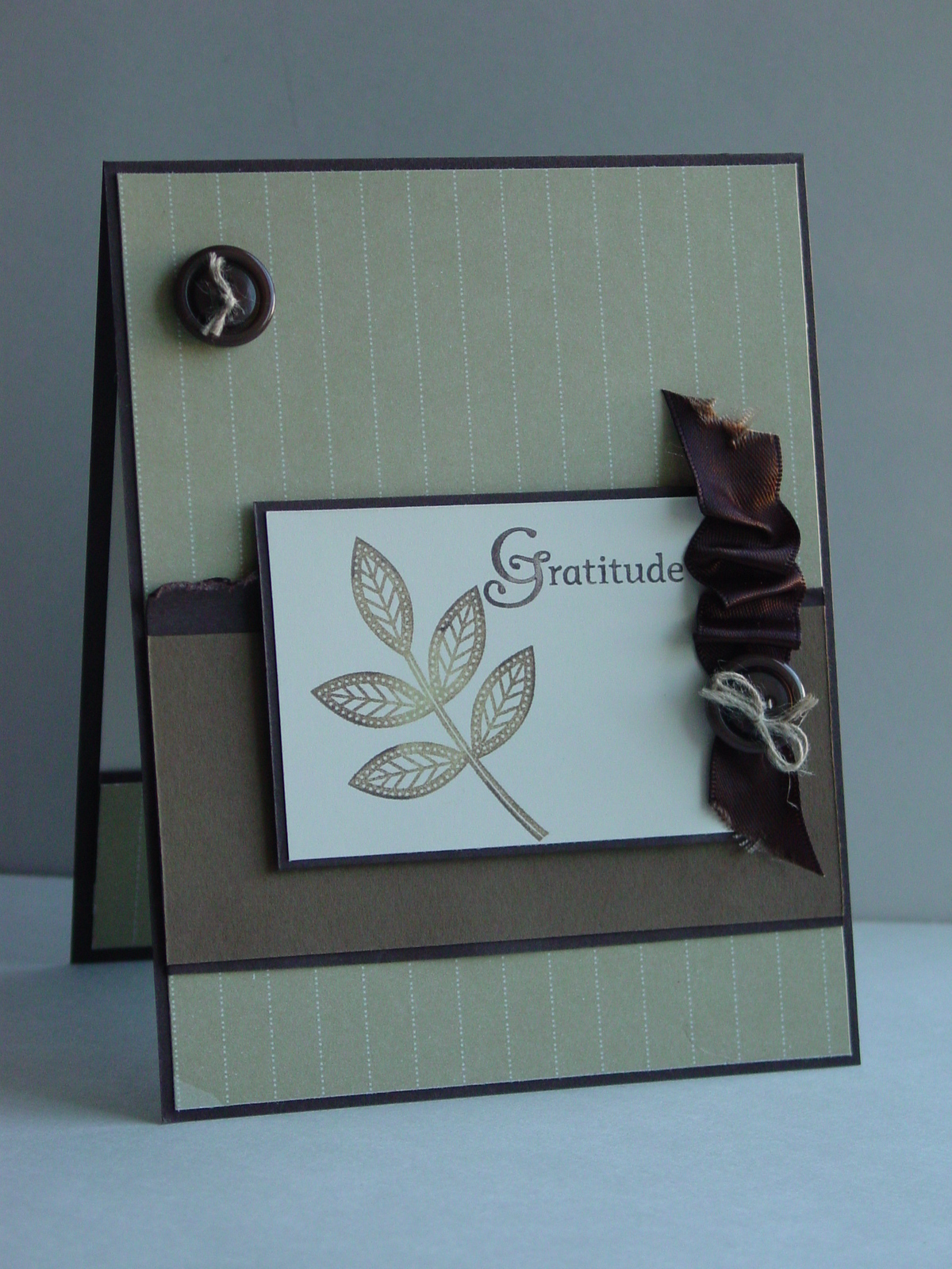
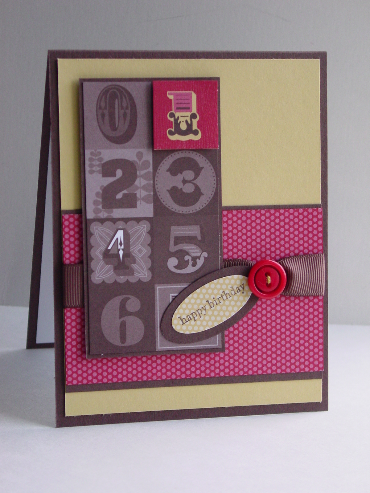
Of course the card above uses this fun set.  How sweet is this little tricycle?  I used my Stampin’ Write Markers to color it in Rich Razzleberry, Lucky Limeade and Basic Gray.  Then I added some Pumpkin Pie flowers from the set for the basket.  I stamped a second basket and cut it out for some dimension.  The prints are from Summer Smooches DSP and I added some of the new 1/4″ Stitched Grograin Ribbon in Rich Razzleberry across the middle.  Some Bright Buttons finished off this fun sketch from Pals Paper Arts.

Thanks so much for stopping in today.  I look forward to ordering a lot of Moving Forward stamps for this great cause and sending this little card to the Davies family with our donation!


Happy Birthday

Happy Birthday published on 9 Comments on Happy Birthday

Nine years ago this morning, I was blessed to become a mom for the first time.  How can it be that so many years have passed so quickly??

And now look at him:

Yesterday we celebrated his birthday with his friends and he had a great time.  He also had a soccer tournament on Saturday and Sunday.  They played 5 games in 2 days and his team won the tournament for the U10 age bracket.  Wow, what a weekend!  And wow, what tired kids I have.

Here is the card I made him for his birthday.  I turned to the Summer Smooches again for the fun colors and patterns.  I love how this print goes perfectly with the balloons from Patterned Party!  I cut out two of the balloons and popped them up on Dimensionals.  The sentiment comes from Up, Up and Away.  The font on it is so perfect for kid cards!  The sketch on this card is from the oh so talented Margaret Moody and is for the Pals Paper Arts 135 Challenge.  Cool sketch, huh??!!  I chose the colors from the DSP for the balloon colors.  Great DSP really simplifies my stamping, I must say!

Thank you for humoring a proud mom today.  I’ll be back in just a bit with a bonus project from Craft Project Central and tomorrow with the latest from Freshly Made Sketches.  It is a sketch you won’t want to miss!  Thanks for stopping by today!

Stamps:  Patterned Party, Up, Up and Away; Paper:  Summer Smooches (available Jun 1st), Real Red, Island Indigo, Whisper White; Ink:  Real Red, Daffodil Delight, Island Indigo, Lucky Limeade, Tempting Turquoise, Basic Gray; Accessories:  Dimensionals, Mini Glue Dots, Stamp-a-ma-jig

PPA131 – Summer Blossoms

PPA131 – Summer Blossoms published on 16 Comments on PPA131 – Summer Blossoms

I got some time to stamp yesterday and just had to pull out my new things from the Summer Smooches package being offered in April.  Many of you know that I have what I call “seasonal stampers disorder”.  My colors choices are completely and utterly seasonal!  I have to say that this beautiful selection of products fits that syndrome beautifully!

Just look at the bright, happy colors here!  They are just perfect for Margaret Moody’s wonderful sketch over at Pals Paper Arts this week.  The Summer Smooches DSP has the most wonderful designs.  I thought this pattern would be fun to use with the matching stamp from Bright Blossoms.  All I did was mimic the colors from the paper when I stamped the flowers.  I matched the little yellow centers from the DSP with a Daffodil Delight brad in the middle of the biggest flower.  Easy and fun!  For the little flag, I pulled out my trusty Teeny Tiny Wishes for the sentiment.  What would I do without that set??!!  The card seemed to need something else so out came the handy dandy Mat Pack for some paper piercing.

I’m still enjoying all of my Sale-a-bration products and the ones from the Occasions mini but it was nice to get a little preview of the upcoming catalog.  The Summer Smooches suite of products will become available on April 1st for one month only (some of the products will only be offered for that month!!).  Just wait until you see the little purses made with the new Big Shot die.  I’d show you the one I made the other day but it was already taken by a friend of my boys…she just loved it!!

I have some great new cards to show you next week!  I’ll be back Tuesday with the SUO Challenge and Wednesday with Freshly Made Sketches.  Until then, thanks for stopping by.  Have a great weekend!

Stamps:  Bright Blossoms, Teeny Tiny Wishes; Paper:  Summer Smooches DSP, Daffodil Delight, Island Indigo; Ink:  Old Olive, Daffodil Delight, Real Red, Tempting Turquoise, Island Indigo, Tangerine Tango; Accessories:  Mat Pack, Piercing Tool, Dimensionals

SUOC36 – Try a new technique

SUOC36 – Try a new technique published on 5 Comments on SUOC36 – Try a new technique

I am so excited to share with you the SUO Challenge for this week.  It is perfect for the new year, I must say.  We are asking you to try a new (to you) technique.  Fun!  The hardest part will be choosing what to try.

I wanted to see what came of using a Faux Tile technique using my Simply Scored Scoring Tool.  I was inspired by the color challenge from Pals Paper Arts PPA126.  They chose Not Quite Navy, Baja Breeze and Very Vanilla.  So that led me to making Faux Delft Tile.  I love this flower stamp from the Sale-a-bration (SAB) set Fresh Vintage and it seemed perfect for using with  this.  I took a Very Vanilla sheet that is 3″ x 4 1/2″ and scored it at 1 1/2″ increments.  Make sure you go over your score lines a couple of times to create nice deep indents.  Randomly stamp your image making sure you don’t press too hard.  This works particularly well with larger stamps but it was not too hard with this one.  Using a sticky note, mask the score line and sponge a bit around each square to mimic tile.  I stamped the images in Not Quite Navy and sponged with Baja Breeze.  Finally I added an oval embossed with Designer Frames and fussy cut.  The sentiment is from Day of Gratitude and punched with an Extra-Large Oval Punch.  The edges were sponged to match the tile panel.  A couple of Basic Pearls and done.

This is a fun technique.  And my husband said…hey, it really looks like tile.  Success!  I can’t wait to see what you will create for this challenge!

My first few days of training went well last week but it showed me how much I have to do to get ready for flying.  I’ll be busily working on some aircraft systems studying this week but there is definitely room for some stamping too.  I’m still trying to get ahead on all the upcoming challenges.  I will be back tomorrow with a new layout from Freshly Made Sketches.  See you then!

Stamps:  Fresh Vintage (SAB), Day of Gratitude; Paper:  Not Quite Navy, Baja Breeze, Very Vanilla; Ink:  Not Quite Navy; Accessories:  Simply Scored Scoring Tool, Big Shot, Designer Frames Embossing Folder, Basic Pearls, Dimensionals

All products are Stampin’ Up!

SUOC26 – Come join the party

SUOC26 – Come join the party published on 8 Comments on SUOC26 – Come join the party

It is time for another SU Only Challenge and we are asking to see your invitations!  Whatever your occasion, we can’t wait to see how you invite people to join you.

I knew I wanted to make an invitation using the Up, Up and Away set.  Of course I love the set as balloons but it can also make flowers!!!  Using a sketch from the Pals Paper Arts Challenge designed by the talented Margaret Moody, I stamped the striped balloons on the angle and put them together to look like a flower.  My Brights Designer Paper Pack provided the DSP and I added an Old Olive button as the flower center.  The sentiment comes from Inviting which is one of those great to have, all purpose word sets!

I decorated the inside of the card with another kind of balloon and a place to put all the party details.

I hope you can come over and join the fun on this challenge.  Don’t forget that you have almost two weeks to complete your entry!

Thanks so much for stopping by today.   I will be back on Friday for a Stampin’ Addicts Holiday Mini Blog Hop.  You won’t want to miss it!!

Stamps:  Up, Up and Away, Inviting; Paper:  Brights Designer Paper Pack, Basic Black, Whisper White; Ink:  Melon Mambo, Old Olive (inside); Accessories:  Brights Designer Buttons, Dimensionals, Black Thread

Criss Cross Blossom

Criss Cross Blossom published on 15 Comments on Criss Cross Blossom

Whew…yesterday was a busy, busy day for stamping at my house!  I had two classes making cards for “Those Wonderful Women” in our lives.  One of the cards we made was targeted for younger ladies but with the bright, happy colors, it could be for anyone.

I started with my Brights Designer Paper Pack and chose the polka dots paper in Melon Mambo, Pacific Point and Daffodil Delight.  The Basic Black really makes those colors pop so that was my base for the card.  The finished card is 4 1/4″ x 4 1/4″.  Just perfect for tucking in a gift bag or inside a present box!! 

I used my Scallop Circle punch to create the flower on this.  Simply punch out one Basic Black scallop circle and two of each color.  Crumple them up (yes…just do it!) to soften the fibers of the paper a bit then re-stack them in whatever order you like.  Punch a hole through the middle using your Paper Piercing Tool and secure the layers with a small brad (I chose a black brad).  Using a little Sticky Strip (or a few Mini Glue Dots), attach a black button in the middle and put it on your card.

The inside of the card pulls right out and has so many fun options.  My stampers commented that this would be cute as a party invitation or to hold a gift card.  They are so right!  I used the flowers from the Apple Blossoms Hostess Set since they match the Scallop Circle flower so perfectly.  The sentiment comes from Teeny Tiny Wishes…my go to word set these days, it seems.

I am working on the tutorial with all the measurements.  If you would like to get that, leave me a note in the comments and I’ll have it out to you as soon as I complete the final details.

The Pals Paper Arts PPA89 fashion inspiration this week is flowers.  Well, I think this happy flower card fits perfectly!  I hope your week has been great and that you get to have some stamping time this weekend.  Thanks so much for stopping in today.  See you again soon!

Stamps:  Apple Blossoms (Hostess), Teeny Tiny Wishes; Paper:  Brights Designer Paper Pack, Basic Black, Whisper White, Daffodil Delight; Ink:  Pacific Point, Melon Mambo, Daffodil Delight; Accessories:  Sticky Strip, Paper Piercing Tool, Scallop Circle Punch, Neutrals Buttons, Neutrals Brads, Stamp-a-ma-jig, Thread (Non-SU)

All products are Stampin’ Up unless otherwise indicated!

ColorLab 26

ColorLab 26 published on 12 Comments on ColorLab 26

You are going to love, and I mean LOVE, using today’s ColorLab Challenge colors.  They are seriously beautiful together! 

The Perfect Plum and Basic Gray pair so nicely and I loved adding a pop of Bashful Blue.  I found another great sketch courtesy of the Operators over at Stampin’ 411 and got to work.  Something about this color scheme compelled me to pull out my Every Moment set.  I just knew the flower and the butterfly would be fantastic on this challenge. 

I started with a base of watercolor paper for my image and stamped the flower and butterfly in Black Stazon Ink.  Using my lightest color first, I colored my butterfly with Bashful Blue and then the flower with Perfect Plum.  I have Stampin’ Write markers in these colors so I used the technique of coloring a bit on a clear block and pulling the color from there with my Blender Pen.  I added Basic Gray to the flower center and stem, and then to the butterfly.  With the little left on my Blender Pen, I shaded a little around the images with Basic Gray.  I used the sentiment from Say It Simply (again!)…it really is a great little set!

For the rest of the card, I rolled out a frame on Perfect Plum with my Big Shot and the Framed Tulips Embossing Folder.  I did use some retired Basic Gray Taffeta ribbon and scrunched it using the thread pulling technique.  All you have to do is rough up the end a bit and pick a center thread to pull.  I did the same on the tails of the bow.  The bow is held together with an Antique Brad.  The team over at Pals Paper Arts have a Bow challenge this week…how fun!  Of course, I love a bow so I am thrilled to join in. 

I hope you love playing with these colors this week!  I can’t wait to see your beautiful creations!  I’ll be back tomorrow for the Stampin’ Addicts Sale-a-bration Blog Hop.  I’ll be showing you projects with the SAB choice Funky Four.  Thanks for stopping in today!

Stamps:  Every Moment (120522-C), Say It Simply (122324); Paper:  Watercolor (105019), Basic Gray (121044), Perfect Plum (101889), Bashful Blue (105120); Ink:  Perfect Plum (100035), Bashful Blue (105111), Basic Gray (120966); Accessories:  Big Shot (113439), Framed Tulips Folder (121809), Antique Brads (117273), Blender Pen (102845), Basic Gray Taffeta (retired)

All products are Stampin’ Up!

Gratitude for River Rock

Gratitude for River Rock published on 9 Comments on Gratitude for River Rock

My stampers here know that River Rock became my go-to color when it was first introduced as an In Color by Stampin’ Up.  It is quite a color chameleon, frankly.  I love how it skews green when paired with blues and moves toward brown when paired with brown family.  It is absolutely lovely with Soft Suede and the introduction of Early Espresso completed the set for me.  So why haven’t I made more cards with this color??!!  Can’t tell you (other than I am also in love with Cherry Cobbler and Cajun Craze and Daffodil Delight and Pear Pizzazz……)!  Imagine my joy when I saw the Pals Paper Arts inspiration picture this week.  Lots of River Rock leaves, Soft Suede tree trunks, a Very Vanilla Sweater…take a look:

October 3

I also found this great sketch from Karen and her Sweet Sunday Sketch Challenge 89:

I found some very old DSP and knew it was just perfect.  One of the leaves from Day of Gratitude got the Ilina Crouse treatment.  I knew this technique would be great with lots of color combinations.  Today it is River Rock, Soft Suede and Early Espresso.  The tip from Pals Paper Arts is to remember layers and I added a torn layer underneath the image panel.  I thought it would add balance to the frayed ends of the ribbon.  Here is the final result:

I am thrilled with the masculine feel of this card and may do a birthday variation, too.  Hope your weekend has been full of fun.  My kids had their first leaf pile jumping of the year…one of my favorite things!  Thanks for stopping in!

Stamp:  Day of Gratitude; Paper:  Retired DSP, Very Vanilla, Soft Suede, Early Espresso; Ink:  River Rock, Soft Suede, Early Espresso; Accessories:  Espresso Satin Ribbon, Linen Thread, Neutrals Buttons, Sticky Strip, Sponge Daubers, Dimensionals

All products are Stampin’ Up!

Seasonal thanks

Seasonal thanks published on 8 Comments on Seasonal thanks

One of my dear friends was over stamping on Tuesday and left a couple of sets accidentally.  I admit that “borrowed” stamps are almost as fun as new stamps and it could not go back to her house until I had put a little ink on the rubber.  Now add to it that one of the sets was Lovely as a Tree and you can understand why I couldn’t resist.  Yes, I know what you are going to say.  How is it that I don’t own this set??!!  Good question and no good answer!  Furthermore, I didn’t even use the trees.  Yes, I know…I SHOULD hang on to it for another couple of days just so the trees get some ink too!  But, she is a really, really good friend and I’m sure she’ll be missing this and what kind of demonstrator hijacks her friend’s stamp sets and…well, you get the point.  I’m just glad I got to play a little with the set!

I recently discovered a challenge that I love called the Stampin’ Sisters in Christ Challenge.  Their challenge this week is Ecclesiastes 3:1 “To everthing there is a season, and a time to every purpose under heaven.”  With the changing of the seasons, you are to use fall colors and/or leaves.  Wait…I have leaves from the Lovely as a Tree set…hmmmm.  Pals Paper Arts posted their PPA61, a sketch challenge created by the wonderful Margaret Moody.  I always love her sketches (hop right over there to see it!). 

I originally intended for this to be a much more complicated card.  I have been playing around with the idea of doing cracked glass for my next club meeting and I thought this might the right card for it (maybe it still will be).  But when I held the stamped panel up to the layout, it just seemed done.  I think it is good to go with your gut feeling on that so I did.  I used the wonderful Watercolor Paper and my blender pen to put the color on the leaves.  Conveniently enough, some of my trees are starting to turn already so I looked at a fallen leaf for my color inspiration.  With the lack of rain we have had in VA, my leaf had a bit of brown on the edges and I incorporated that in.  My ribbon is the retired Chocolate Chip 1 1/4″ Striped Grosgrain Ribbon.  I have to admit this would be prettier with the current Early Espresso ribbon but I had to finish up this before I would allow myself to buy it.  I simply can’t encourage my own ribbon hoarding.  I’m sure you have your own little stashes and know what I mean!  In any case, here is my final result:

You can click on the picture to see more detail.  I have always loved this quote from the Inspired by Nature set and it really seemed to fit with the biblical quote for the challenge.  You see, I find that when challenges present themselves, good friends always step in and help you know that God is watching over you.  It also seems like those are the times when you don’t have a spare moment to make a meaningful card.  This one is going into my little box for one of those days.  I hope that you find some inspiration in the words from Ecclesiastes, too.  Thanks for stopping by and have a wonderful day!

Stamps:  Inspired by Nature, Lovely as a Tree; Paper:  Early Espresso, Cajun Craze, Watercolor; Ink:  Early Espresso, River Rock, More Mustard, Cajun Craze, Soft Suede, Stazon; Accessories:  Wide Striped Ribbon, Neutrals Designer Buttons, Linen Thread

All products are Stampin’ Up!

A Pals Sketch Birthday

A Pals Sketch Birthday published on 2 Comments on A Pals Sketch Birthday

The son of a dear friend turns one this week and I needed a card, of course!  In a dramatic turn from ALL of the Christmas cards I have been working on, I pulled out my Play Date DSP to see what I could come up with.  The Pals Paper Arts this week was designed by Margaret Moody so of course it is fantatic.  Make sure you go check it out!  I have done a similar card concept before with the numbers but, as I mentioned then, the  numbers are what made me buy this paper.  I love the idea of highlighting the specific birthday using the monochromatic and the mulitcolored papers!  That is what I did again on this one.  I love the bold colors in this DSP and I let the paper do most of the work.  After I got the numbers panel completed, I needed a little something for balance and tied on a button from the Brights Designer Buttons collection.  I layered the Oval Punches and used the phrase from Teeny Tiny Wishes. 

Didn’t this turn out cute?  The mommy of the little boy loved it and I’m happy that it highlights the special birthday.

Now, since I can’t let you go without SOMETHING from Christmas, I have a close-up of one of my cards from the Stampin’ Addicts Blog Hop last weekend.  I shined a light on the card so that I could capture all the shimmer from the Shimmer Paints I used.  I am not normally a “glitter girl” but the sparkle from this card is so pretty in person.  I hope this gives you more of a feel for it.

Thanks for stopping in today.  Tomorrow I will have close-up pictures and details about my cracked glass card from the hop.  Have a great day!

Stamp:  Teeny Tiny Wishes; Paper:  Chocolate Chip, So Saffron, Play Date DSP; Ink:  Chocolate Chip; Accessories:  Large and Small Oval Punches, Chocolate Chip Wide Grosgrain (ret), Brights Designer Buttons, Dimensionals

All products are Stampin’ Up!

Primary Sidebar