
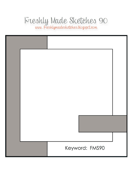
 I think that summer is almost officially here!! My boys have started swim team and tomorrow is their last day of school. The summer flying seems to be in full swing (make sure you look for me if you are on a United Airbus…especially on a weekend, lol) and I am working to find time for stamping. That said, it is easy to stamp when you have a sketch this great! Linda Callahan really did a fantastic job on this and you are going to have such fun using it!!
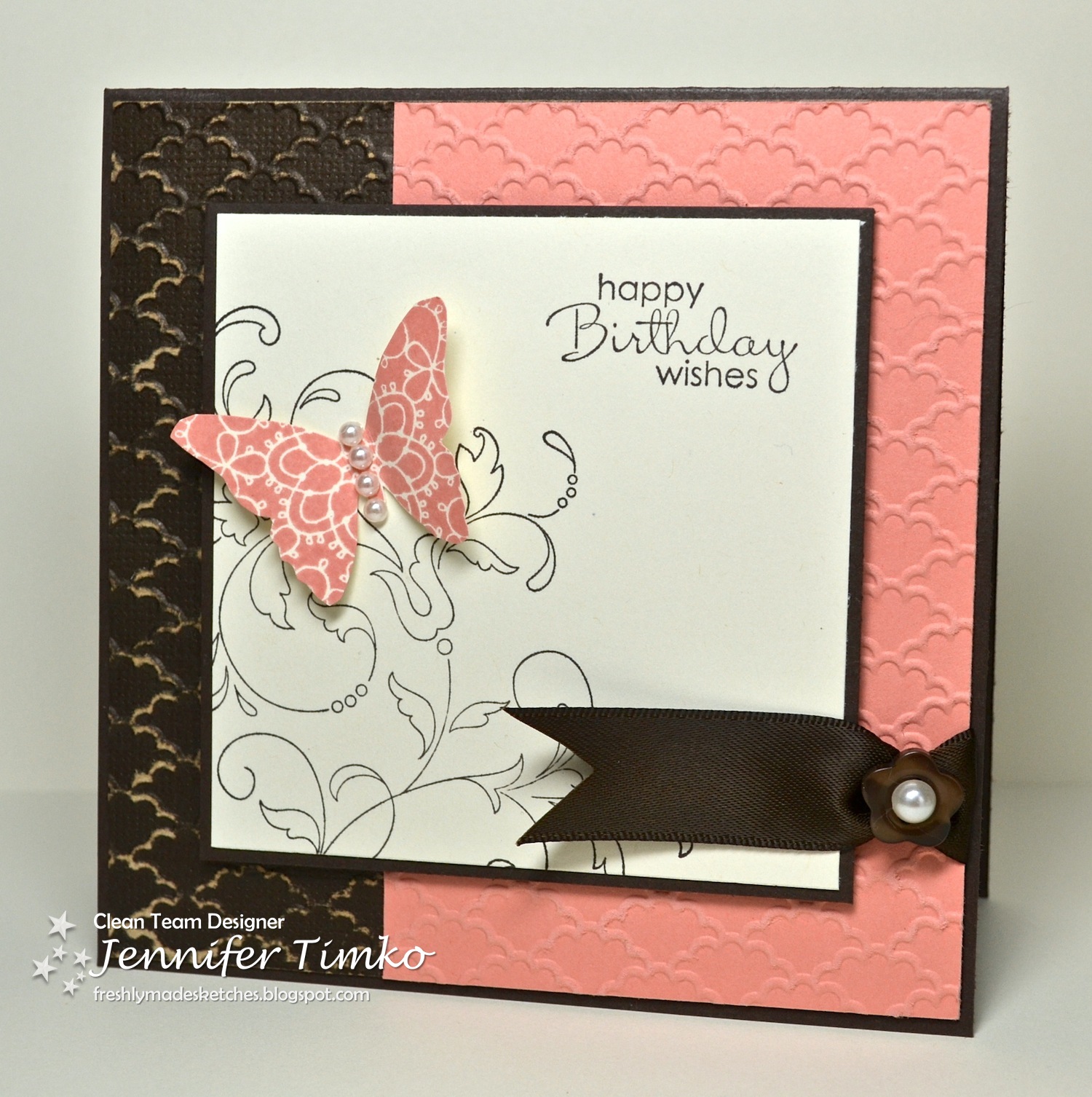 I am not so patiently waiting for my new catalog order to arrive (it should arrive today!!) so I chose to combine a little new with some old favorites. The colors…oh yes, this is a very happy color combination for me!! The new In Color Crisp Cantaloupe pairs beautifully with Early Espresso. I used the Core’dinations version of Early Espresso for embossing and ran the split panel through with the Fancy Fan Embossing Folder. I lightly sanded the Espresso side (trying to keep it clean) just so that you could see the bit of “core color” peeking through. I thought Creative Elements paired nicely with the embossing folder so I stamped the flourish and then cut out a butterfly from the same set. A sentiment from Petite Pairs seemed like a nice match. I added in a little bit of retired Early Espresso Satin Ribbon tied with a retired Neutrals button. I topped the button and the butterfly with Basic Pearls. This card doesn’t have a particular recipient yet but I can think of a few people I would love to send it to!
I actually said “wow” out loud at this week’s design team cards! Truly, I am incredibly lucky to be associated with such amazing talent!! That creativity is not limited to the team though. I am thrilled every week by the inspiration I find in the gallery! I love reading your posts and seeing your work!!
Ok, I have a card to share with you on Friday. Father’s Day is almost here and I’m trying to get everything ready! I look forward to showing the card I made for my father-in-law! Until then, thanks for stopping in! See you soon!
Stamps: Creative Elements, Petite Pairs; Paper: Early Espresso Core’dinations, Crisp Cantaloupe, Very Vanilla, Early Espresso; Ink: Early Espresso, Crisp Cantaloupe; Accessories: Big Shot, Fancy Fan EF, Basic Pearls, Neutrals Buttons (ret), Espresso Satin Ribbon (ret)

11 Comments
Wow this is pretty! Love these colors together and the sanding adds a subtle but oh so effective accent!
This is so pretty. Love the color combo and pretty butterfly.
Jennifer, I love this card! Gorgeous color combination and texture with the embossing/sanding. I love the flourish image and the butterfly….Well, I have to admit I love anything with butterflies! : ) I’ll probably be CASEing this card someday!
Beautiful! I LOVE the embossed background. Not to mention the pretty butterfly and swirly background!
Amazing card Jen! I love those colours together! Of course I love the butterfly and it’s pearled tummy!!! I can’t believe your kids are done school already! We have two full weeks to go!!!
So pretty! I love this color combination. And I love what you did with the little piece of ribbon. Thanks for the reminder — need to get my dad’s father’s day card in the mail.
This is absolutely gorgeous! My core’dinations paper is unopened (gasp!)…but I need to check it out now! Love the delicate flourish and butterfly with that embossing. Every detail is perfection!
This is absolutely gorgeous Jennifer! The colour combo you’ve used is such a pretty one – I wish we got our new goodies as early as you – jealous!
Beautiful Jennifer! I love the color combo!
This color combination is so beautifully dramatic! Love the embossing on the two different cardstock types/colors and the butterfly is beautiful, too.
I love the ribbon banner; that was a clever touch! I haven’t been won over by that color, but maybe I will try it with EE since it looks so beautiful on your card. 🙂