Skip to content

A little birthday Mojo

A little birthday Mojo published on No Comments on A little birthday Mojo

Having my company in town last week was so fun but of course that meant that stamping just didn’t happen.  I guess that is part of summer…and the visits are one of the best parts of this time of year.  Today I needed to get right to work, though, because I need a card for a birthday party tomorrow.  Where else to turn on a Monday when you are looking for inspiration but Mojo Monday??!!  Their sketch number 151 is another great one. 

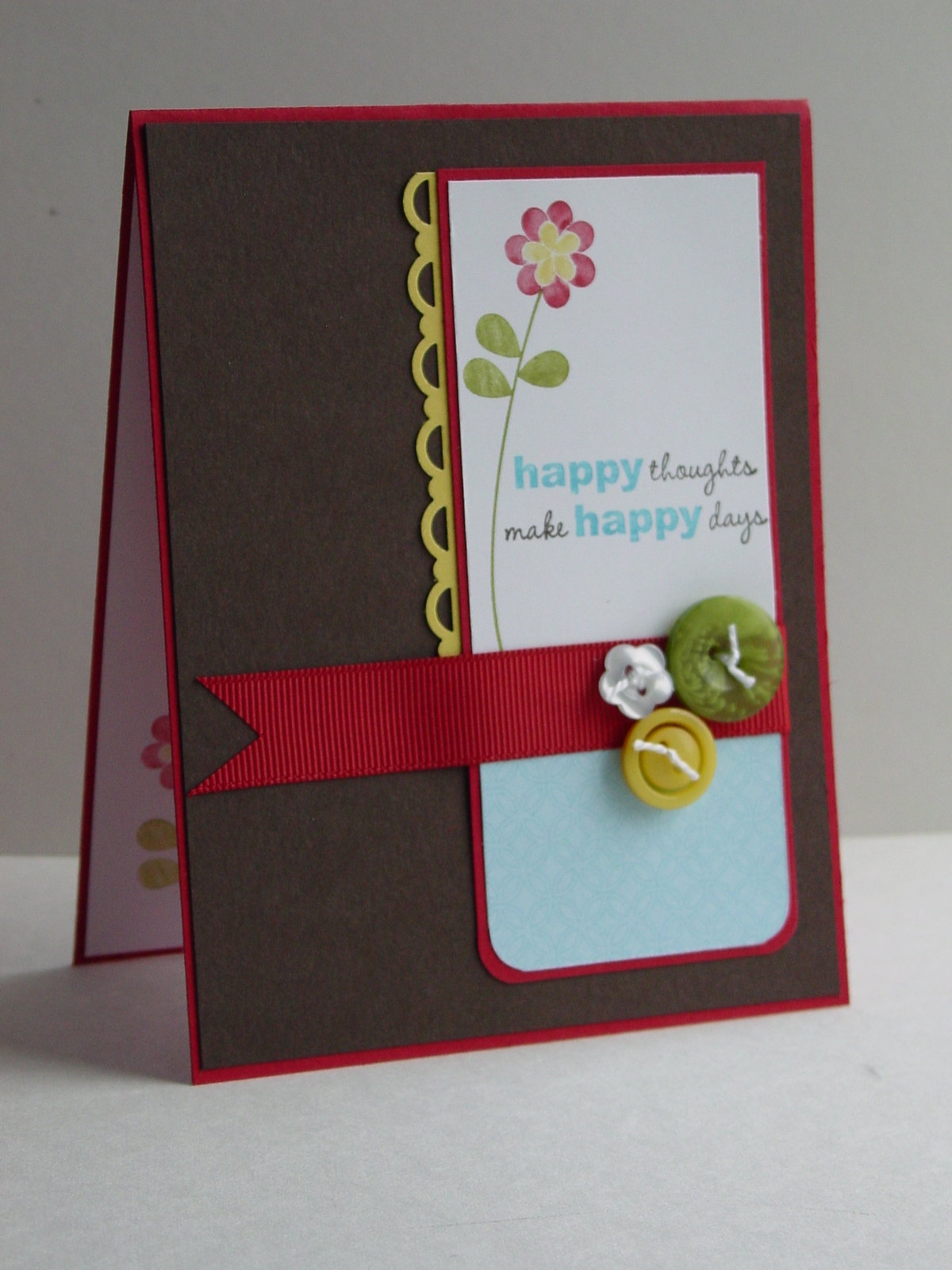
I have made a few other cards with the new Play Date DSP from Stampin’ Up but making birthday cards was my reason for getting it.  The first time I saw this paper, I envisioned playing with the numbers to highlight a specific birthday year.  The best part…it actually worked as I had it in my brain.  Usually, I have to move paper around and see it together to make it work so this was quite a happy thing for me!  As I am sure you can tell, the birthday boy is turning 7.  I used the single-tone Chocolate Chip number sheet for the focal image and then cut the number 7 square out of the multi-colored number sheet.  The DSP really does all the work here.  I used the words from my Teeny Tiny Wishes set, stamped it on the Tempting Turquoise sheet and punched it out with the Large Word Window punch.  I added the Modern Label underneath the Word Window and punched out another to split in half as the “border” beneath the Turquoise panel.  I kind of like how that turned out and that it gives a continuity.  It seemed like something was missing so I added my new favorite accessory…well, my second favorite because SU ribbon is like an addiction for me…the new Designer Buttons.  Done, done, and done…love it when that happens! 

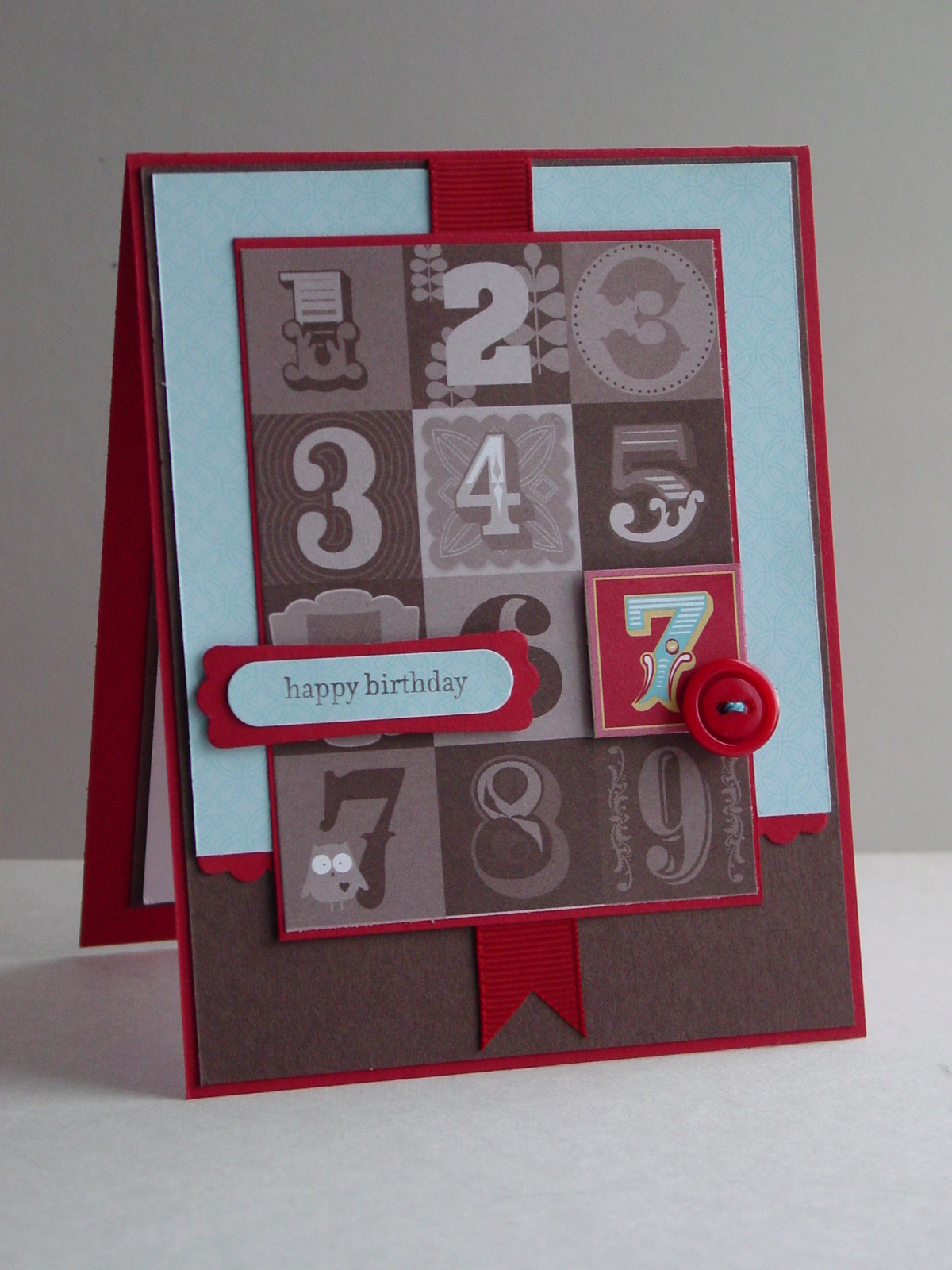
The best part about this paper is that the number sequences guarantee that I can make other variations of this card for other birthdays.  While I know that most of this will be lost on a 7 year old boy, his mother is one of my club members who will surely appreciate it!  I hope you find this card as fun as I do.  Have a great week!

Stamps:  Teeny Tiny Wishes; Paper:  Play Date DSP, Real Red, Chocolate Chip, Whisper White (inside);  Ink:  Chocolate Chip; Accessories:  Brights Designer Buttons, Real Red Wide Grosgrain, Word Window Punch, Modern Label Punch, Dimensionals, Thread (dyed with Tempting Turquoise ink)

All products are Stampin’ Up!

Happy thoughts and happy colors

Happy thoughts and happy colors published on No Comments on Happy thoughts and happy colors

I have never considered myself a “Brights” stamper but, with the new Color Renovation at Stampin’ Up, Brights may be my favorite.  Yes, yes…favorite is relative since I do have Seasonal Stamper’s Disorder*.  In any case, today’s card puts the focus on this color group.  My layout today comes from MaryJo’s TechnoStamper Monday Lunchtime Sketch Challenge.  The stamp set is one that I keep reaching for…a hostess level 2 set called Apple Blossoms.  The flowers and the little leaves are such fun!  It is also a set that I see using a lot for teacher gifts later on this year.  Talk to your demonstrator about how to earn this level 2 set by hostessing a workshop!!  If you don’t have a demonstrator, I would be happy to help you myself.  The buttons are from the Brights Collection of Designer Buttons.  There are 72, yes 72, buttons in each box (trust me, it is stuffed full) and I don’t feel at all guilty about putting so many buttons on one card.  Take a look at this fun layout:

This card will be perfect for a friend who is visiting later today!  Hope you have a great day and I appreciate you dropping by!

Stamp:  Apple Blossoms; Paper:  Daffodil Delight, Real Red, Whisper White, Early Espresso; Ink:  Old Olive, Real Red, Tempting Turquoise, Daffodil Delight, Early Espresso; Accessories:  Brights Designer Buttons, Real Red Wide Grosgrain, Corner Rounder Punch, Scallop Trim Border Punch, Thread

All products are Stampin’ Up!

*Seasonal Stamper’s Disorder:  The tendency to change all color preferences based on time of the year.

Concord Toile

Concord Toile published on 20 Comments on Concord Toile

Thanks to the team over at Pals Paper Arts for making my card an Artist Pick this week!  I am so thrilled!

I have to admit that the mojo went missing this morning.  Maybe it has to do with the fact that my kids were running around and asking all kinds of questions but, hey…that’s what they are supposed to do, right?  I tried watercoloring my Elements of Style, embossing the watercolored images, re-watercoloring, sponging…you get the picture.  Suffice it to say, there was no image worth saving.  That is when I simplified.  If watercoloring wasn’t going to work today, it was time to skip it!  The big flower stem in the set looks like toile to me and then it hit me.  Pals Paper Arts has a monochromatic challenge and the color is PURPLE.  Ummm, ok.  Well, I have to admit that purple is not a go to color for me.  The toile idea and the purple did seem to work though.  With all my reservations about purple, the new Concord Crush really is an appealing color.  It is so rich and almost dark enough to have a neutrals feel.  The OCC Sketch Blog has a great new layout this morning, too:

After the first failures, I was ready to try it again!  As soon as I stamped that flower in the Concord Crush, I knew this was going to work!  I stamped it on the Concord paper with Craft White and then popped out some butterflies with my Beautiful Wings embosslit.  Seems my Big Shot has been getting more of a workout lately! 

With the elegance of the toile look, I added some White Organza ribbon.  Finally, I wanted to dress up the butterfly so I got the new Basic Pearl Jewels out.  These little things are so very cool!  Pull them off, stick them on, instant elegance!!  Here is the final result:

And here is a close-up of the butterfly:

Details on the butterfly:  I attached the Concord little butterfly to the toile big one with a little Dotto along the midde.  I cinched the ribbon with some thread and then tied the butterfly onto the ribbon.  My original intention was to leave thread antennae so I had a knot at the top of the butterfly.  Once I started putting on the pearls, I realized that the thread wasn’t right and trimmed it down.  I simply attached the big pearl to the knot…makes it look like I planned it but lucky is better than good sometimes!

The best part about this card is that I have a dear friend who loves purple and has a “significant” birthday coming up.  Shhh, don’t tell her that this is her card!!  Thanks so much for stopping in today! 

Stamp:  Elements of Style; Paper:  Concord Crush, Whisper White; Ink:  Concord Crush, White Craft;  Accessories:  Big Shot, Beautiful Wings Embosslit, White Organza Ribbon, Basic Pearl Jewels

All products are Stampin’ Up!

Lattice Lotus

Lattice Lotus published on No Comments on Lattice Lotus

Sorry I haven’t posted in a few days.  I had my new catalog Open House last week and then had company in town.  Today is the first time I have been able to pull out some stamps for a while.  I was so happy to see this beautiful layout over at the Sweet Sunday Sketch Challenge:

This seemed like an easy one to do quickly and I was right!  The colors for the Color Challenge at Splitcoast CC281 are Crushed Daffodil Pizzazz (Concord Crush, Daffodil Delight, Pear Pizzazz).  I pulled out my Friend Never Fade (I know…again) and my brand new Square Lattice embossing folder for my Big Shot.  Well now I see what all the hype is about.  This folder adds so much for so little actual effort!!  The oval is the smallest from my Ovals die and it is backed by the Scallop Circle punch.  This is also my first time using the new Pear Pizzazz 1/2″ Stitched Poly Ribbon…love it!

I really love this little lotus flower (I think that is what it is).  A nice quick card that still feels special!  Just what I needed today. 

Thanks for dropping by…have a great day!

Stamp:  Friends Never Fade; Paper:  Daffodil Delight, Pear Pizzazz, Concord Crush; Ink:  Daffodil Delight, Pear Pizzazz, Concord Crush; Accessories:  Big Shot, Square Lattice Embossing Folder, Ovals Die, Scallop Circle Punch, Pear Pizzazz 1/2″ Poly Ribbon, Dimensionals

All products are Stampin’ Up!

Fresh Cut Stencil

Fresh Cut Stencil published on No Comments on Fresh Cut Stencil

Stenciling is showing up everywhere and Stampin’ Up has started making some of the most beautiful products for this technique.  Sadly, my first order in the new catalog was all about new colors and new stamps (don’t worry, though, I’m certain this will be remedied in future orders!).  The challenge over at Stampin’ Royalty  (SR#28) takes advantage of this trend and asks for projects using stencils.  I sacrificed one of my Fresh Cut Notes (p. 171) so that  I could play along.  The best part is that I can continue to use this one note over and over for many projects so it was a worthy sacrifice!  I saw the CAS76 layout challenge over at Splitcoast and knew this was the way to go.  By definition, stenciling gives the feel of layers without actually having to have them and I wanted to keep the laying to a minimum.  Stacey’s Curtain Call Act 39 used the most lovely combination this week…take a look:

This card came together pretty quickly.  I sponged over the flower with Certainly Celery ink onto the Crumb Cake (Kraft) paper.  The center was a bit too bare so I popped on one of my new Basic Pearl Jewels.  You can expect to be seeing ALOT of these on my card, by the way!  I added the sentiment with Wild Wasabi ink and was left with the ribbon to do.  I saw this cool tutorial from Makeesha on how to scrunch the ribbon using Sticky Strip.  Well, it works great and adds so much texture!  Here is the final result:

I must say that I wasn’t totally thrilled with the final result at first (although I love each element), but it is growing on me.  Definitely more Clean and Simple than I have been doing lately.  Let me know what you think.  It is a bit out of my box but that is what challenges are so good at doing for us stampers!  Hope you have a great day…thanks for stopping in!

Stamp:  Apple Blossoms (Hostess Level 2); Paper:  Whisper White, Crumb Cake (Kraft); Ink:  Certainly Celery, Wild Wasabi; Accessories:  Fresh Cut Notes, Basic Pearl Jewels (p. 188), Certainly Celery Satin Ribbon, Sticky Strip, sponges

All products are Stampin’ Up!

Happy Birthday, Brandi!

Happy Birthday, Brandi! published on 2 Comments on Happy Birthday, Brandi!

My fabulous upline, Brandi, has a birthday coming up!  Yea!  Of course I needed to make a card using my latest products.  I really wanted to make another card using Friends Never Fade and Greenhouse Gala DSP, but this time using a darker color palette.  I found this great layout over at the OCC Sketch Blog:

I knew it was just right!  For the small rectangle, I used a piece of the DSP that has Chocolate Chip as the main color.  I wanted the darker piece so that I could use my cool new 1/8″ Daffodil Delight Taffeta Ribbon.  It is really fun ribbon!  I have to say that I have been leaning towards wider and wider ribbon the longer I have stamped so this was kind of a gamble (or so I thought) to buy.  No fear, it is awesome to work with and, frankly, works in places that wide ribbon won’t.  I colored directly on the flower stamp with Daffodil Delight, Baja Breeze, Real Red and Early Espresso markers.  The words are from the Well Scripted set (ret).  Here is the result:

The little bow was inspired by Kerin Sylvester‘s card for this week’s Stampin’ 411 sketch challenge.  I used Early Espresso paper for the layering and it really goes beautifully with this DSP!  I find it funny how the addition of some new colors can change how I feel about the existing ones.  Real Red has generally not been my “go-to” red but somehow it feels updated when added to the Daffodil, Baja Breeze and Espresso.

Brandi, I hope you have a wonderful birthday!  Thanks so much for being my upline and inspiring me to become a Stampin’ Up demonstrator!!

Stamps:  Friends Never Fade, Well Scripted; Paper:  Greenhouse Gala DSP, Daffodil Delight, Baja Breeze, Early Espresso; Ink:  Real Red, Daffodil Delight, Baja Breeze, Early Espresso; Accessories:  1/8″ Daffodil Taffeta Ribbon

All products are Stampin’ Up!

Cherry Silhouette

Cherry Silhouette published on 7 Comments on Cherry Silhouette

I have to say, the new colors at Stampin’ Up are making me happier and happier!!  Every time I use them, the Color Renovation makes even more sense.  Today’s color of choice was Cherry Cobbler and what a fabulous red this is…don’t even get me started on what lovely Christmas things will happen with it!  My starting inspiration today is challenge number 11 over at Stampin’ Celebration:

Look at those beautiful flowers…yep, I see Cherry Cobbler!  I also pulled a little Baja Breeze from the table cloth as an accent color.  The flowers look just like the ones in my new hostess set Silhouette Sentiments so the stamp set choice was easy.  I found this layout over at Clean & Simple:

I love the little panels with the tiny flowers of the stamp set!

The little Baja strip of DSP comes from the Play Date set of papers.  I can’t tell you how much I will be using the new Early Espresso family of products (it is a “Getting Started” color so it has lots of coordinating accessories)!!  The color of this ribbon is so much richer in person. 

This card is for my wonderful sister’s birthday.  This red is a color I have always associated with her since it is just beautiful on her.  How lucky for me that I have it as part of the new color palette!  Thanks for taking a look today.  Don’t forget to leave a comment since they are much appreciated!

Stamp:  Silhouette Sentiments (hostess level 1); Paper:  Cherry Cobbler, Early Espresso, Play Date DSP, Whisper White; Ink:  Cherry Cobbler, Baja Breeze, Early Espresso; Accessories:  Espresso Satin Ribbon, Neutrals Designer Buttons, Dimensionals, Thread

All products are Stampin’ Up!

A "Blue Carrot" Funk

A "Blue Carrot" Funk published on 7 Comments on A "Blue Carrot" Funk

This is definitely NOT to be confused with a blue funk.  Today over at Splitcoast, their Inspiration Challenge uses a store called Blue Carrot.  I found this really cool picture there and it reminded me of my brand new, never yet used set called Funky Four (p. 93).

The colors also worked for the coordinating paper called Play Date (p. 175).  Then I  found this great layout from Stamping 411:

Before I get into the card details, I have to give a huge thanks to the Operators at Stamping 411.  I had read their tutorial on mounting the stickers on Stampin’ Up’s new cling mount stamps.  Well, I just got my first set of those and the tutorial was right on target (although I don’t trim the rubber)!!  My cling mount stamps cling perfectly and I may be a convert!!  Check out all the great info over there…it is fantastic!

Back to my card.  I must say that this one came together pretty easily (it had to, it is a Saturday and my house is crazy on Saturdays!).  I am in love with the little leaves in both Funky Four and Apple Blossom (hostess level 2), and I am thrilled that they are in the DSP.  Using my trusty Stamp-a-ma-jig, I stamped the three flowers using the plate as a motivation.  The Olive button is from the new Brights Designer Buttons collection and it was the perfect way to make a quick bow with my Real Red Wide Grosgrain.  I added another little flower inside the card and it is ready to send off to one of my sons’ schools.  They were kind enough to put together a bag of 4th of July cookout goodies for military families and the one they gave us was amazing.  How lucky we are to have such a community!!

My picture seems a little blurry but it will have to do for now (off to play outside with the kids).  Your comments are valued and I look forward to your thoughts on all the new items!

Stamp:  Funky Four, Apple Blossoms (words); Paper:  Play Date DSP, So Saffron, Real Red, Chocolate Chip, Whisper White; Ink:  So Saffron, Real Red, Old Olive, Chocolate Chip; Accessories:  Real Red Wide Grosgrain, Brights Designer Buttons, Dimensionals, Thread, Stamp-a-ma-jig

All products are Stampin’ Up!

New Friends!

New Friends! published on No Comments on New Friends!

Is there anything better to spark creativity than new stampin’ stuff??!!  I certainly can’t think of it if there is!  Yesterday, my box of new Stampin’ Up paper, stamps and accessories showed up and I got some time to break into it this morning.  I have to say that no matter how beautiful I think the designer papers are going to be, the paper from Stampin’ Up always goes way beyond my expectations.  I ordered the new Greenhouse Gala paper (p. 173) and the coordinating Friends Never Fade stamp set (p. 99).  All I can say is WOW!!  I thought the the Sweet Sunday Sketch Challenge 76 would be perfect to highlight both the stamp set and the DSP.

The coordinating accessories are the new Brights Collection Designer Buttons (p. 186) and the new 1/8″ Taffeta Ribbon in Daffodil Delight (p. 191).  The latest addition to the buttons is this one with cool variations of color throughout.  The skinny ribbon is going to be so fun to work with, too!!  I used the words from the Silhouette Sentiments (Level 1 hostess, p. 11) to finish the card right off.  I stamped a matching flower inside and the card is all ready for a friend who needs a lift right now.

I can’t tell you how excited I am about all the new offerings in the Stampin’ Up catalog.  I hope this card brightened your day.  Thanks for stopping by!

Stamps:  Friends Never Fade, Silhouette Sentiments; Paper:  Pear Pizzazz, Baja Breeze, Whisper White, Greenhouse Gala DSP; Ink:  Pear Pizzazz, Daffodil Delight, Baja Breeze (all Stampin’ Write markers); Accessories:  Brights Designer Buttons, 1/8″ Daffodil Delight Taffeta Ribbon, Dimensionals

All products are Stampin’ Up!

Double the fun!

Double the fun! published on 3 Comments on Double the fun!

As I posted my baby cards last weekend, I told you that I had been working on a big (for me) project.  Well, the secret is out and I can share now.  A dear friend of mine is pregnant with twins and I was part of a group that made her matching scrapbooks.  Her twins are actually one boy and one girl so the scrapbook use the same layouts (bacically) but with different papers.  You may or may not know that I am not much of a scrapbooker.  I have used My Digital Studio with some wonderful success but have never made entire traditional scrapbooks.  Together with two of my friends, Christine and Simone, we committed to making these books.  Let’s face it, the mom of twins isn’t going to have time to scrapbook for a while!! 

We started by getting two of the adorable Olive Polka Dot 6″x6″ albums from the Summer Mini.  Then, we chose the Petal Party and Happy B-day Simply Scrappin’ Kits as the base for each.  It is amazing how stampers with totally different styles can create a unified project just by using the same papers!!  The best part is that we had lots of paper and self-adhesives left over so that the mom can add finishing touches once the pictures are in.

To add to the fun, there is a challenge over at Stampin’ Royalty this week that is about “Seeing Doubles” – SR#26.  It seemed like the perfect time to post some of these great pages.

To start, I have the two cover pages (created by me):

I really don’t have room for all the pages but I am going to show you a couple of my favorites!  Take a look at the fabulous artwork on the “first tooth” pages created by Simone (on the left, each pairing).  Her dear husband drew it for her…wonderful!

And the following pages were created by Christine as “Grandparent” pages:

We tried to leave lots of room for journaling and embellishment after the pictures are put in.  We were so thrilled with the final result and, more importantly, the mom-to-be seemed to love it!  So glad you stopped by and I hope to see you again soon!

Primary Sidebar