Skip to content

ColorLab 41

ColorLab 41 published on 13 Comments on ColorLab 41

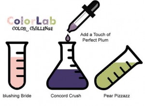
If you are a purple and pink fan, you will love this week’s colors at the ColorLab Challenge!!  Just take a look.  Not sure I would have thought to put the Concord Crush and Perfect Plum together but they are really pretty, especially when you add in Blushing Bride.  All of the main colors are In Colors this year and they coordinate so well.  Within a month, we’ll be seeing next year’s addition to the In Color family with 5 more colors.  Don’t forget, though, this year’s colors are here for another year (yes, we will have 10 In Colors!).

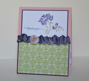
I used the flower from Friends Never Fade since it is so fun to add multiple colors to it.  The coordinating Pear Pizzazz paper is from the Greenhouse Garden DSP and is one of my favorite prints!  I created my own Concord Crush Satin Ribbon by dying some Vanilla Satin Ribbon, dyed some of the new Baker’s Twine in Blushing Bride and tied on a button.  I am so glad that Concord Crush is staying around for another year.  It seems to take me a while to “warm up” to some colors and the more I use this beautiful purple, the more I love it!

I hope your week is going well.  The family is almost recovered from the stomach yuck, thank heavens!  I have another class tonight and then will have a bit of a break to stamp just for me.  Hopefully I’ll be posting a bit more regularly starting next week.  Thanks for stopping in today.  Can’t wait to see what beautiful things you create with this color palette!!

Stamps:  Friends Never Fade, Short & Sweet; Paper:  Greenhouse Gala DSP, Blushing Bride, Concord Crush, Whisper White; Ink:  Concord Crush, Perfect Plum, Blushing Bride, Pear Pizzazz; Accessories:  Vanilla Satin Ribbon, White Baker’s Twine, Neutrals Buttons, Sticky Strip

All products are Stampin’ Up!

SUOC19 – Decorate it with flowers

SUOC19 – Decorate it with flowers published on 7 Comments on SUOC19 – Decorate it with flowers

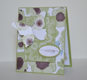
I guess I took the SU Only Challenge pretty literally today!  This card is really covered with flowers.  I started with my Greenhouse Gala DSP and used pieces containing the same flower.  Then I cut out two butterflies from Pear Pizzazz and Whisper White, stamping the same flower on the Whisper White butterfly in Pear Pizzazz and Chocolate Chip ink.  I created the butterfly’s body with the new Baker’s Twine from the Summer Mini.

This was a card we made in my Mother/Daughter stamping class last Friday.  We took two layouts and made them each two ways – a mom version and a teen version.  It was such fun and the girls really showed their creativity!!

Fighting a stomach thing in my house so this is short and sweet!  Hope your week is going well!

Stamps:  Friends Never Fade, Short & Sweet; Paper:  Greenhouse Gala DSP, Pear Pizzazz, Whisper White; Ink:  Pear Pizzazz, Chocolate Chip; Accessories:  Espresso/White Baker’s Twine, Large Oval Punch, Scallop Oval Punch, Big Shot, Beautiful Butterflies Die, Dimensionals

All products are Stampin’ Up!

ColorLab 40

ColorLab 40 published on 8 Comments on ColorLab 40

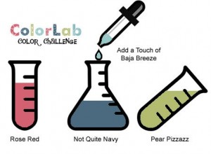
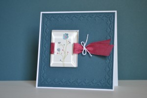
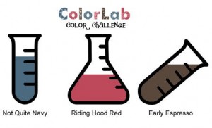
Ooh, take a look at the pretty colors this week at the ColorLab!!  I love Not Quite Navy and it is really pretty paired with Rose Red.  As soon as I saw these, I knew I was using flowers and Seam Binding!  After all, I think I have Seam Binding in all the available colors and keep hoping for more.  What was that…it isn’t in the new mini??!!  Well, it is still available because it is on the carry over list.  YEA!!!

Actually this card is pretty much an advertisement for the carry over list.  Framed Tulips Embossing Folder…check, Beveled Windowpanes…check, Rose Red Seam Binding…check!  All of them are still available.  Now I am sure you are wondering (or maybe not), where is the Baja Breeze??  Well the challenge did call for just a touch and I put it on the largest of the flowers along with Not Quite Navy.  Apparently I blended too well and it is hard to see.  Oh, well…it is there (and only the barest touch).  I love Silhouette Sentiments with the Beveled Windowpanes and have seen this tying technique around lately.  It comes together easily and I’m certain I’ll be using it again!

Thanks for stopping in today.  I can’t wait to see what you make with these colors!  I’m finally catching up from the weekend with family and should have more to post next week.  I have a Mother/Daughter Stamping Class tomorrow night that has some fun projects.  Hope the rest of your week is great.  See you again soon!

Stamp:  Silhouette Sentiments; Paper:  Not Quite Navy, Whisper White; Ink:  Not Quite Navy, Rose Red, Pear Pizzazz, Baja Breeze; Accessories:  Big Shot, Framed Tulips Embossing Folder, Beveled Windowpanes, Rose Red Seam Binding, Thread (non-SU)

All products are Stampin’ Up unless otherwise indicated!

Rose Butterfly

Rose Butterfly published on 19 Comments on Rose Butterfly

Quick post today since I am still catching up from the First Communion weekend.  This card uses a variation of the Stampin’ 411 sketch this week.  This butterfly is one of the Presto Patterns DSP and Elements of Style combinations I had been playing around with.  I like the ideas of distressing the papers and using some Soft Suede to age it.  I have some First Edition DSP sticking out from the corners and was so excited to find out that it is still available for purchase (it is on the carryover list along with the seam bindings!).  The ribbon uses the thread pulling technique and is overlaid on the beautiful Victoria Crochet Trim.

I hope your week is going well.  I’m working hard to catch up and I’ll be back with another ColorLab Challenge on Thursday.  See you then!

Stamp:  Elements of Style; Paper:  First Edition DSP, Rose Red, Soft Suede, Early Espresso; Ink:  Soft Suede, Early Espresso, Rose Red; Accessories:  Log Cabin Smooch Spritz, Victoria Crochet Trim, Rose Red Seam Binding, Antique Brad, Big Shot, Beautiful Butterflies Die, Basic Pearls, Blender Pen, Sponges

All products are Stampin’ Up!


Happy Mother’s Day

Happy Mother’s Day published on 7 Comments on Happy Mother’s Day

I want to wish you a happy Mother’s Day with two cards made by my sons.

The first is made by my youngest son and he had a lot of fun with my Big Shot.  I gave him some retired papers to choose from and this is what he wanted.  We rolled out lots of butterflies and played with them until he chose two.  You can see that he did all the putting together but I think it gives the card a lot of charm!  *smile*

The second card is by my oldest son.  Again he chose the image to use and colored it with Watercolor Pencils.  He actually stamped the words with my Stamp-a-ma-jig because he wanted them straight (again, his mother’s child).  Now I can tell my stampers that the “Jig” is so easy a child can do it!

These cards are for my mother-in-law and the ones for my mom went in the mail before I got pictures.  I am absolutely certain that the grandmothers will love them!  I hope your Sunday is wonderful.  Thanks for stopping in.  See you again soon!

First Communion Invitation

First Communion Invitation published on 9 Comments on First Communion Invitation

The big weekend is almost here for my oldest son’s First Communion.  Family is coming into town and it is sure to be a great time for all!!

This is the invitation that we sent to friends and family.  It was such a joy to make these!  My son chose the colors (yep, the apple doesn’t fall far from this tree) and they seem perfect!  I was actually going to use just Basic Gray and Very Vanilla but he told me it wasn’t happy enough.  He was definitely right!!  The Early Espresso and Baja Breeze set just the right tone.  I played around with this cross and found that using the “sharp” end of the Stampin’ Write Marker is great for coloring the narrow spaces.  The sentiment is from Inviting.  I love that the font is flexible for many card styles!  A Basic Pearl was the finishing touch on the stamped panel and I popped that panel on Dimensionals.  I have to admit that I am pretty proud of this one!!  The best part is that it was simple enough to replicate and not make myself too crazy.

You’ll notice that the ColorLab Challenge did not post this week.  We will be back next Thursday with our new colors and you will love them!  I’m so glad you were able to stop in today.  I’m hoping to have a fun post ready for Mother’s Day (hint…I didn’t make the cards).  Have a great weekend and I’ll see you again soon!

Stamps:  Crosses of Hope, Inviting; Paper:  Very Vanilla, Baja Breeze, Early Espresso; Ink:  Baja Breeze, Early Espresso; Accessories:  Stamp-a-ma-jig, Basic Pearls, Dimensionals

All products are Stampin’ Up!
Strength & Hope Campaign

Strength & Hope Campaign published on 6 Comments on Strength & Hope Campaign

As I told you yesterday, I want to share more about Stampin’ Up’s Strength & Hope Campaign. Stampin’ Up is partnering with The Breast Cancer Research Foundation with the sale of this beautiful stamp set.  I am excited to tell you that I will be providing the materials to create donation cards at every stamping function I hold in May.  My hope is to provide cards that can be sent to those fighting this disease and for them to know how many people stand with them in their fight.

This is the card we will be making all month.  I guess you can call it pink with attitude!  Pretty in Pink is the star of this show with both the ink and the beautiful Satin Ribbon.  The details from yesterday’s card apply but I used the Hope sentiment from the new set instead.  Hope is such a promising word and I find it perfect to use with the butterflies!  I accented the word and the butterflies with Basic Pearls to add that something special.

The details of the campaign follow along with images of the included products.

Item Description Price
118100 Strength & Hope wood-mount set $17.95
123660 Strength & Hope clear-mount set $13.95
124475 Strength & Hope digital kit
Includes a four-piece stamp brush set, 12 Designer Series Papers, and 10 embellishment pieces.
$9.95

*Stampin’ Up! is donating $2 from this purchase to The Breast Cancer Research Foundation® . BCRF is dedicated to preventing breast cancer and finding a cure in our lifetime by funding clinical and translational research worldwide. For more information about BCRF, visit www.bcrfcure.org.

I hope you will find this set a necessary addition to your repetoire. You can order through my online store (link on the sidebar) or through your demonstrator. Leave me a comment on this post any time in May and I’ll make a card to donate on your behalf.

Thanks for stopping back in today. I’ll be back tomorrow with a ColorLab Challenge! See you then.

Stamp: Strength & Hope; Paper: Whisper White, Pretty in Pink; Ink: Pretty in Pink; Accessories: Pretty in Pink Satin Ribbon, Basic Pearls, Dimensionals

All products are Stampin’ Up!

SUOC18 – Butterflies for you

SUOC18 – Butterflies for you published on 7 Comments on SUOC18 – Butterflies for you

For the next two weeks, SU Only Challenges is all about butterflies!

No better time than now to show you the new Strength & Hope set from the Summer Mini!  This butterfly image is beautiful!!  I inked him up with Pink Pirouette and Early Espresso Stampin’ Write Markers and stamped him on Whisper White card stock.  A little pearl from the Basic Pearls adds just the right touch!  The sentiment comes from Elements of Style and is inked in the same colors.  Of course, a couple more pearls “had” to be added!  This layout comes from my Stampin’ Success magazine.  Stampin’ Success is a monthly publication that is sent to every demonstrator and is full of ideas, techniques and sneak peeks of new products!  One of the many perks of being a demonstrator!

During the month of May, I will be using a version of this layout to make donation cards in support of Breast Cancer Awareness.  It is hard to find anyone who hasn’t been touched by this dreadful disease and I’m so proud to be part of a company who is doing so much to erradicate it!  Come back tomorrow and I will show you my donation card and give you more information about Stampin’ Up’s campaign.

For today, just enjoy the beautiful butterflies over at the SU Only Challenges site and then go create your own butterfly magic.  I can’t wait to see what everyone makes!  Thanks for stopping in today!

Stamps:  Strength & Hope, Elements of Style; Paper:  Pink Pirouette, Early Espresso, Whisper White; Ink:  Pink Pirouette, Early Espresso; Accessories:  Circle Punches (1 1/4″ and 1 3/8″), Early Espresso Satin Ribbon, Basic Pearls

All products are Stampin’ Up!


ColorLab 39

ColorLab 39 published on 6 Comments on ColorLab 39

Take a look at what the ColorLab Challenge has for you this week!  Aren’t they fun??!!  I’m not sure I would have thought to put Razzleberry with Pumpkin Pie but they are great together.  Who knew??  I found the Clean&Simple:137 sketch too good to not use this week so that is where I got my layout.

I had my Apple Blossoms set out for a Hostess Club project and it called out to be used for this too.  It is pretty self-explanatory with all images coming from that set.  The DSP is from the Brights Designer Paper Pack and all the accessories are Old Olive.

Spring break continues around here so I can promise this was a quick and easy card!  My vegetable garden is now planted and I got to put in some flowers too!  My oldest son helped me pick out the flowers at the nursery so I have quite an ecclectic collection!  All the better for inspiration in stamping!

Thanks for dropping in today.  Don’t forget to go see what the other Color Chemists have created this week.  Have a great week!

Stamp:  Apple Blossoms (Hostess); Paper:  Brights Designer Paper Pack, Old Olive, Whisper White; Ink:  Old Olive, Pumpkin Pie, Rich Razzleberry; Accessories:  Old Olive Wide Grosgrain, Bright Buttons Pack, Dimensionals, Thread (non-SU)

All products are Stampin’ Up unless otherwise indicated!

Mother’s Day Rose

Mother’s Day Rose published on 11 Comments on Mother’s Day Rose

Today I am sharing another card from my class for Those Wonderful Women.  This was our Mother’s Day card for the class.  It is also for Stampin’ Royalty’s “Let’s Get Wet” watercolor challenge.

I had the hardest time getting a picture for some reason and the rose looks a little splotchy here.  It is prettier in person.  The coloring from the class participants was absolutely gorgeous!    Now this is as close as I come to a CASE (Copy and Share Everything) and I used this lovely card from Renee Van Stralen at Stamping for Sanity.  Her card is so stunning!  I simplified a little by leaving the back layer as one piece and keeping it monochromatic.    I scrunched up the Rose Red Seam Binding behind the rose and added the Rose Red frame layers behind each Very Vanilla panel.  The sentiment comes from the Teeny Tiny Wishes word set.

My children have Easter Break this week so my stamping may be sporadic!  I also have my stamp clubs and I am so excited to meet with them.  The weather here in Virginia finally feels like spring and I am putting in the rest of my vegetable garden over the next couple of days…what fun!  I hope your week is fantastic and I’ll see you again soon.

Stamps:  Fifth Avenue Floral, Teeny Tiny Wishes; Paper:  Rose Red, Very Vanilla; Ink:  Rose Red; Accessories:  Rose Red Seam Binding, Basic Pearls Blender Pen, Big Shot, Manhattan Flower Embossing Folder, Dimensionals

All products are Stampin’ Up!
Primary Sidebar