Skip to content

One sketch, two cards

One sketch, two cards published on 5 Comments on One sketch, two cards

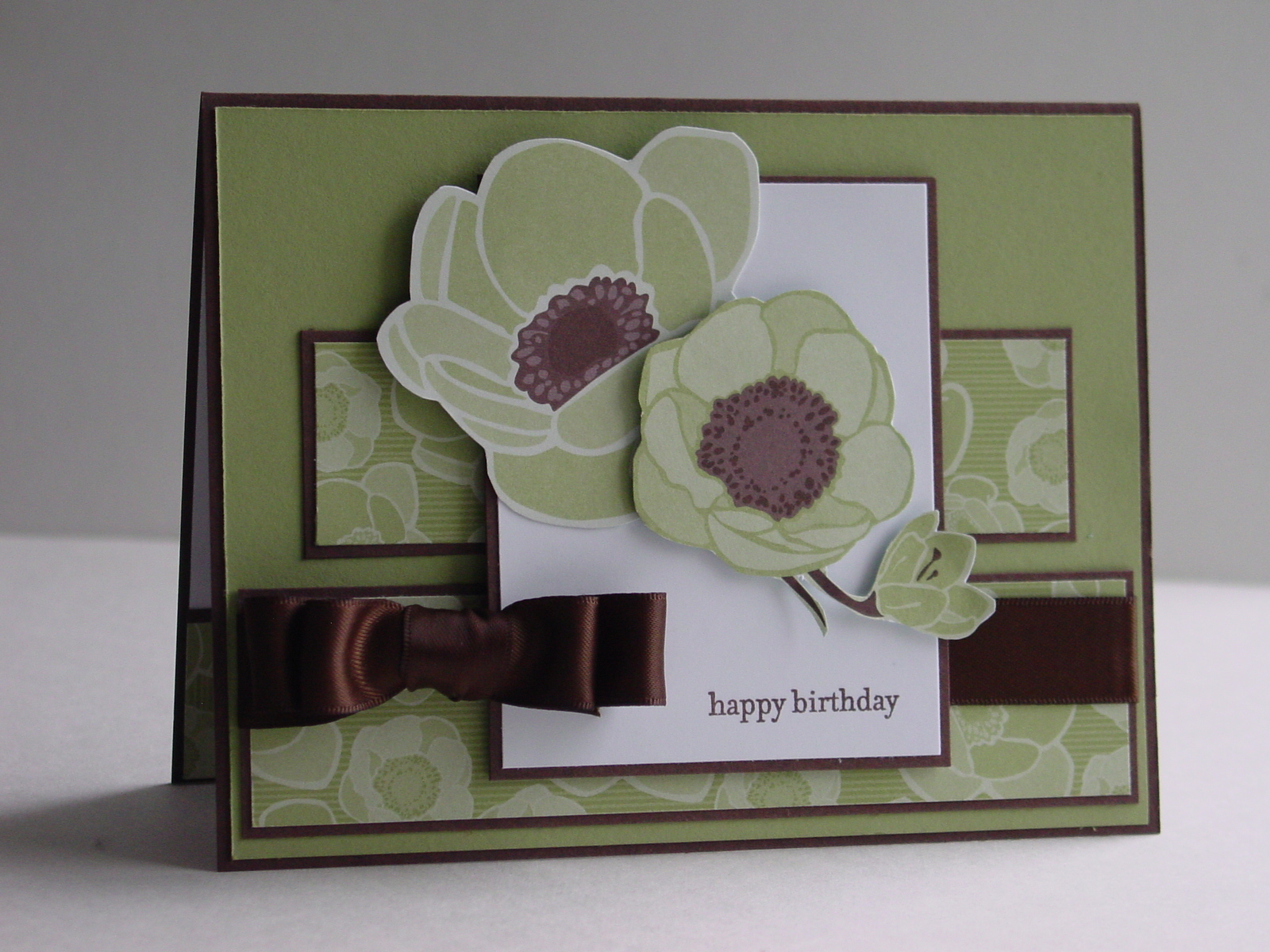
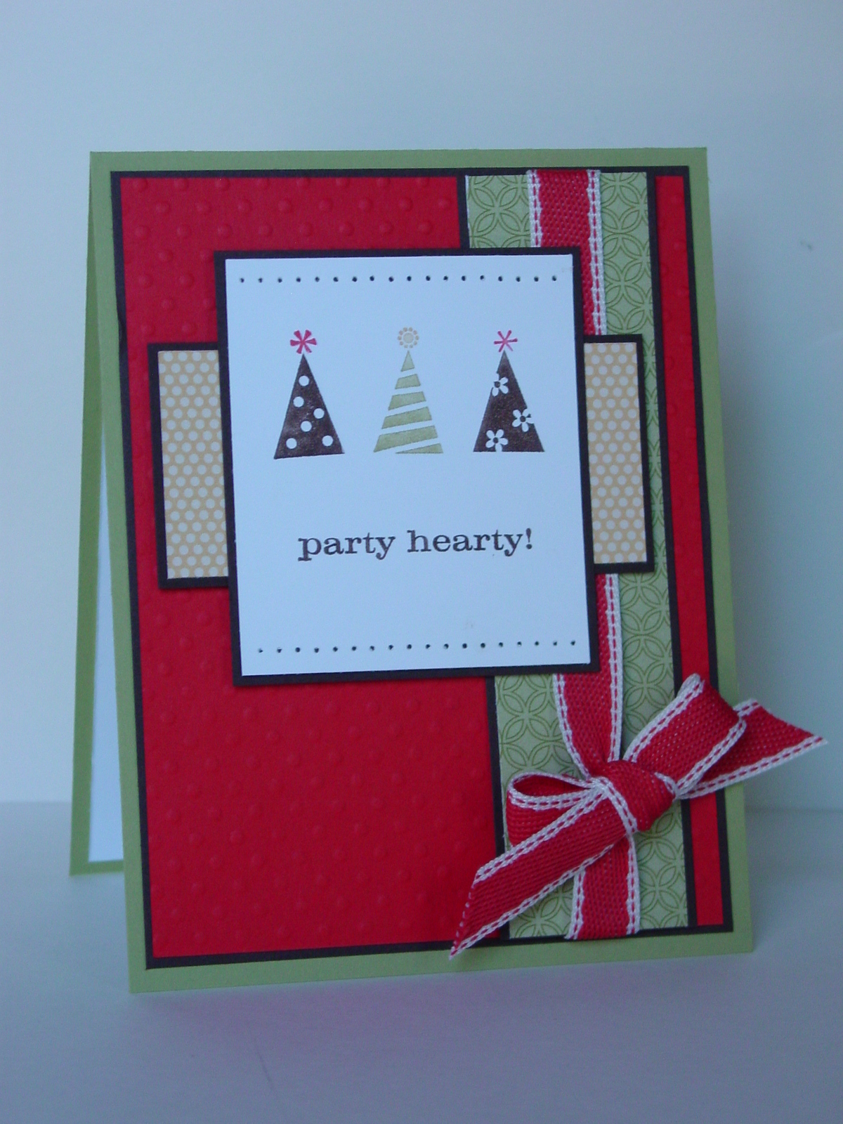
I found a great sketch over at Splitcoase today, SC302.  I liked it so much that I actually made two cards with it!  The first also uses the Color Throwdown 114 colors for this week, Poppy Parade, Pear Pizzazz, So Saffron and Chocolate Chip.  I actually substituted Early Espresso for the Chocolate because I am low on Chocolate paper (the horror!!).  I used the Play Date DSP as my starting point and added some dimension to the Poppy panel with my Big Shot and the Backgrounds 1 Texturz Plates.  The ribbon is from my little stash my upline gave me at Regionals.  I need a birthday card for one of my nephews and I think this will do the job nicely.

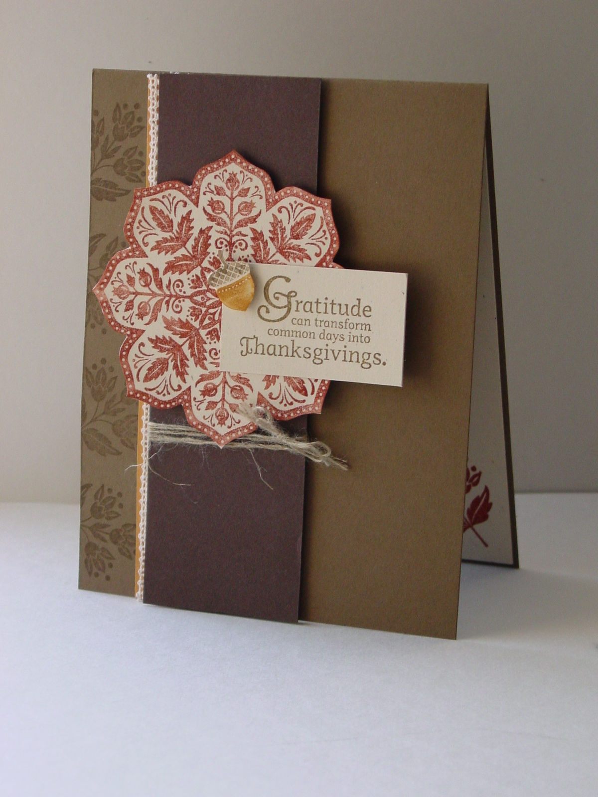
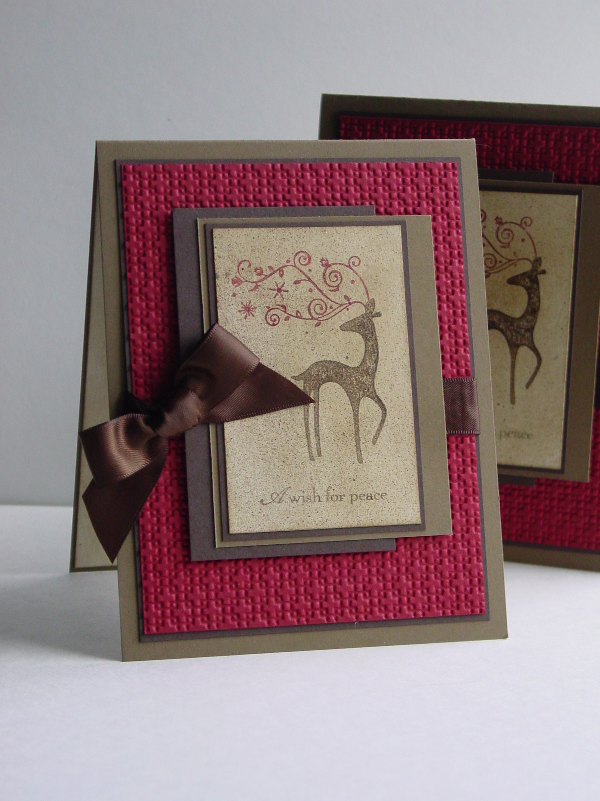
The first card came together so quickly that I had time for a second before heading out to the local “Cows and Corn” for a school field trip.  I had been playing around with the medallion from Day of Gratitude and the technique taught by Ilina Crouse at Regionals…Rock and Roll with a Twist and a Huff.  Mine started with More Mustard and I sponged on Cajun Craze using a sponge dauber.  I used the Square Lattice Embossing Folder this time and some of my cool buttons.  You all must know by now that I am a ribbon hoarder and this came off a package I received (Williams-Sonoma, I think).  Great match for Cajun Craze!  This is also for the Stampin’ Sisters in Christ challenge 60 to create a thank you card.  The scripture this week is:

1 Timothy 4:4 “For everything created by God is good, and nothing is to be rejected if it is received with thanksgiving…”

I still need some thank you cards so I’m glad to have another one completed.  The weather here is beautiful and field trip was fantastic.  There’s nothing like fall in Virginia!!  Hope your day is great too.  See you soon.

Card 1:  Stamp:  Party Hearty; Paper:  Play Date DSP, Poppy Parade, Early Espresso, Pear Pizzazz; Ink:  Poppy Parade, So Saffron, Pear Pizzazz, Early Espresso; Accessories:  Poppy Parade 1/2″ Stitched Poly Ribbon, Paper Piercer, Mat Pack

Card 2:  Stamp:  Day of Gratitude; Paper:  Cajun Craze, Early Espresso, More Mustard, Naturals Ivory; Ink:  Cajun Craze, More Mustard; Accessories:  Neutrals Designer Buttons; Dimensionals, Linen Thread, Non-SU Ribbon

All products are Stampin’ Up unless otherwise indicated.

Club projects

Club projects published on 5 Comments on Club projects

I had one of my Hostess Club meetings this morning and I finally get to post the projects.  I had such fun with these cards (and with my stampers)!  The first is a demonstration of the Cracked Glass technique using A Wish for Peace.  I love scenes like this with the antique look you get from cracked glass.  I sponged the horizon in So Saffron, Sahara Sand, Soft Suede and a touch of Chocolate Chip after stamping the main image in Soft Suede.  A little So Saffron was put in the church window and then I painted on Champagne Mist Shimmer Paint for the church.  The “snow” is Frost White Shimmer Paint applied with a slightly damp Aqua Painter.  Click on the picture to see all the details.  I embossed it, cracked it and applied a little more Soft Suede to help highlight the cracks.  The layout is last week’s sketch challenge from Splitcoast Stampers, SC301.  I used my new Victoria Crochet Trim and made just a little tab to add some interest.  The embossing on the Soft Suede comes from the Square Lattice Embossing Folder and my Big Shot.

The shimmer paints never photograph as pretty as they are but they are beautiful through the embossing.  I am also including my other project which is a shameless CASE of a card I saw at Baltimore Regionals.  I don’t know who the original designer is but thank you!  It uses my new Day of Gratitude set and I love the little bit of lace peeking out from the edge.  This big medallion is so wonderful and I’m in love with that little acorn!

It appears that I am fully into my fall color palette, now that I look at my last few cards!  I hope you enjoy these…thanks for stopping by!

Card 1:  Stamp:  A Wish for Peace; Paper:  Naturals Ivory, Soft Suede, Early Espresso; Ink:  Soft Suede, So Saffron, Sahara Sand, Chocolate Chip; Accessories:  Embossing Powder, Heat Tool, Big Shot, Square Lattice Embossing Folder, Shimmer Paints, Victoria Lace Trim, Dimensionals

Card 2:  Stamp:  Day of Gratitude; Paper:  Soft Suede, More Mustard, Early Espresso, Naturals Ivory; Ink:  Cajun Craze, Soft Suede, More Mustard; Accessories:  Victoria Lace Trim, Linen Thread, Dimensionals

All products are Stampin’ Up!

Birthday Flowers

Birthday Flowers published on 6 Comments on Birthday Flowers

Yes, yes, I know…it looks like I have been neglecting my stamping, but I haven’t!  I have been busily working on swaps for this weekend’s Stampin’ Up Regional in Baltimore.  I’ll be posting those on Saturday (while I am busily swapping them).  Until then, I needed a little break from all the browns and Cherry Cobbler (hint, hint).  One of my dear sisters-in-law has a birthday soon so I made a card for her.  It will be a little late by the time it gets there but I only profess to be a card maker, not a card sender.  I found a great sketch over at Splitcoast today.  It is their Sketch Challenge 300!!  Go take a look because they have some prizes.  Cool! 

I used my Greenhouse Gala paper and stuck to the Chocolate Chip and Pear Pizzazz pairing.  The big flowers are cut out of the DSP and one is popped up on dimensionals.  The words come from Teeny Tiny Wishes and fit just perfectly.  Finally the ribbon is the Espresso Satin and I love that it coordinates with the browns in the paper.

This Pear color remains one of my new favorites.  I thought maybe it would move back on the list a bit during my fall color transition but I love how it pairs with the Chocolate Chip and still feels seasonal.

Thanks for stopping in today.  Back to the card front assembly line for me!!  Have a great week!

Stamp:  Teeny Tiny Wishes; Paper:  Greenhouse Gala DSP, Pear Pizzazz, Chocolate Chip; Ink:  Chocolate Chip; Accessories:  Early Espresso Satin Ribbon, Dimensionals, Stamp-a-ma-jig

All products are Stampin’ Up!

Monochromatic Wish

Monochromatic Wish published on No Comments on Monochromatic Wish

I haven’t been posting this week because I have been working on some projects for a Blog Hop coming up this weekend.  I am participating in the Stampin’ Addicts Hop this weekend featuring products from Stampin’ Up’s new Holiday Mini.  My set is Rejoicing in Christmas and I have had so much fun it.  Here is a sneak peek:

Lots of sparkle, yes indeed!!  Make sure you drop back by this weekend.

Now for today’s post I have made another Christmas card using a beautiful set called A Wish for Peace.  I used the Sketch Challenge 295 from Splitcoaststampers and the Stampin’ Royalty challenge #34, Monochromatic Neutrals.  I chose brown as my neutral (big surprise) and started with Naturals Ivory paper.  I stamped the church image and then sponged on Sahara Sand, Soft Suede and Early Espresso ink for the sky.  Hard to see in the picture but I used Champagne Mist Shimmer Paint for the church and Frost White Shimmer Paint for the ground.  Finally, I used some Smooch Spritz on the whole image.  Pulled out the Square Lattice embossing folder (well, that would assume that it had been put away, but you understand), tied on the button with Linen Thread and attached the Espresso Satin Ribbon.  Here is the final result:

This card is going right into the stash for my Operation Write Home Challenge.  It came together quickly so I’ll probably make a few more just like it!

That’s it for today.  Make sure to stop back by on Friday (or during the weekend!).  Have a great Wednesday!

Stamp:  A Wish For Peace; Paper:  Naturals Ivory, Soft Suede, Early Espresso; Ink:  Soft Suede, Early Espresso, Sahara Sand; Accessories:  Big Shot, Square Lattice Impressions Folder, Shimmer Paints, Smooch Spritz, Espresso Satin Ribbon, Linen Thread, Neutrals Designer Buttons

All products are Stampin’ Up!

He's back…with a challenge

He's back…with a challenge published on 7 Comments on He's back…with a challenge

Oh, my little friend Dasher is back!!!  He went into a rest period after his big trip with Santa last year but it was time to pull him out again.  I seriously LOVE this reindeer!!  Now, rest assured, he is not back in this August heat without a really good reason…actually two reasons.  First, I have issued a Christmas card challenge to my steady group of stampers.  No excuses, no procrastinating, now is the time to start with the Christmas cards.  I asked them to figure out how many people they estimate to be on their nice list (you know, deserving of your finest card making nice).  Take that number and divide it by four, then make that many cards a month between now and November.  No muss, no fuss, and your cards are done before the true holiday panic sets in.

As of today I am putting out another challenge, or at least drive, request.  In one month, we will celebrate Patriot Day (Sep. 11th).  As a United Airlines pilot and a former Air Force pilot, I find this day particularly sad.  I would like, instead, to make it a day of thanks for those serving in our Armed Forces.  If you are not familiar with Operation Write Home, click on over there right now and then come back for my challenge. 

I am looking to join in with them to celebrate their Birthday Bash.  I’m asking my stampers to donate as many cards as possible to the cause (some Christmas and some all occasion) and I will end my month with an Open House on Sep. 10th.  If you live in Northern VA and would like to donate cards, please let me know and I will get you the specifics.  Operation Write Home does have some pretty specific rules about glitter (NONE) for the safety of our troops, so please nothing sparkly that can rub off in any way.

Ok, so now that I have TWO card challenges in place, I needed to get going!  I found the sketch over at Splitcoast today (SC293) really helpful to get me moving.  Additionally, I wanted to add some embossing for the Our Creative Corner challenge – It’s Embossable.  Naturally I pulled out my new Square Lattice embossing folder…yea!  As I stated above, there is no glitter allowed on the OWH cards but a little shimmer is always a good thing.  I started with a Naturals Ivory panel, sponged it with Soft Suede and then applied Champagne Shimmer Paint with a sponge dauber.  A little mist of Smooch Spritz and I was ready to stamp on Dasher (p. 20 IBC) and the words from A Wish for Peace (p.38 IBC).  I inked up “A wish for peace” because it seems particularly appropriate for my OWH kick-off.  The Cherry Cobbler embossed panel really added the dimension I wanted for this and the Early Espresso satin ribbon finished off the card.  I just wish you could see the shimmer on little Dasher!

Now, you will notice that there are two cards.  Part of my OWH request was that every time a card gets stamped, just make two.  Yep, design once, stamp twice!!  Easy!  Yes, I know where is he??!!!!  Wait no more…

You can click on the photo to see it bigger if you’d like.  Now aren’t you glad to see this fellow again??  Both of these are going into my OWH stack and I will take a picture on Sep. 11th with the final result. 

I hope that this motivates you to donate some cards too.  There are shipping details and lots of card ideas at the OWH site.  Thanks for dropping in today.  Happy stamping!!

Stamps:  A Wish for Peace, Dasher; Paper:  Cherry Cobbler, Soft Suede, Early Espresso, Naturals Ivory; Ink:  Cherry Cobbler, Soft Suede, Early Espresso; Accessories:  Champagne Shimmer Paint, Big Shot, Square Lattice embossing folder, Espresso Satin Ribbon, Dimensionals

All products are Stampin’ Up!

Jazzed up Flowers

Jazzed up Flowers published on No Comments on Jazzed up Flowers

The challenge over at Stampin’ Royalty today is to “Jazz it up” and what a fun thing to do.  I knew I wanted to join in as soon as I saw the cool projects the Goddesses had made!  You start with a basic card or other project and then create a jazzed up version.  I didn’t have anything around that worked so I created a new basic card using the Splitcoast sketch challenge, SC283.  Here is my basic card:

I used the soon to be retiring DSP, Lovely Flowers (hostess) and cut out a flower panel and then used the other patterns to add to the layout.  I have really loved using this paper when I need a quick card that still has a wow factor!  At first I thought that I might even like the basic card better but then…

Well, I added some ribbon (SAB’09 Ret), cut out a flower and popped it up with a dimensional, and put on a sentiment (to match the scallop trim), and here is the jazzed up version:

Ok, I’m convinced…jazzing up was the right thing to do!  I just love this color combination and I am so happy that ALL of these colors will still be available as part of the Color Renovation.  While this DSP will be gone, I can tell you that I have seen a sneak peek of a DSP that has similar qualities.  The new catalog launch is just around the corner!!  Can’t wait!!

Thanks for stopping in!  Here is one more picture of the two cards together.  Have a great day!

Stamp:  Short & Sweet; Paper:  So Saffron, Rich Razzleberry, Lovely Flowers DSP; Ink:  Melon Mambo; Accessories:  Scallop Edge Punch, Scallop Oval Punch, Saffron Ribbon (Ret), Dimensionals

All products are Stampin’ Up!

Brilliant Olive Pumpkins?

Brilliant Olive Pumpkins? published on No Comments on Brilliant Olive Pumpkins?

No specialty pumpkins here, just a cool color combination from Stampin’ 411!  Their Color Inspiration calls for Brilliant Blue, Old Olive and Pumpkin Pie.  I was a little skeptical at first but the colors are really fun together (and I need a fun birthday card!).  I saw the sketch challenge over on Splitcoast yesterday (SC279) and had to give it a try.  These colors seemed to call for using my Sweet Pea DSP (from the Occasions Mini).  That paper pack has sure been great to use…so many super designs and so much paper!  I pulled out the Big Shot and created some butterflies with the Beautiful Wings Embosslit (still available!).  This card came together so quickly but it still felt like it was missing something.  You know, when in doubt try ribbon or punch some holes for texture!!    Ribbon didn’t work so out came the Mat Pack.  A few holes later…here it is:

This is just the kind of card I was hoping for!  I love the unique layout and these colors are a bit out of my norm.  I have lots of Brilliant Blue so I am happy to have used some of it.  Thanks for stopping by to take a look.  Have a great day!

Stamp:  Short & Sweet; Paper:  Sweet Pea DSP (ret), Old Olive, Brilliant Blue, Whisper White; Ink:  Old Olive; Accessories:  Big Shot, Beautiful Wings Embosslit, Mat Pack, Paper Piercer, Thread

All products (other than thread) are Stampin’ Up!

A True Friend…

A True Friend… published on No Comments on A True Friend…

I am lucky to have a number of amazing, true friends in my life and this is for one of them.  I guess there is double meaning since I am starting my fond farewell to some other “true” friends…one of which is Sage Shadow.  I must admit that I was a latecomer to the Sage Shadow fan club.  I could never make it work.  Then this lovely Nouveau Chic paper came out and I am happy with every card!!  But, I already have a sample of the newest colors that will be arriving in the Color Renovation (a wonderful perk of being a demo!) and I am sure that I will have new friends in no time.  Until the new catalog, though, I will happily use my lovely retiring colors with reckless abandon!  Yes, you’ll be happy to know that I am not at all that fickle when it comes to my real friends.  They are rocks in my life and I don’t know what I would do without them!!  So to my dear friend (she knows who she is), thank you for being a wonderful person!

The card uses the Splitcoast sketch challenge 278 which is a wonderful square card layout.  This is another of those sketches that will become a go-to for me, I think.  I used the retired SAB ’09 Botanical Blooms for the image and the words from Lovely Flowers (Hostess).  While it isn’t a part of the promotion, I convinced myself that the two-step stamp was in the spirit of the Two-Step into Spring promotion (details on my side bar).  The ribbon and the button just kind of came to me at the end when it didn’t look quite finished.  That really seemed to put the right touch on the card. 

The colors look a little washed out in the picture to me compared to the card but you get the idea.  I’m so happy you dropped by.  Have a great day!!

Stamps:  Lovely Flowers (hostess), Botanical Blooms (SAB’09 Ret); Paper:  Nouveau Chic DSP, Sage Shadow, Basic Gray, Watercolor; Ink:  Going Gray, Sage Shadow, Apricot Appeal; Accessories:  Gray Taffeta ribbon, Gray Corduroy button

All products are Stampin’ Up!

It's a Nouveau day!

It's a Nouveau day! published on No Comments on It's a Nouveau day!

Nouveau Chic, that is!  I felt like moving away from the pinks and spring greens for something a little different.  One of my dear sisters-in-law and her husband have an anniversary coming up and I need a card for them.  She has beautiful taste with gray being a popular color for her decorating.  Nouveau Chic was an obvious choice, don’t you think?  I have to admit that when I bought this DSP, I thought I was going out of my box for colors.  I quickly found out that this paper easily lends itself to beautiful cards.  Watercoloring seems to be my technique of choice when I am using these colors.  I pulled out my Fifth Avenue Floral set again today.  Starting tomorrow, Stampin’ Up begins its Two-Step into Spring promotion and this set (along with some others) will be 20% off retail price.  This set has been a favorite of mine since the day I opened it.  If you don’t already have it, this price it too good to be true!  Here are all the sets that have the discount:

Item  Page  Description  Discount Price 
113824  94 Greenhouse Garden  $20.76 
113734  98  Fifth Avenue Floral  $19.96 
111578  101  Flower Fancy  $29.56 
113258  112  Trendy Trees  $14.36 


Now back to the card…  I used the sketch from Splitcoaststampers Sketch Challenge 274.  This is another great one with loads of possibilities.  I almost turned it on its side for a different look but the original sketch worked better for this particular card (maybe I’ll get another chance at it tomorrow!).  The Technique Lover’s Challenge 266 at Splitcoast this week is an Inside Out challenge.  In other words, decorate the inside to coordinate with the outside.  I am so happy I took the extra step inside!! 

SC274, TLC266 - Anniversary


And here is the inside:

TLC266 - Anniversary for Millers inside

I bet you are wondering about the ribbon, aren’t you??!!  Well, it doesn’t take too long looking at my blog to realize that I am a ribbon addict, hoarder, collector!  I love SU ribbon, I can’t stop with it!  Why…because it is so easy to work with and the textures are so beautiful!  Today I am working with the Basic Gray Taffeta ribbon.  This one is easy!!  Cut a piece about 50% longer than you need and make each end a straight cut (vs. on the angle).  Unravel one end just a little until you can see the individual threads that go lengthwise through the ribbon.  Find a middle thread and start to pull.  The ribbon will start to smush together and you just work it down the piece until you have what you need.  I attached the ends at the back with mini glue dots.  On the piece inside the card, I used a couple extra glue dots to make sure such a long piece stays secure.  I love the texture it provides for not very much actual effort! 

I used my watercolor blender pen with Sage Shadow and Going Gray ink to color the flowers, then used the fine tip end of an Apricot Appeal marker to color the centers.  The “Love” word is from Well-Scripted (still available for another month).  I inked it using a Going Gray marker being careful at the connection point between “love” and “you”.  The fine tip of the marker fixed the tiny break in the script. 

Thank for dropping by today.  I really appreciate your comments!!  Off to work in the yard on a lovely day in VA!!  Have a great day!

Stamps:  Fifth Avenue Floral, Well-Scripted, Of the Earth (inside); Paper:  Nouveau Chic DSP, Basic Gray, Very Vanilla, Watercolor (for flowers); Ink:  Going Gray, Basic Gray, Sage Shadow, Apricot Appeal; Accessories:  Basic Gray Taffeta ribbon, Dimesionals, Blender Pen

 All products are Stampin’ Up!

Razzleberry Easter

Razzleberry Easter published on 4 Comments on Razzleberry Easter

Today I had the time to sit down and make a card “just because”.  No intended recipient, no class, just because I felt like it!  Yea!  Of course, I’m sure I will use something from it since I am starting to plan for a watercoloring class in April.  I went to the Splitcoast sketch challenge for today, SC270,  and it was really interesting.  I wasn’t sure how I felt about the panels having the asymmetry.  Once I started with it, though, I found it easy to work with!  I had some scraps from my Lovely Flowers DSP (hostess) that were crying out to be used…another bonus of this layout!!  Now, I must confess that the reason I had scraps of the Razzleberry paper was because I had used the fun dots on the other side.  Razzleberry hasn’t been my most used In Color this year.  But, seeing that I seem to have Seasonal Stamper’s Disorder (SSD)*, the purple was suddenly really appealing to me.  Purple this time of year does seem to demand an Easter card so here we are!!  I stamped the flower from Lovely Flowers in Stazon on Watercolor Paper and then used my blender pen to color it with Crushed Curry and Rich Razzleberry.  On the strip with the DSP, I originally only had the DSP on the Chocolate Chip.  As I looked at the card, it just seemed a bit dark.  I put in the Very Vanilla layer, used the SAB border punch  and that seemed to do the trick!!  I also divided up the panels with small strips of Chocolate Chip card stock to give them definition.  The entire card still seemed to be missing something so I naturally turned to ribbon!!  Unbelievably (because for me, ribbon usually fixes everything!), it just didn’t provide the balance I was looking for so I dug out my paper piercing tool and my mat pack and voila!

SC270 - Lovely Easter


Of course, I wanted the inside of this card to be special, too.  I had just the perfect word set!!  The retired SU set, Glorious Gift, has been well used every Easter since I got it.  Easter truly is a glorious gift from God!  I set the words off with a few more watercolored flowers and I feel like the card is as special as the holiday.  I hope you think so, too!  Thanks for stopping by!

Lovely Easter inside


* Seasonal Stamper’s Disorder – The tendency to change color favorites with the seasons!!

Card details:

Stamps:  Lovely Flowers (hostess), Glorious Gift (ret), Well Scripted (Occasions mini)

Paper:  Lovely Flowers DSP, Old Olive, Chocolate Chip, Very Vanilla, Watercolor

Ink:  Rich Razzleberry, Old Olive, Chocolate Chip, Crushed Curry, Stazon

Accessories:  Blender pen, Mat pack, Paper Piercing tool, Dimensionals, Scallop Trim Border punch

All products Stampin’ Up!

Primary Sidebar