Skip to content

Newton’s Nook Designs February Release – Newton’s Pot of Gold

Newton’s Nook Designs February Release – Newton’s Pot of Gold published on 33 Comments on Newton’s Nook Designs February Release – Newton’s Pot of Gold

Are you ready for another week of amazing releases from Newton’s Nook Designs???  Just say yes because you are going to LOVE what we have to show this week!  First up Newton himself is making an appearance and he seems to have the luck of the Irish!  Newton’s Pot of Gold is being featured along with the Land Borders die set.

Newton Finds the Gold by Jen Timko | Newton's Pot of Gold Stamp Set by Newton's Nook Designs, Land Borders Dies #newtonsnook
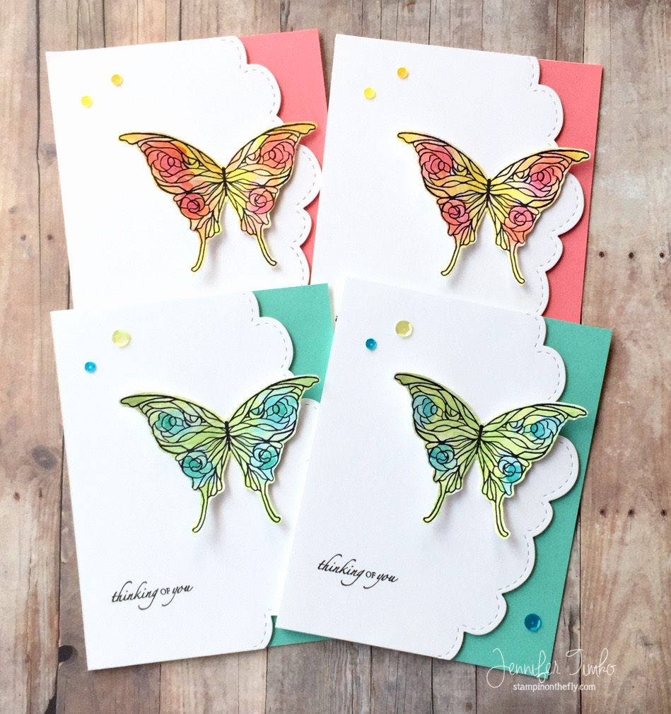
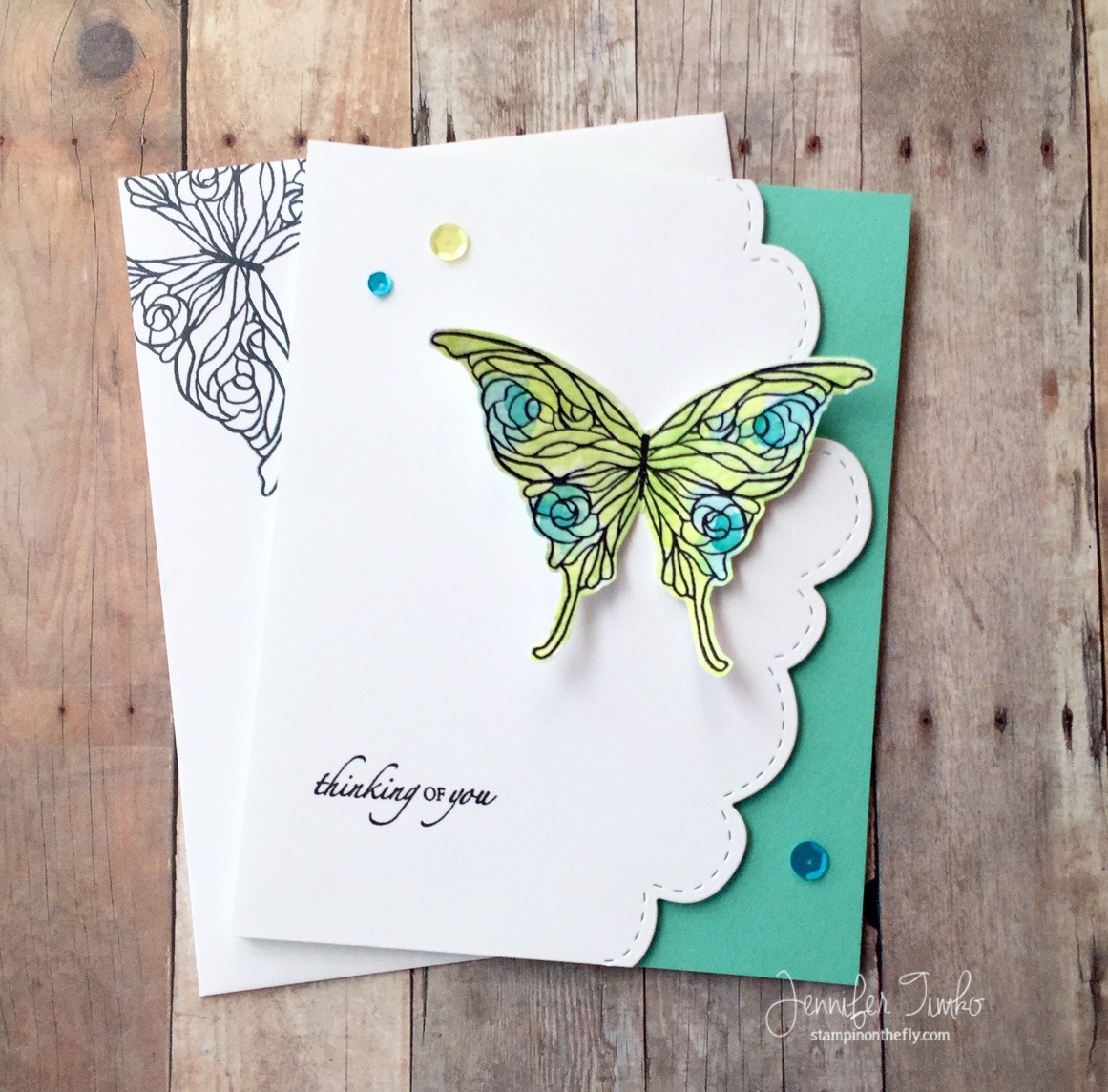
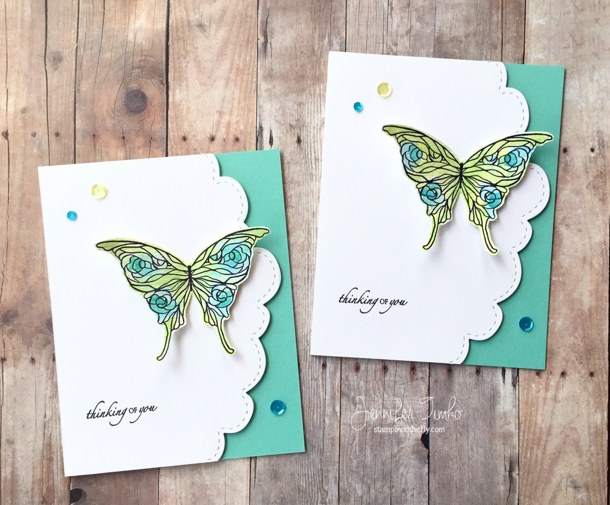
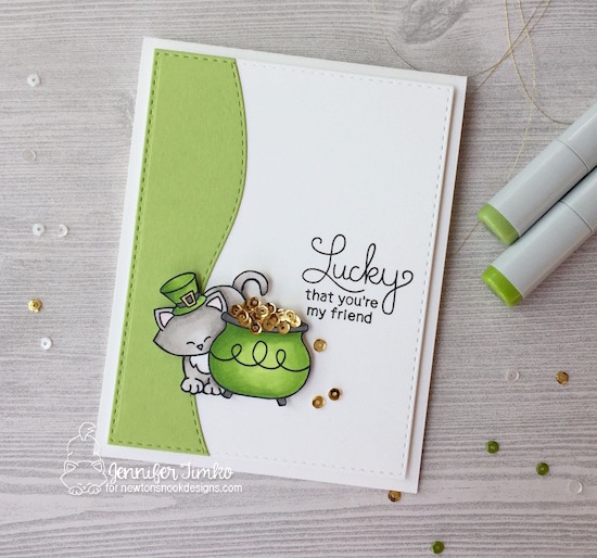
This sweet little stamp set is perfect for your St. Patrick’s Day fun but I love that the sentiments will be ones you can turn to again and again.  I started by coloring my image with Copic Markers (colors listed below) and while I was coloring, I had some inspiration.  How about using sequins as gold?!  Yes, they are totally perfect with the scale of the image and I could not even be more excited about how this turned out.  So how did I get the sequins on there?  It was actually easier than I thought it would be.  I put a ‘blob’ (yep, official crafting term) of Ranger Multi Medium Matte Glue on a scrap of paper and then using a toothpick end, applied the glue where I wanted it to be.  Then just added the sequin on top.  I put down one layer in the placement of the gold on the stamp image and once dry, added some more on top.  This glue dries pretty quickly and most importantly, it dries with a matte finish.

I needed just the right layer for this fun image to go on, so I created a little interest using the Land Borders Die. I cut a piece of Green Apple Card Stock (SSS) with the border die, then laid it on some white card stock and cut again with a stitched rectangle.  The sentiment is really one that I’m happy to add to my repertoire (being a hoarder collector of sentiments).  Now here is the best part….

Would you like to win the “Newton’s Pot of Gold” Stamp Set?
This set will be given away to ONE lucky winner

Here’s how to win: 

Comment on the NND blog and Design Team blogs (see list below)! The winner will be chosen at random from the collective reveal posts. Make sure to check out each of their blogs and comment for your chance to win. You will not know which blog has been chosen so the more you comment on the better your chances are of winning! You have until Thursday February 16th at 9pm CST to comment  — winners will be announced on the blog post on Friday, February 17th. 


I am so happy that you stopped in today.  Tomorrow will be Day 2 of release week and I know you will be thrilled to see what comes next.  I hope you have a great day!

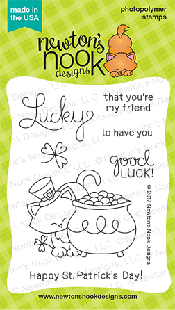
Copics:  Newton – W2, W3, W5;  Pot and Hat – YG03, YG25, YG17, Y35, E31

Stamp: Newton’s Pot of Gold (Newton’s Nook Designs); Ink:  Momento Tuxedo Black,  Copic Markers; Paper:  Green Apple (Simon Says Stamp), Thick Whisper White (SU); Accessories:  Big Shot, Land Borders Die (Newton’s Nook Designs), Stitched Rectangles (Simon Says Stamp), Misti Stamp Tool, Sequins (Pretty Pink Posh), Dimensionals


Signature 2016 - 1

The Card Concept #58

The Card Concept #58 published on 15 Comments on The Card Concept #58

cc58-you-are-enoughI am so happy to share this card with you today for The Card Concept!  First of all, I cannot even being to tell you how much I love this sentiment.  I have been looking for the perfect place to use it and this card was definitely it!  We all need to hear this message over and over (and over and over…..).  There are so many people that will try to convince us that we need to change, that we need to do just one more thing, that there is something wrong with us somehow.  Nope!  Not true.  None of that.  While there is nothing wrong with working to be the best you, at the end of the day YOU ARE ENOUGH.

Ok….with all that out of the way, I’m going to admit out loud that this inspiration photo completely freaked me out.  I first saw it and I had nothing, nada, zilch.  I pondered how bad it would be to just call uncle and bail out this week, haha!  No, I’m not kidding.  So I walked away.  For a week!  And then it was time to face the challenge and woman up!  So I looked at it a different way and saw fun colors and that stitching and I had my answer.  Whew!!!  I used this fun striped print from Pop of Pink and simply added a shaker with stitched circles.  All I had to do was mix up two of my Pretty Pink Posh sequin mixes to get the colors from the inspiration.  I took the Summer Mix and pulled out the teal and added some of the green from the Birthday Bling Mix.  Perfect!  And a Clean and Graphic card created with no wimping out!  Sometimes challenges that give me the most trouble to start help me create some of my favorite cards.  Totally true for today’s card.  I am also submitting this for the Can You Case It challenge this week:  Shaker Cards!

58cyci138-300x300I hope you will join right in with us on this one.  Use any part of the inspiration photo and pick a style for creating….then off you go!  Can’t wait to see you in the gallery.  Now this is my second post of the day.  You can see my Freshly Made Sketches post by just scrolling.  Thanks for stopping in today.  See you soon!

Supplies (affiliate links included):

Stamps:  Lovely (Essentials by Ellen – Ellen Hutson); Ink: Versafine; Paper: Thick Whisper White, Pop of Pink DSP; Accessories:  Big Shot, Stitched Mat Circles (LID), Sequins by Pretty Pink Posh (Summer Mix, Birthday Bling Mix for Concord and 9th), Window Sheet, Foam Tape

Signature 2016 - 1

The Card Concept #57

The Card Concept #57 published on 10 Comments on The Card Concept #57

Jen Timko - CC57 - Just a NoteAfter a summer hiatus, we are back to stamping over at The Card Concept!  And we are starting you off on a happy note with a fabulous inspiration piece that you are sure to love.

As soon as I saw all those little plants in the bright rainbow pots, I thought of this stamp set from an old Paper Pumpkin kit (SU).  The little coffee cut just begs to be colored and the sweet plant is a perfect touch.  I want this in real life!!  I added a sentiment from the Watercolor Wishes set.  I just thought this font was a nice match for the image.  All of my coloring is using Tim Holtz Distress Inks in a variety of colors.  The pink is Picked Raspberry which I totally adore!!  I added these sequins from Pretty Pink Posh that mimic the colors from the inspiration and cut the panel using my Wonky Stitches Dies from My Favorite Things.  In keeping with the Clean and Graphic style, I put my image panel up on a white card base to complete it.

The Card Concept #57Just an admin note, this is my second post of the day.  If you are looking for my card for the Freshly Made Sketches challenge, just roll down.  Thanks for stopping in today.  I hope you are inspired by the team and have a great time choosing YOUR style this week for the challenge!  See you soon!

Supplies (affiliate links included):

Stamps:  Paper Pumpkin (cup and plant), Watercolor Wishes; Ink: WPlus9 Black Dye Ink, Tim Holtz Distress Ink – Twisted Citron, Mowed Lawn, Picked Raspberry, Squeezed Lemonade, Spiced Marmalade; Paper:  Tim Holtz Distress Cardstock, Thick Whisper White; Accessories:  Big Shot, Wonky Stitched Rectangles STAX (MFT), Dimensionals,  Sequins by Pretty Pink Posh (Share Handmade Kindness Mix, Summer Mix), Ranger Mini Ink Blending Tool

Signature 2016 - 1

Freshly Made Sketches #253

Freshly Made Sketches #253 published on 6 Comments on Freshly Made Sketches #253

FMS253 - ThanksOh do I have a fun one to share this week over at Freshly Made Sketches.  The lovely Jennifer Brum is our hostess this week and she had this “out of the box” sketch for us that I just love!  You are going to think of so many things to make!!

I pulled out my Pop of Pink DSP and Washi Tape and played around with some ideas before I decided….hang on…..to mostly keep it super simple.  I know, shocker right?!!  Haha!!  I hadn’t used this flower die (Echo Park Paper Co) in a while and thought it would be great for the sketch.  I thought it would be fun to use the die on this DSP and I like the effect.  I took the coordinating Washi Tape and attached to a strip of white card stock.  Not really the intended use but I just loved this particular pattern under the flower so…..  The sentiment is from Paper Pumpkin (the same kit as my FMS card with the fall flowers last week).  I think this curved font worked really well, don’t you??  A few sequins to finish.

FMS Final 253-001This is my first post of the day but don’t be surprised when another goes up soon.  The Card Concept Team is back from their summer break with a great challenge.  So….three cards from me in two days.  See, I have been a little more busy with my stamping!  I hope you get some time to create too.  See you soon!

Supplies:

Stamps:  Paper Pumpkin (SU); Ink: Versafine Onyx Black; Paper: Thick Whisper White, Pop of Pink DSP; Accessories:  Big Shot, Flower Die (Echo Park Paper Co.), Sequins (Pretty Pink Posh and SU), Dimensionals, Glue Dots, Pop of Pink Washi Tape

Signature 2016 - 1

Stamp Ink Paper #64

Stamp Ink Paper #64 published on 1 Comment on Stamp Ink Paper #64

SIP#64 -Botanical BirthdayI have something fun to share with you today!  I get to be a guest designer with the Stamp Ink Paper Challenge over the month of September!  Awesome!!  And lucky for me they started off “easy” (for me) with a Less Is More challenge this week.  Right up my alley!

Back in July I has colored this flower from Altenew’s Botanical Garden for the 30 day coloring challenge but never used it for anything.  But there it sat calling out to me.  I thought it would be perfect for this kind of challenge since a clean card allows focus on the flower itself.  Just a couple of colors of Zig Clean Color Pens can create such a beautiful look!  I love the wash on this flower!  The sentiment comes from a Paper Pumpkin Kit (love that font!!) and seemed just right to match the style of the image.  I cut the panel using my trust Stitched Rectangles dies and added a few Sparking Clear Sequins from Pretty Pink Posh.  These have a touch of gray to them but also can take on colors behind them.  My favorite sequins!

14207753_10153802923923531_4274181975561845747_oI hope you will join in with us for this week’s challenge.  Super fun inspiration from the DT for sure!  Back tomorrow with the latest from Freshly Made Sketches.  Until then, I hope you have a great start of your week!

Supplies (affiliate links included):

Stamps:  Botanical Garden (Altenew), Paper Pumpkin (sentiment); Ink: Zig Clean Color Pens, WPlus9 Black Dye Ink, Versafine Onyx Black; Paper: Tim Holtz Watercolor Paper, Basic Gray (SU); Accessories:  Zig BrusH2O, Big Shot, Stitched Rectangles (SSS), Dimensionals, Sparkling Clear Sequins (PPP)

Signature 2016 - 1

Freshly Made Sketches #250

Freshly Made Sketches #250 published on 10 Comments on Freshly Made Sketches #250

FMS250 - Merry ChristmasI’m sure you have already been blown away by the amazing Cécile Ribon in her time as a Guest Designer at Freshly Made Sketches.  Well, this week she took on the task of being our sketch hostess.  And look at what she came up with!!  It really is fun!

I wanted to play a little more with O Christmas Tree from Concord and 9th as a continuing celebration of their first birthday.  The fonts from this set are so fabulous and the variety of images are super fun.  I took a panel of watercolor paper and inked it up with Tim Holtz Distress Inks in a variety of blues.  Then I splattered it with some water to see what would happen.  True confessions….this was actually my third panel….I messed up the embossing on the first two….yes, it was THAT stamping day.  The interesting finding in all this was the differences you get with varying brands of watercolor paper.  This paper is the Fabriano 140 lb Cold Press but I has also played with the Tim Holtz Distress Watercolor Paper.  They have different textures (Tim Holtz has a smooth side and a rougher side) and the water spots move the ink in different ways.  It is like a fun experiment to play with them!!  I found that the Fabriano held onto the color just a little more and the texture really shows when you sponge on the colors.  I think the effect on this is pretty and I didn’t want to distract too much from it.  I added the snowflakes from the set by stamping in Versamark and heat embossing with White Stampin’ Emboss Powder.  I pulled a snowflake wooden element from my stash (SU) and heat embossed it in white too.  The sentiment was stamped onto a Night of Navy panel the same way.  I added a few Sparkling Clear sequins which I love for how they morph depending on the background.

FMS Final 250-001I hope you have a great time playing with this sketch!  The angled panel allows for so many great options.  Make sure you stop by and say hi to Cécile too.  This is her first sketch and I think she did a great job!!  Trying to fit in some more stamping today.  Hope to have more to share soon.  See you then!


Supplies (affiliate links included):

Stamps:  O Christmas Tree (Concord and 9th); Ink: Versamark, Tim Holtz Distress Ink – Tumbled Glass, Broken China, Chipped Sapphire, Blueprint Sketch; Paper:  Fabriano 140 lb Cold Press, Night of Navy; Accessories:  Dimensionals, Heat Tool, White Stampin’ Emboss Powder, Sparkling Clear Sequins (PPP)Ranger Mini Ink Blending Tool, Snowflake Wooden Element (SU Retired)

Signature 2016 - 1

O Christmas Tree in Gold and Silver

O Christmas Tree in Gold and Silver published on 1 Comment on O Christmas Tree in Gold and Silver

DTGT16jentimko - O Christmas TreeThe most wonderful week of inspiration continues today over at Splitcoaststampers!!!  It is Dare To Get Dirty Challenges week and you will not even believe all that SCS has already done!  As a former “Dirty Girl”, I get to participate on the planning side and today is the day for my challenge!!  How do you get to see all this fabulousness??  You simply have to be a Fan Club Member at Splitcoaststampers.  Not only can you see all the details of the challenges, you can participate with present and past Dirty Girls.  My sample makers have created the most awesome inspiration.  I hope you will come check it out!  You can see all the cards for my challenge HERE.

I can’t share the details of the challenge but I think you will not be too surprised by my choice of challenge!  As I was making cards, I was actually inspired to make two variations.  Gold and Silver!  They used the new set from Concord and 9th called O Christmas Tree.  I am totally in love with the sentiments and the great trees!  As an extra bonus, Concord and 9th is celebrating their first birthday so I wanted to join in on their party!  I heat embossed the trees on Thick Whisper White card stock (in gold and silver) to put as the base of my shaker cards. For the gold version, I used Pop of Pink DSP’s gold confetti pattern and cut it using the Stitched Rectangle Dies (SSS).  The silver version uses a retired DSP.  I added sequins based on the color of embossing.  The gold is from SU’s Metallic Sequins and a retired holiday pack while the silver are the Pretty Pink Posh Sparkling Clear sequins.  Now for that bit of sparkle on the sides.  Remember back during Sale-a-bration when the Glitter Tape was one of the choices?  Yeah.  I HAD to have that and I got it with the holidays in mind.  It is so easy to use and it adds so much!!  I heat embossed the sentiments again and done!  Now…..which is your favorite??!!  My house is split on their decision (which is why I posted both).The challenges this week really are amazing and your need to come check out the gallery!!  I hope you will go over and check out my challenge and join in!!  Thanks so much for stopping in today.  See you soon!

Supplies (affiliate links included):

Stamps:  O Christmas Tree (Concord and 9th); Ink: Versamark; Paper:  Thick Whisper White (SU), Pop of Pink DSP, Retired DSP; Accessories:  Big Shot, Stitched Rectangles Dies (SSS), Dimensionals, Heat Tool, Gold and Silver Stampin’ Emboss Powder, Sparkling Clear Sequins (PPP), Metallic Sequins (SU)

Signature 2016 - 1

Blogs 4 Boobies Blog Hop and Card Auction

Blogs 4 Boobies Blog Hop and Card Auction published on 16 Comments on Blogs 4 Boobies Blog Hop and Card Auction

Jen Timko - B4B - Butterfly SetI have something incredibly special to share today!  I am participating in a very special kind of blog hop.  Not only are designers sharing their beautiful work, but we are working together for a very special cause!  Skipping Stones Design has coordinated this Blogs 4 Boobies Hop and Auction to raise money for the Susan G. Komen Foundation.  There is no doubt in my mind that cancer has touched each of you in some way.  For me, personally, I lost my father to cancer and have another dear family member who is fighting the good fight right now.  So how can you help?BannerShopping at Skipping Stones Design:  Between June 1st and June 14th, there will be $2 donated for every stamp sold at SSD.

You can help by bidding on the auction items.
 
***Bidding Instructions***
1. To bid on the card set I’ve posted today:
Leave a comment below with your bid amount and your email address.
Starting bid is $5.
Only comments on this post will be eligible for this card auction.
Comments without an email address are invalid.
(Including your email address is the electronic equivalent of signing your bid.)
2. Comments will post in chronological order, so you will be able to see the current high bid.
3. Return frequently to see if you’ve been outbid and to place a new high bid.
(Below the comment field, you’ll see a “subscribe to post comments” option. You can subscribe if you would like notification of additional comments.)
4. My auction closes at 8 pm Mountain Time on June 11th (10 pm Eastern Time).
The winning bid will be the highest valid bid at the close of the auction. I will notify the winner by email. Skipping Stones Design will send the winner an invoice for the amount of the winning bid. Once the invoice is paid, I will mail the card!

Please spread the word!  When more people know about this event, we have a better chance of raising more money for this great cause!

This is a 7 day event and I’m am hopping on day 5.  You can go refer to the Skipping Stones Design link at the top of my blog roll to see all of the designers who are participating (there are more than 60).


Jen Timko - B4B - Coastal ButterflyNow for my card set!  I created a set of 4 cards that I hope you will love.  These use the butterfly from Healing Wings and the sentiment from Breathtaking Butterflies.  I used Tim Holtz Distress Inks on Watercolor Paper to color this amazing image.  Once they were colored, I hand cut them to help them pop on the page.  I started with blue and green inks combined with a Coastal Cabana base.  I had so much fun making it, that I made two. Jen Timko - B4B - Coastal PairThen I decided I should make a set of four cards and wanted to try another color scheme.  So I played around with yellows and oranges and found that the resulting butterfly matched my new Flirty Flamingo card stock.  Jen Timko - B4B - Flamingo butterflyI colored in much the same way and simply added different sequins to match the inks.B4B - FlamingoI love the results on both colors of cards!!

So now we get down to the nitty-gritty!  I hope you will consider bidding on this set.  Please remember to leave your bid and your email address in the comments of this post to be eligible.  You are also most welcome to leave comments without a bid since I always appreciate hearing from you!Jen Timko - B4B - Auction SetSupplies:

Stamps:  Healing Wings (SSD), Breathtaking Butterflies (SSD); Ink: Tim Holtz Distress Inks, WPlus9 Black Dye Ink, Versafine Onyx Black; Paper: Tim Holtz Watercolor Paper, Thick Whisper White, Coastal Cabana (SU ret), Flirty Flamingo (SU); Accessories:  Big Shot, Bold Butterflies Thinlits, Border Builders Die (LID), Summer Mix Sequins (PPP), Share Kindness Sequins (PPP)

Signature 2016 - 1


Freshly Made Sketches #237

Freshly Made Sketches #237 published on 8 Comments on Freshly Made Sketches #237

Jen Timko - FMS237 - SmileKnow what puts a smile on my face??  Yep, Wednesdays!  Especially when we have a sketch at Freshly Made Sketches as awesome as this one from Linda.  I felt like I needed a bit of a sunny card for today because we have had rain, lots and lots and lots and lots…of rain.  I thought a happy little bird might brighten things up!

Ok, he really is a Happy Bird from that set by WPlus9.  I had colored this fellow a while ago and he was sitting there begging to be put on a card.  I finally found just the right one.  This striped background comes from the It’s My Party DSP pack…yes, I may have a little bit of a problem putting it down but I’m sure you’ll forgive me.  It matched the bird.  It just had to happen!  I stamped the wire and the sentiment in Versafine ink onto Thick Whisper White paper and just popped up my little friend on a dimensional.  He was colored with Zig Clean Color Markers and cut out with the coordinating dies.  I found that Pacific Point card stock was a good match with the blue and added it as a layer behind the image.  Finally a few sequins from Pretty Pink Posh.  Love these!

FMS Final 237-001Ok, ready, set, stamp!  I just know the gallery will be full with a sketch this open for interpretation!  Make sure you take a minute to visit the team’s blogs for all their awesome inspiration!

Back to lots of flying this week (and next) but I have a few things I’m working on.  Ok, really I’m just sketching and hoping to work on when I get home!  Until next time, have a great day!

Supplies (affiliate links included):

Stamps:  Happy Birds (WPlus9); Ink: WPlus9 Black Dye Ink, Versafine Onyx BlackZig Clean Color Markers; Paper:  Thick Whisper White (SU), It’s My Party DSP (SU), Pacific Point; Accessories:  Sequins (Pretty Pink Posh), Big Shot, Happy Birds Coordinating Dies (WPlus9)

Signature 2016 - 1

The Card Concept #55

The Card Concept #55 published on 14 Comments on The Card Concept #55

CC55- Hello SunshineSo guess what?!!  I have a fun announcement to make!  Yes, I have been holding out on you but I can finally share.  I am one of two new additions to the design team at The Card Concept!  Now try to contain your shock but I’m one of the clean designers…..  Clean and Graphic to be exact.  The definition:  Clean lines, simple treatment of text, no frills, bare boned, message communicated quickly.  Yep….I think Lesley (the challenge creator) knows me pretty well!

Our inspiration for this challenge spoke to me right away.  I knew right away that I was going to pull out this sentiment from Paper Pumpkin.  This one makes me smile every single time!!  I’ll share why a little further on.  For the background, I pulled out the Dots & Stripes stencil (to mimic the graphic) and my new Clarity Stencil Brushes.  Yes, they really are ALL that.  You can blend and no lines or unevenness shows.  I used Tim Holtz Distress Inks and they blended so well!  To keep it clean, I simply added the sentiment to an offset panel and a few sequins.

So now the sentiment.  When I first graduated from Air Force Pilot Training, I became an instructor in the T-38, the secondary training jet at the time (and a beautiful, fast, pointy nosed jet it is!!).  My students were more advanced so we could give them a little more latitude as they learned.  Instead of direct intervention, we could give verbal hints and suggestions.  Well, apparently over time I started calling my students “sunshine”.  As in “What is the plan, Sunshine” or “Where are you going, Sunshine”.  They learned that when I called them Sunshine that they might need to reconsider what they were doing, lol.  Fast forward almost 20 years….  My husband finds that another instructor that I flew with is in his Guard unit.  I had totally forgotten about the Sunshine thing until he was telling my husband about it.   Needless to say, the reminder brought back some good laughs and stories!!  And yes, the military is remarkably small sometimes.  My friend who works with my husband is also a pilot at United with me.  So there it is….Hello Sunshine!  And really, no corrections needed.  Hmmm….I think I might need to send this one in to my friend, don’t you think?

So if you stuck with me, thanks for humoring me.  Sometimes cards just have a bigger story!  So now you need to jump over and see the rest of the inspiration from the design team.  Make sure you add in a welcome to the lovely Ilina Crouse too.  How amazing to be a part of this fabulous group!  Thanks for stopping in.  See you soon!  (and a reminder that my Freshly Made Sketches post is down one…went up a little earlier today)

Supplies (affiliate links included):

Stamps:  Paper Pumpkin (SU); Ink: Tim Holtz Distress Ink ; Paper: Thick Whisper White (SU), Basic Black; Accessories:  Clarity Stamps Stencil Brushes, Dots & Stripes Stencil (SU), Sequins (Pretty Pink Posh and SU)

Signature 2016 - 1

Primary Sidebar